
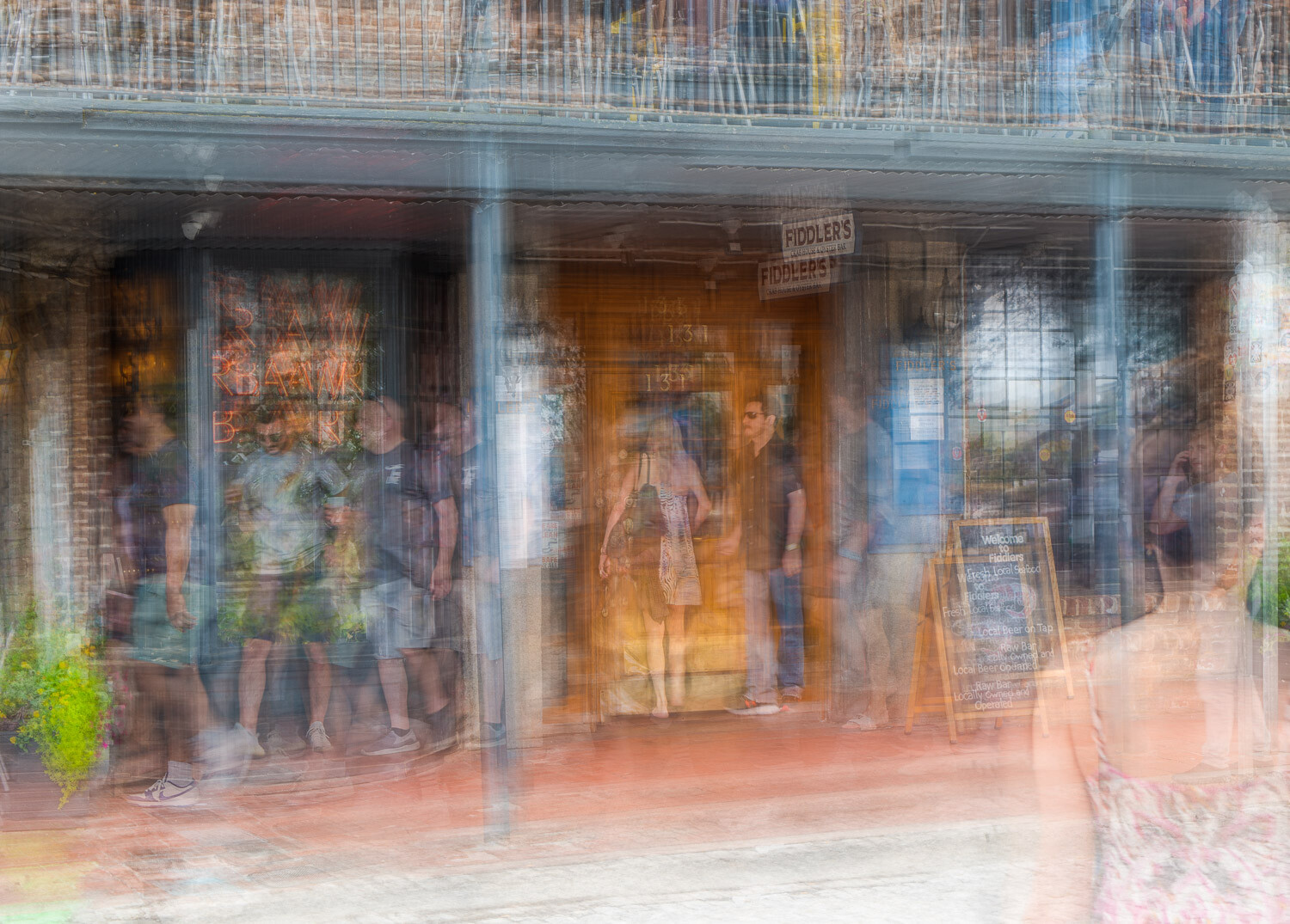
Something a bit different
I have been playing around with the idea of capturing the flow of objects around a static subject for some time now. This is the result of such an experiment, taken whilst on vacation.
In this instance a number of shots were taken of a Savannah restaurant, handheld and as vacationers wandered by. The goal was to capture lots of images that could be layered and figures selectively masked in to build a story.
I tried to keep this playful, in a manner that I felt best suited the mood at that time.
For those familiar with the Ventosa ITR process flow this is very similar (layer/mask/adjust opacity) but I purposely focused against aligning the subject in each frame.
This is open for comments (good OR bad gratefully accepted, from veteran and novice alike).
** As a side challenge, let's see who is the first to spot the person using their phone.


10 Comments
Alan, I love what you've captured here... the vibrancy, the movement, the sneakily concealed man on his phone 😉 I'm definitively picking up the holiday vibe.
Thanks for the feedback Mike!
You've really captured something here, Alan! This image really appeals to me; Mike puts it well in describing my reaction too.
Where I'd differ is in saying that the young woman is wondering why her guy hasn't rung, when, well - he SHOULD! I didn't realise that your talents extended to mind-reading, Alan. That's supposed to be more my bailiwick as a psychiatrist.
Ha, you are the expert at messing with folks' minds Chris.
That's a great take on the story. I wish I had thought of that angle, then I could have pretended it was intentional and appear to be smart, like you :-)
Perhaps you should get out the house and try this yourself - I'm sure your patients would love to see some of your brain-teasing artwork on the walls of your office.
I think that would make them worse, Alan! I do have eleven of my prints in my office, carefully selected NOT to be too thought-provoking, as it is "interesting" what some people will come up with. Not necessarily in a good way for our work!
FWIW, Alan, I'm not tempted. As we've discussed, while photography offers endless possibilities, and I admire what people will do, and the extent of their experimentation, there's no accounting for taste.
To me, ICM and ITR and some long-exposure work has an inherent slickness to my eye that turns me off, or at least doesn't turn me on, float my boat, press my buttons. Some very fine ICM work, for instance, calls to my mind watercolour or oil abstract or semi-abstract paintings - but I find myself wanting the paper texture in the watercolour, or the rich surface texture (especially on seeing the actual painting) of oils or acrylics. For me the definitive image is the print, not on-screen.
The aesthetic or expressive virtues of photography lie elsewhere for me. All totally subjective, so I'd never criticise ICM or ITR work per se, and as here, can see worth in it. You're a very fine exponent of these genres, and I can admire and respect that, without wanting to personally emulate it; I have to feel some internal drive to press the shutter button, and random experimentation just leads to noise or chaos - for me.
But the very fact that others see your such work, and want to have a go, inspires me vicariously. Good on youse (as we say in Oz)!
G'day Chris, I certainly understand your viewpoint and appreciate the feedback. In fact, my own wife has serious reservations to what she terms my 'blurry photos'.
I think any form of abstract work divides the community, and as you say it's all down to personal taste.
I appreciate your ability to acknowledge the work, even if it is not to your liking.
I'd really like you to get out of the house and see you posting some of your work again (it's been a while...), so I'll continue to nudge you in any way I can...... ;-)
I can't wait to get out of the house, down the coast, and into the countryside next month, smell fresh air and positively fondle that shutter button, Alan!
With luck, I can finallly resume my habit of taking leave, and lots of photos, in winter (I think that's a bit like your summer....) and spring.
I can actually ask a business if they off Veteran, Senior or Student discounts...I don't know why they don't offer Novice discounts?
I really like what you did here. I seriously need to attempt this.
Thanks for the feedback Dean, if you (others) do try this I'd recommend the following;
- position yourself so you can shoot the static element with somewhat similar position. I have tried shooting on a tripod previously (just to appease Chris...) but the overall effect was not the same.
- think about where you'd like moving objects in the frame, and await those opportunities.
- try to isolate people or groups. Although a throng of people could be masked in/out it is easier to do so if there is space in-between.
- shoot LOTS of frames. Having options on what to include is never a bad thing, and the cost of storing on an SD card minimal.
Other than that have fun!