
Silos
I've just arrived for a few weeks in Tasmania.
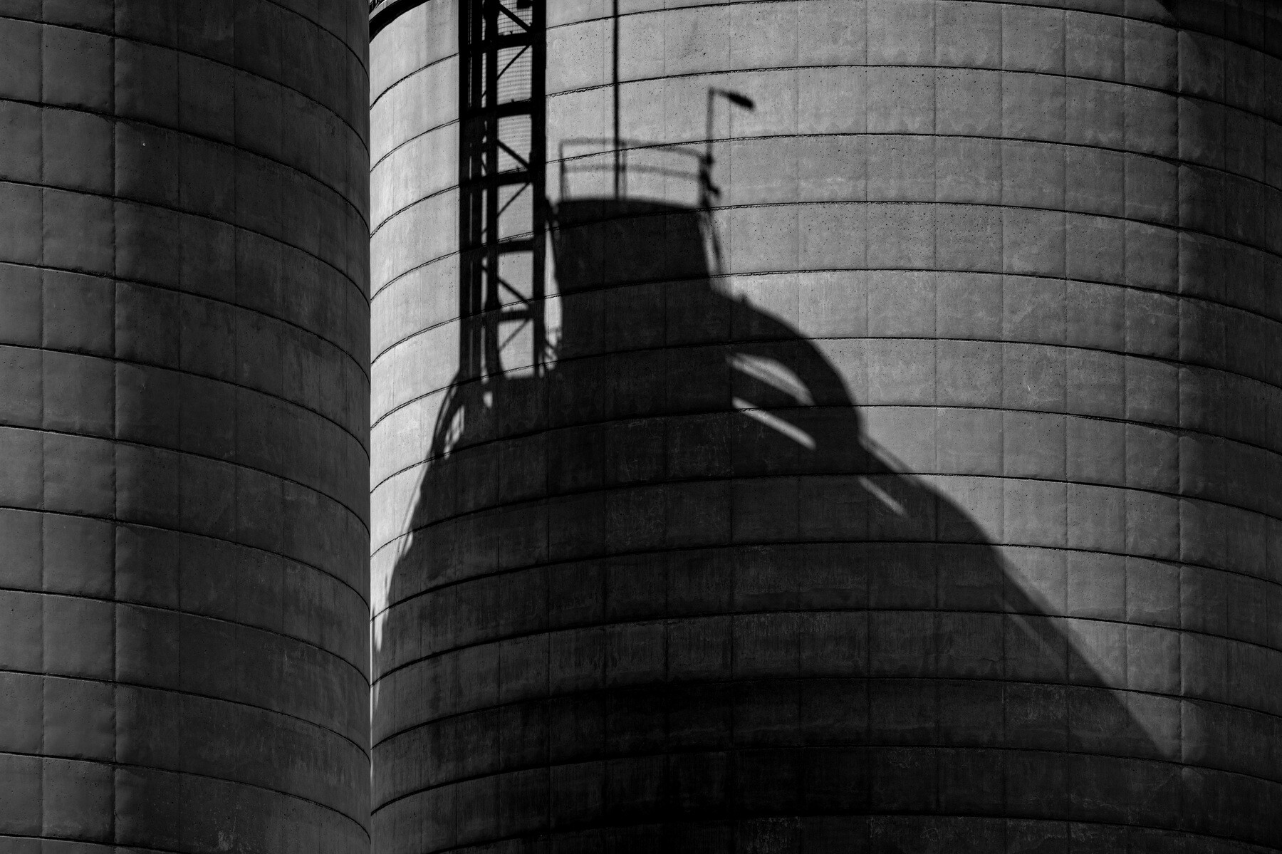
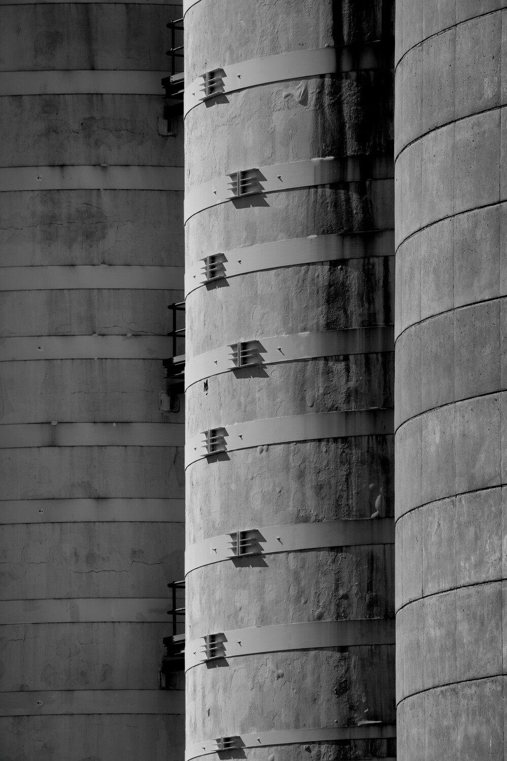
These silos near the ferry terminal provide an opportunity for abstract images.
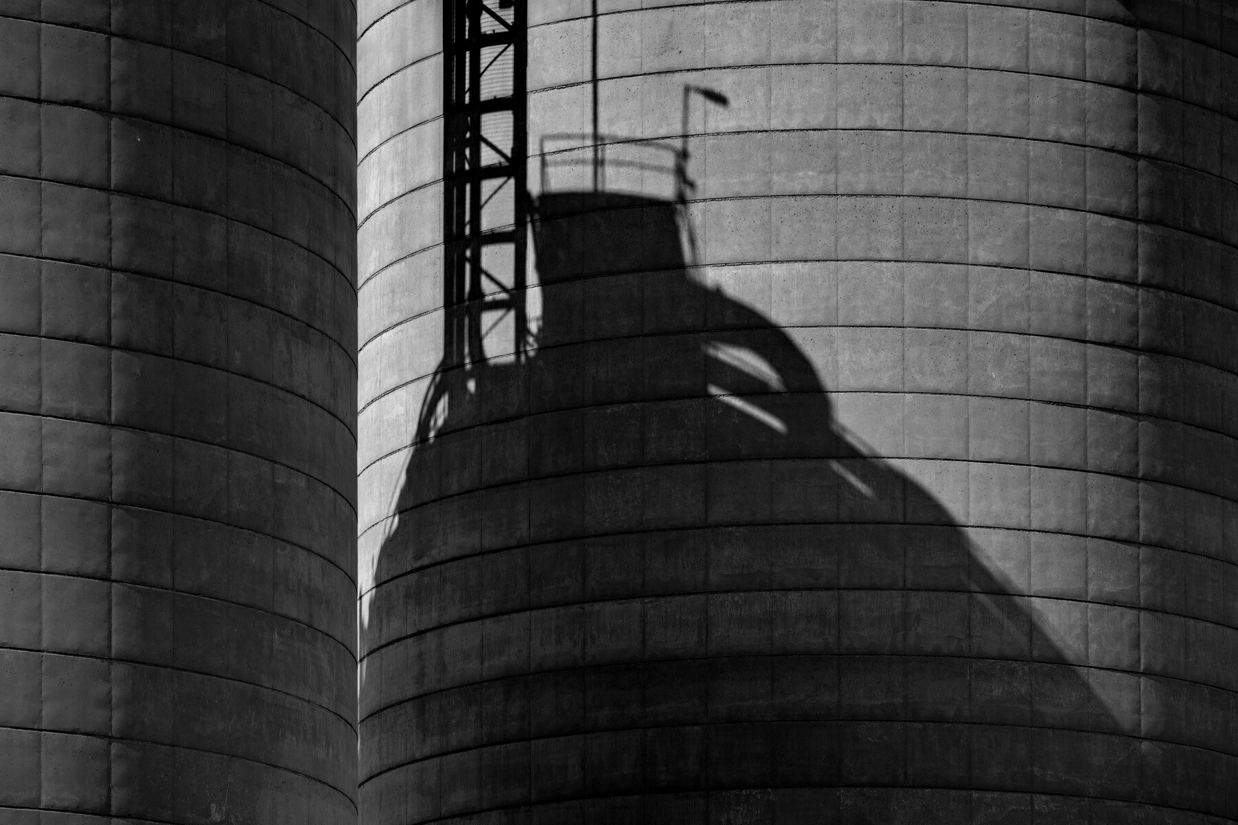
I am interested to hear what others think about the difference between the firstt two images. The first is as shot, with the top of the right silo just visible. Cropping the image to exclude it spoilt the composition. The second version is altered by cloning to make it more "clean". What do you think of the difference? Is it trivial? Do you prefer one to the other?


5 Comments
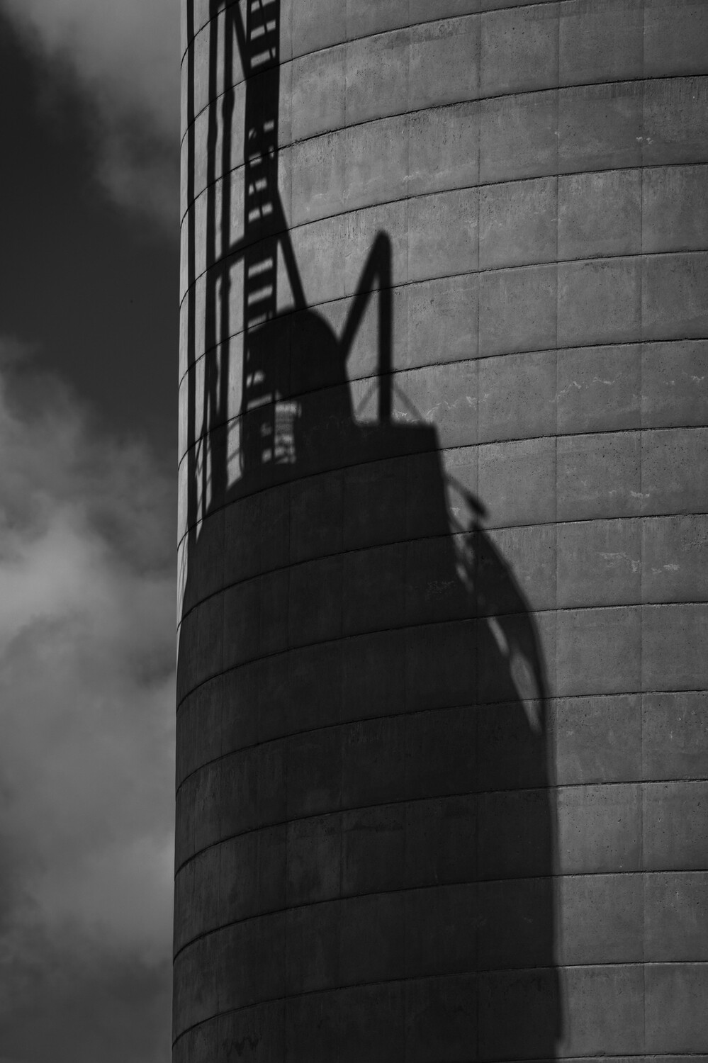
Out of the first two, I prefer the second. Out of the five I prefer number 4. To me vertical subjects lend themselves more to portrait orientation. Love the tones and texture.
Thanks, Chris. I expect most people would prefer the "cleaner" No. 2. For me, that litlle triangle balances the composition out a bit better. I think... Or maybe not... ;-)
As I said elsewhere, I do particularly value your opinion.
I prefer the 2nd, primarily due to the increased contrast between shadow and light.
#4 is interesting due to the ambiguity it presents (which is behind, which in front?).
Thanks, Alan. You weren't supposed to notice the tonal differences! But you're quite right. I did my cloning too early in processing, eager to see it if could be done unobtrusively, and it worked so well I thought I'd better leave it as it might well be the best I could manage. THEN i realised I hadn't finalised the tones...
I hadn't thought of the ambiguity in 4, probably because I know all too well what's what. But that's an added bonus. Thanks for the observation.
Chris Jablonski Between first two, the second. Image 4 too is interesting.