• 0
  • 0
Andrew Williams's picture

Son of Beaches

A few years ago I published to no great acclaim a book called "Beaches." That was a compilation of pictures taken at the seashore from 1969 through 2018 between Atlantic City, Wildwood, and Cape May in New Jersey, and Ocean City, Maryland. The ongoing project "Son of Beaches" includes some pictures that were left out of the earlier publication and a lot of newer work, most of which is not minimalistic, abstract, or experimental.

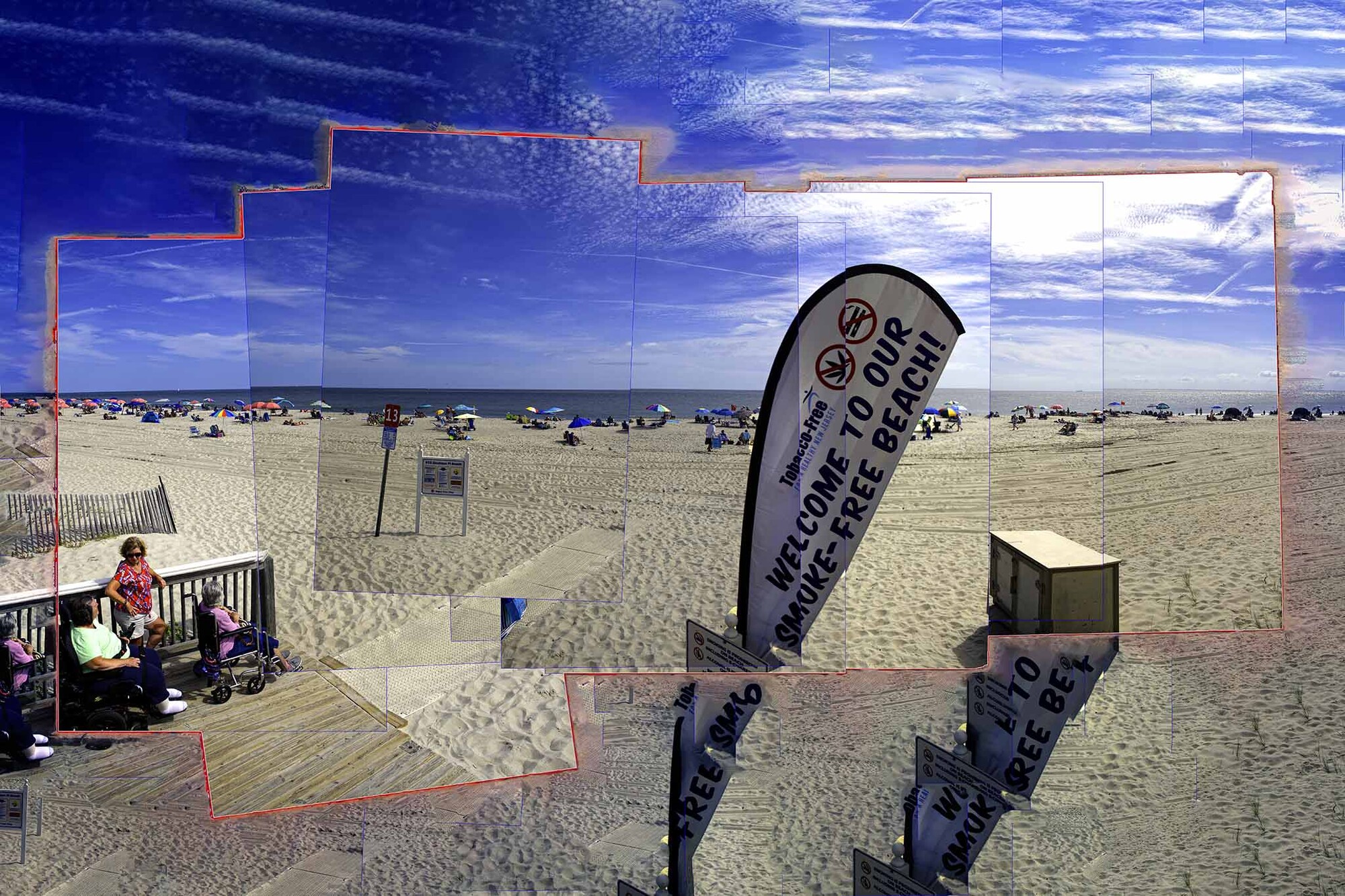
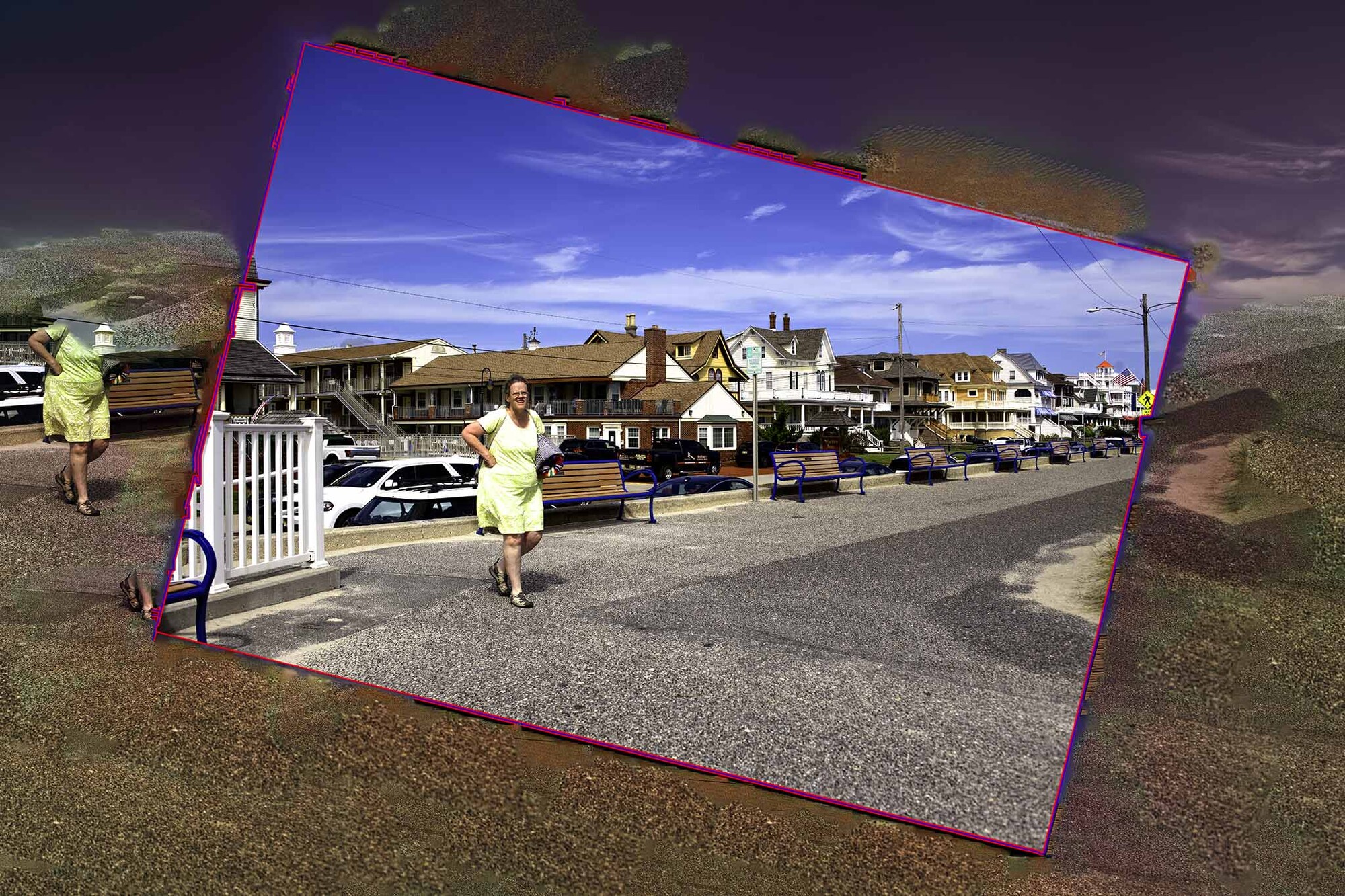
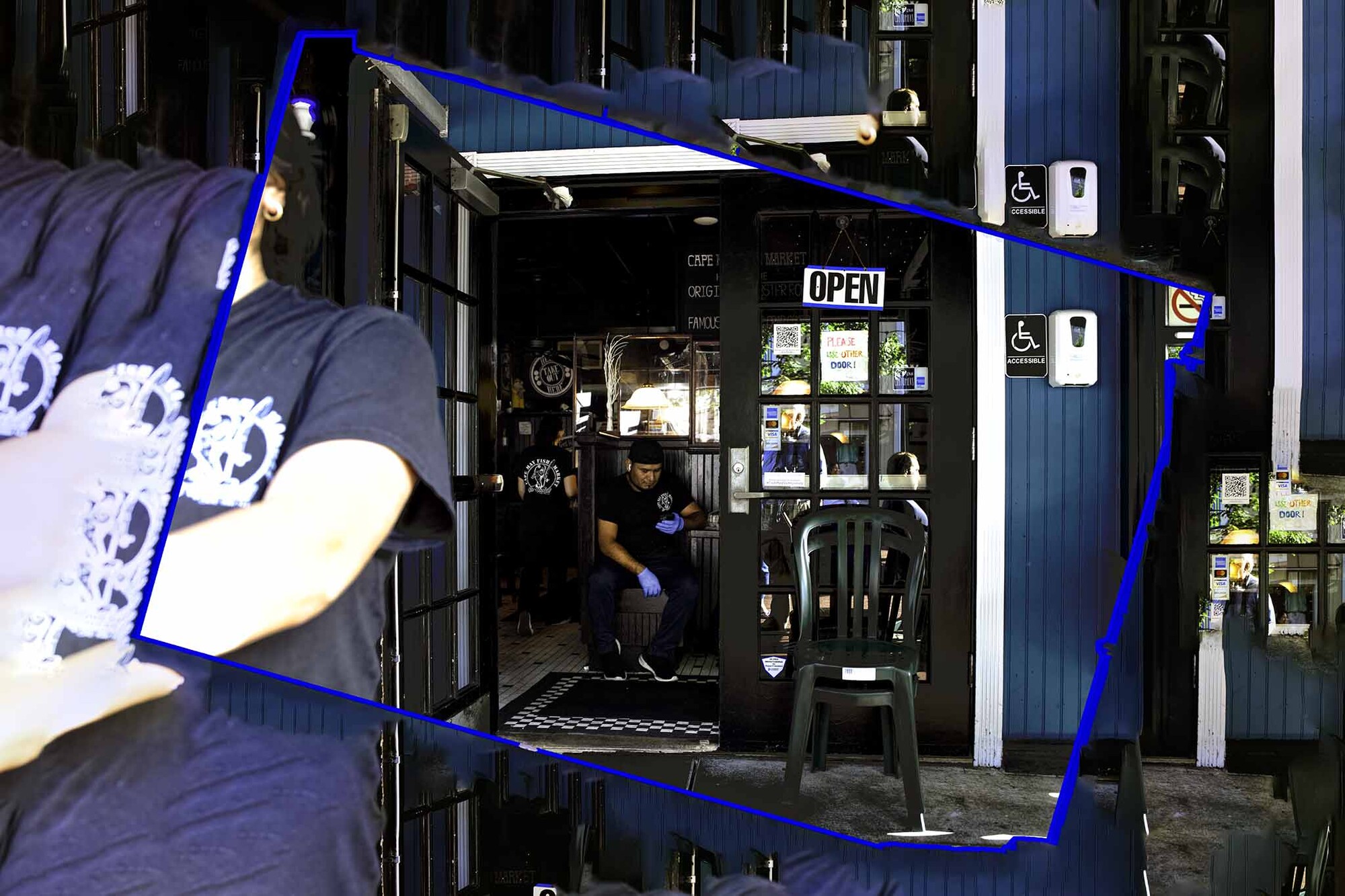
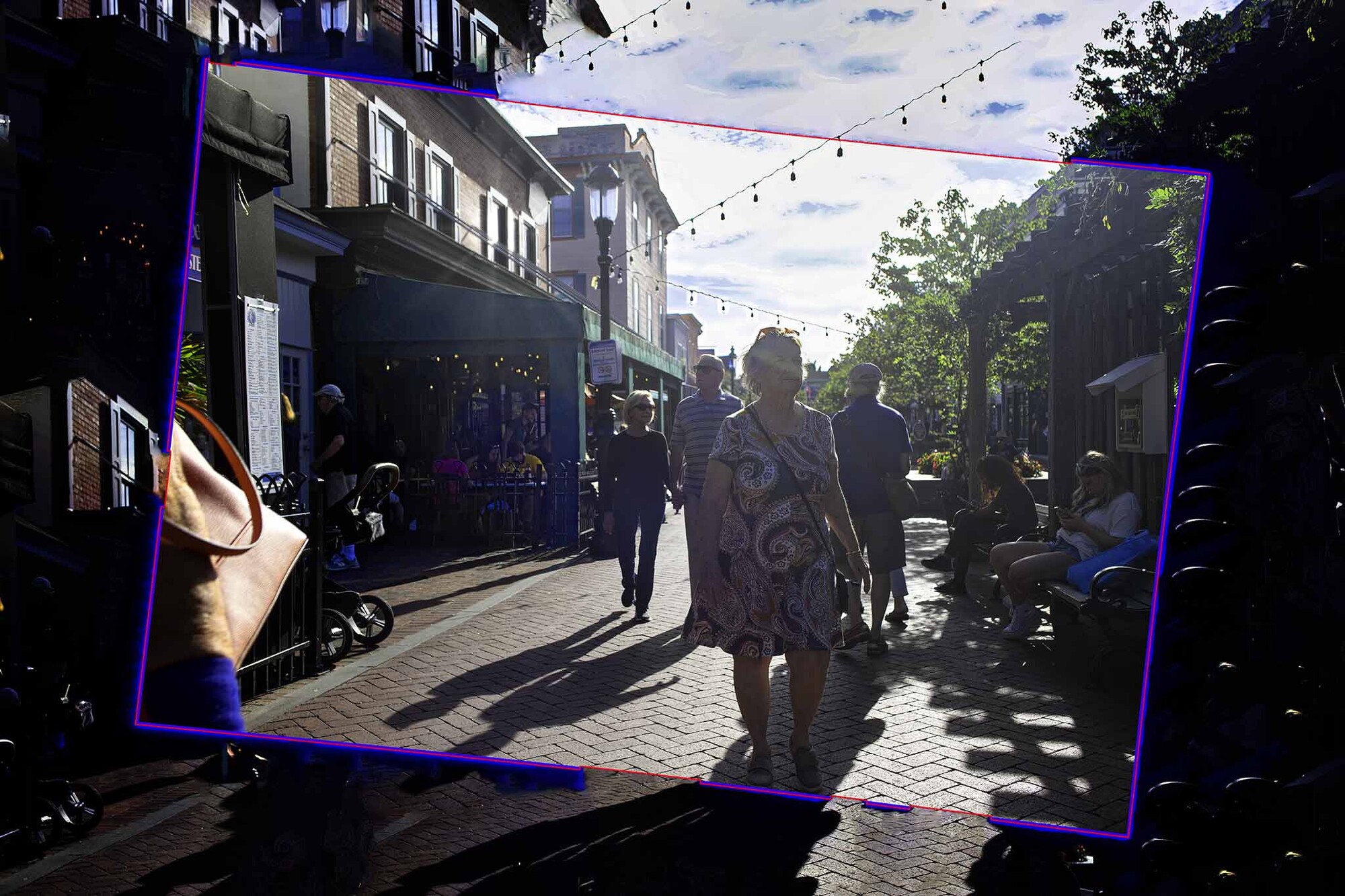
We (sans Harry) took a day trip to Cape May (billed as America's Oldest Beach Resort) on Saturday and had a lovely time and a fine meal at the Cape May Fish Market on the Washington Street Mall. We've been going to Cape May for forty years. I walked around and took pictures while my wife and daughter hit the beach. One person even called me a creep for taking pictures with people in them, so all-in-all it was a successful day.

The only planned image here is the first one, where I used a sequence of vertical exposures.

The other three were shot automatically, triggered by my D850's built-in intervalometer every five seconds while I walked around with the camera hanging on my chest. The original impetus for this was to avoid people calling me a creep for photographing them, but it's been interesting to look at them all (1,187 that afternoon, most of which will remain bits on a hard drive never to be seen again,) seeing where I was and what I was looking at however inadvertently. Basically, the camera shot whatever was in front of me, but since I was moving it was almost never level. Making the vertical lines vertical was the first part of the post-processing. The rest of the process has been described here several times. I seem to be leaning toward blue lines instead of or in conjunction with the red ones.

Log in or register to post comments
5 Comments

I sat down with a cup of coffee, opened your post, and enjoyed reading it, Andrew.

#1: Colors are beautiful, and the sand looks so inviting.

#2, #3, #4: Have the feel of the freezing (a snapshot) of a moment in time while retaining the feeling of action/motion surrounding that snapshot that was continuing on forward from that moment.

I can't choose between blue or red lines. Both colors have that summer beach-y feel.

Thank you for the kind words.

This is a process. I am trying to formulate a conceptual framework for what I've been doing. Some parts are clear and some are still a mystery.

For instance, I understand why everything ends up in a 2x3 aspect ratio. In addition to it being the format of every 35mm camera I've owned (starting with an Argus C3 sixty years ago) and my more recent Nikon FX cameras, we are endowed with two eyes arranged in a horizontal format. The 2x3 aspect ratio (or something close to it) is inherent not only in our equipment but also in our DNA. This is also part of why movies and TV shows use a horizontal format.

The boxes separate the photograph (or photographs) from the fill. In the case where multiple exposures are combined into a single image, those boxes separate each element.

I have less understanding of the color and thickness of those boxes. I've sorta concluded that the outer box should be thicker than any interior box. I am at a loss as to whether they should be red or blue or any other specific color or if it depends on other content matters. Should it be a complementary or contrasting color?

So far I've just used whatever felt right at the time. I may be forced to read a book about color theory.

I'm not sure how the boxes are formed, but if there's a way of changing the color of the line using the eyedropper tool to a specific color that is in the image (maybe the image's predominant color or maybe not), you could try using that as the color of the box. Also, Is there a way to make the box lines have a beveled look (if you're into a three dimensional look). Also you could experiment with the shapes of the box to reflect a theme in the photo - at first glance, the third image box looks sort of like the state of PA (although you weren't in PA). As I said in my previous post, outside the box has the feel of life moving on while the inside of the box has the feel of capturing a moment from that life motion.

There are several ways to select the box and it can be any color. The eyedropper idea is not one I have explored, but I'll let you know what I find out.

Depending on the method, it may or may not have a clean rectangular edge. The irregularities occur when I straighten/tilt the image. When I do that, there are four adjacent triangles created because Photoshop wants rectangles, and sometimes when I select the actual image the software gets a bit befuddled if those triangles are adjacent to a dark part of the image. You can avoid this by putting on the box before the straightening assuming the box is not black. If the box is thick enough it will bleed into the fill.

I create the boxes with the selection tool after making the selection. This is where you can choose the color and thickness. It is possible to have multiple lines of different colors with a bit of trickery. as you can place the box inside, in the center, or outside the perimeter.

I'm still fumbling around with all this. I'm likely to go back and redo a lot of things once I have a better theoretical grasp on what I'm doing. Harry suggests that I have too much time on my hands. I suspect he would like both a morning and afternoon walk.

That last reply was an interesting read because it helped me to understand better how you accomplish your effect ... and the challenge of doing it. You're doing really well figuring out how to get what you're envisioning. I was thinking about the idea of motion around that central snapshot. I took your last image from the original post, opened it in PS, selected the central snapshot then inversed the selection so that a motion filter would be just applied to the exterior of the box. I used a motion blur effect to increase the feel of movement on the outside. Just an idea. Hope you're enjoying the cooler weather lately!