
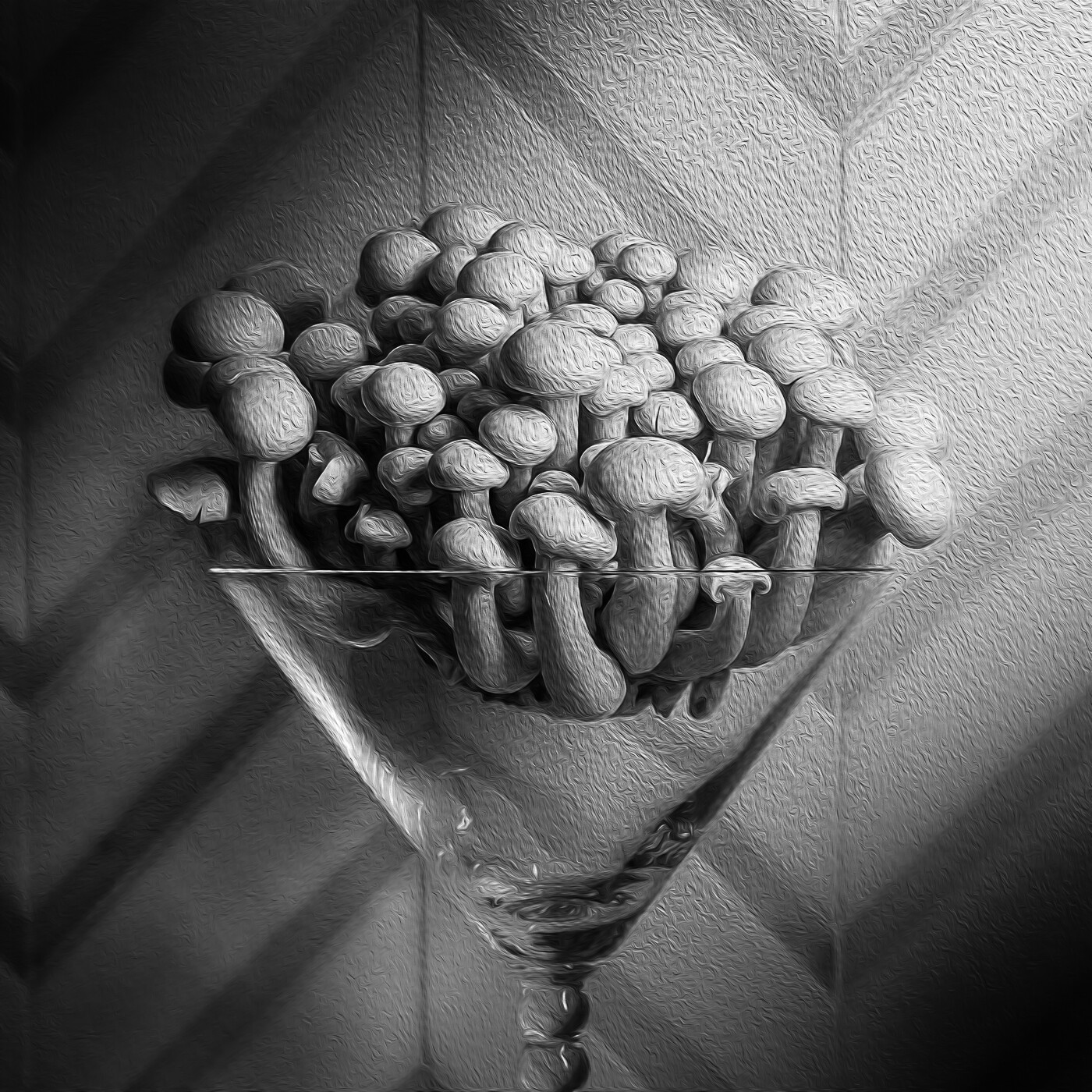
Fun Guy
My photography club is having an abstract photography competition. This is a genre I really struggle with. I know what abstract is, it's just tough for me to come up with compositions. Just thought I'd share one of my entries. Any constructive advice would be appreciated.


8 Comments
As with Jennifer I find this interesting Marcus, I would think it certainly falls into the abstract category. The lighting is great, really picking out the form of the mushrooms.
I do like the filter applied to the mushrooms but wonder if the result may have been more compelling had it not been applied in the same degree on the background.
That said, it is difficult to say without seeing a comparison, and I really like the image as it stands.
Thanks for your comments Alan! After I applied the filter to the photo in PS I reduced the clarity and texture of the shadows in an attempt to emphasize the subject in LR. I think maybe I'll revisit this and compare to the current version.
I do like the original but am interested to see what you come up with.
Is the distance in bottom left the same as the top right?
I like the well defined shapes you achieved using the lighting you chose. Interesting how the texture layer(?) does not "appear" on the glass surface but feels it's on the back surface.
Did you use a light wand? Wondering because of the shape of the light reflection in the stem.
Wow....very good eye! Yes, I did use a light wand to light the subject. I applied a filter in PS and then used reduced clarity and texture in the shadows to try to highlight the subject. The distance between the top and bottom should be the same as I was directly in front of the subject. I appreciate your comments...
Hello Marcus. I really like the image. Square format, composition, tonality, light/shade. Super lush. Just love monochrome.
The only "issue" I would have is that in UK English fungi is pronounced Fun-gee (O.E.D pronunciation). Tongue-in-cheek dialectal differences aside, very nice image. Best of British to you Sir.
BTW, very nice portfolio, that Redwing in Spring is particularly eye catching.
Hi Chris, thanks for your kind words! It's actually pretty interesting to know how other areas pronounce a specific word.
I see what you are saying, it would add more dimension between the Subject and the Background.
But I could be wrong.