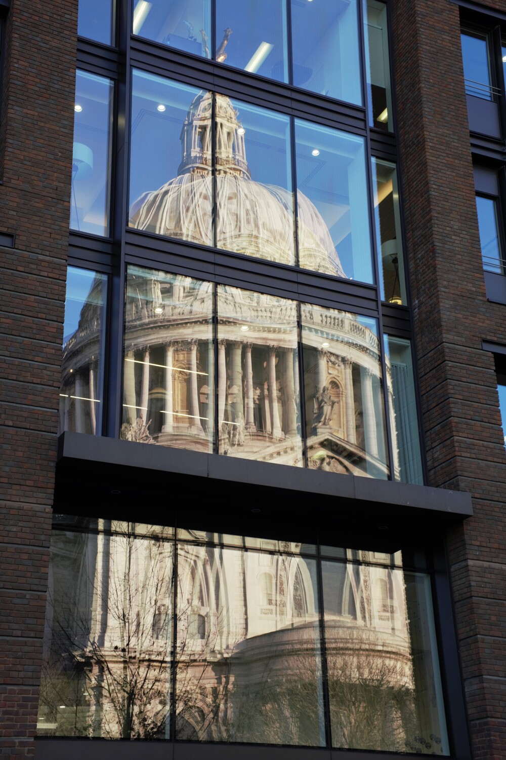
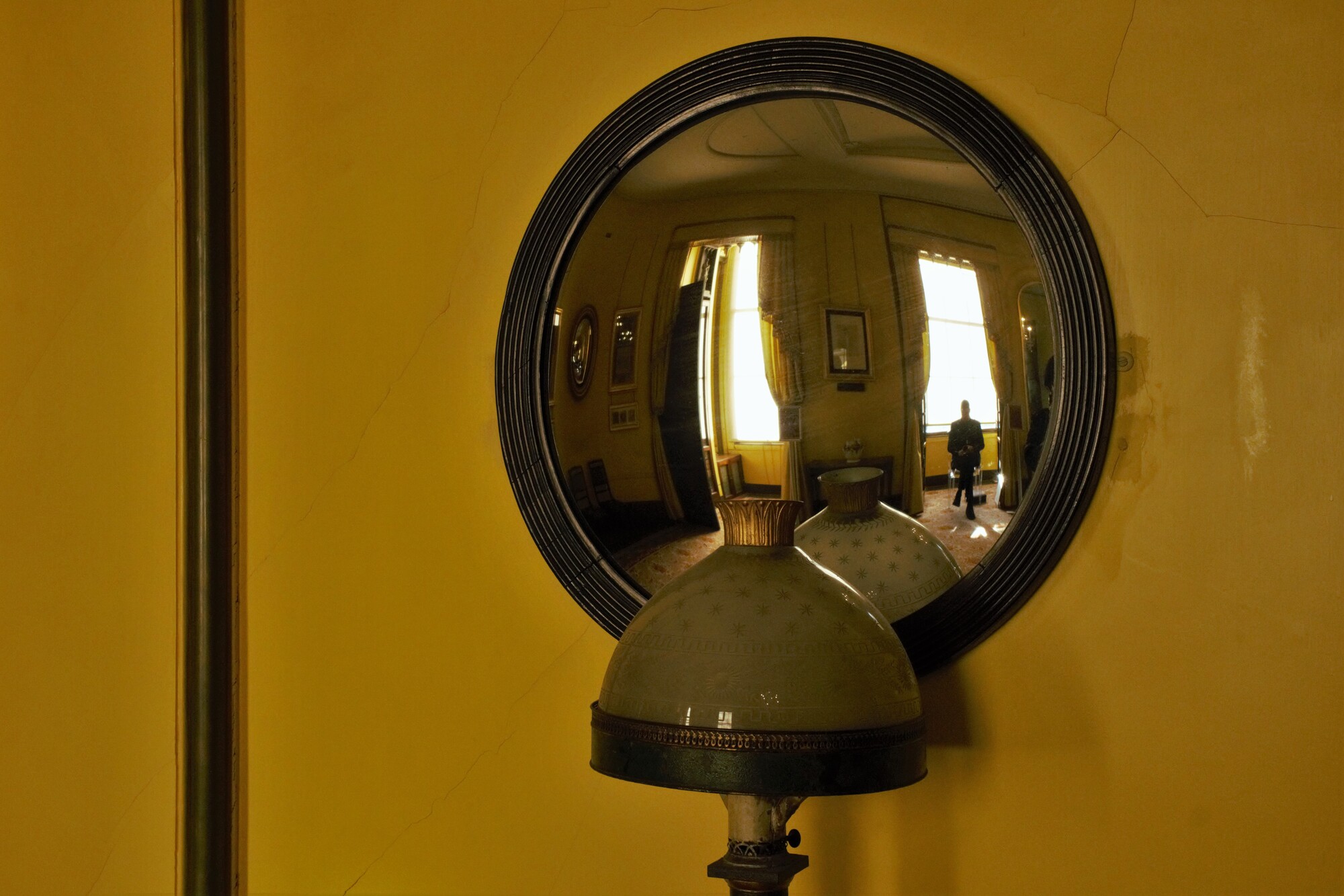
London reflections pt. 2
The first one must have three layers of glass??? The second one is from inside a small museum.

The first one must have three layers of glass??? The second one is from inside a small museum.
First time this young lady posed and worked in studio. Just finished her Masters degree and is now pursuing her PhD.
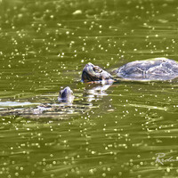
Spotted close to walking trail in Ebor NSW. Intense body colour indicates recent skin shedding.


4 Comments
Nice shots !
Thanks.
I like these Charles.
#2 especially looks better when enlarged. I think this could be rotated a little to the left to straighten the vertical object (unless my eyes are off.....) and to get rid of the dark area on the left edge.
As with Jennifer I like the minimal/no-minimal contradiction within this.
I didn't notice that on the edge! I straightened it and lightened the shot a bit. (To those reading this, I removed the original Alan was referring to.)