
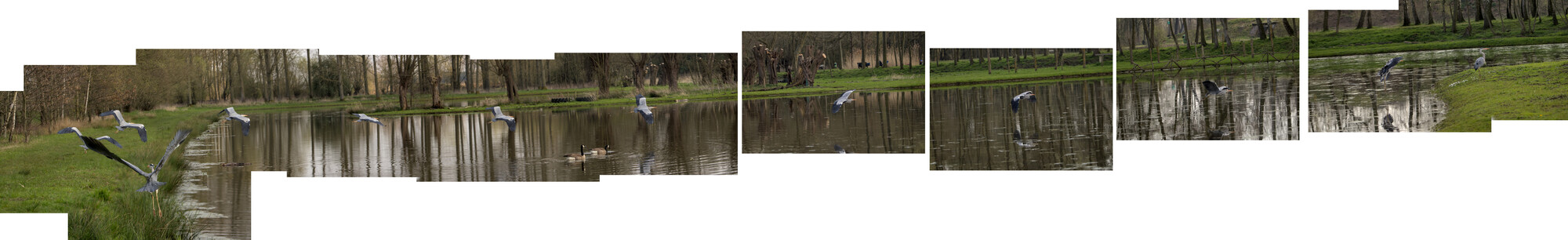
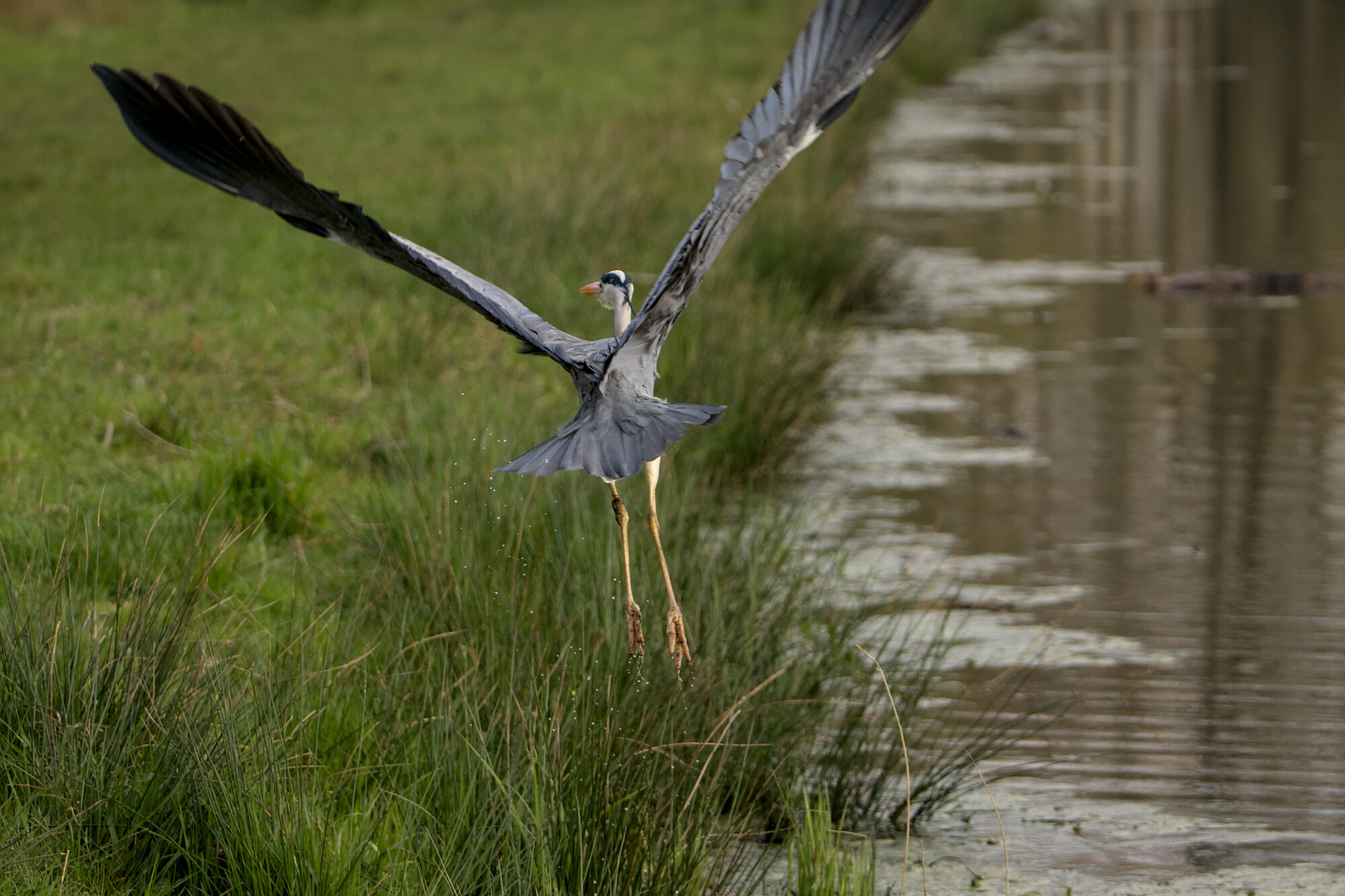
Heron in flight
Remember my composition with the cormorant ? This time I got a series of pictures of a heron in flight, which I then composed into a chain that documents the (almost) complete flight.
Sadly I don't cover the entire picture with "photo" and since my tool of choice is GIMP (Linux user ..) I don't have content aware fill ...
Does anyone have any suggestions on how to fill all that empty space ?
ps. I had to resort to quite a lot scaling down, since the original image is quite large ...
pps. In order to get an idea of the full resolution, extrapolate the size of the 2nd photo ...


14 Comments
Hey Ian, you can look into Photopea (free online alternative to Photoshop - https://www.photopea.com/).
I'm not sure if it will fill your content-aware/Linux OS needs but I believe many others use it in place of Photoshop.
Good luck with the project!
Thanks, I will definitely take a look at it !
My humble suggestion of a process would not require any new software or much technique.
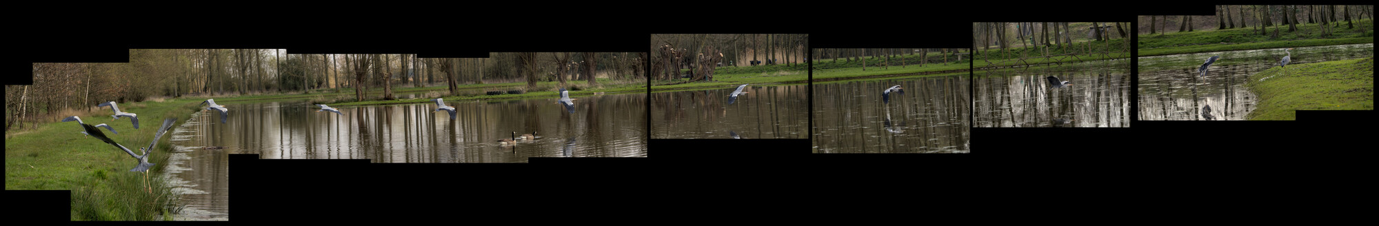
1. Extend the canvas to allow a border beyond the Left/Right/Top/Bottom of the image layout. I generally use a 25% extension, but you should do what seems right to you.
2. Fill all that empty white space with Black. Since our eyes reflexively go to the brightest part of an image, this will change the dynamic away from the filler and toward the images contained therein.
If it were my work I might also surround each individual frame with a thin yellow stroke. This disguises any transition issues between the frames. These could be caused by slight misalignment or optical vignetting.
In my own work I use content-aware fill since it is available to me and adds a modicum of abstraction, but I rarely do only that. I normally make it much darker than the photographic images. Sometimes I invert the colors. Occasionally I make it B&W or a B&W negative. Mostly the idea is, as above, to return the eye to the actual photograph.
My philosophy about things like this is to make any manipulations either invisible or obvious. In "straight" photography, the goal is to do any retouching without anyone being able to tell that you did it, even though we all know photographers have been using burning, dodging, and other techniques on their "straight" images forever. Ansel Adams used burning and dodging to great effect. W. Eugene Smith used dissimilar techniques (Q-tips and bleach) in his prints, but unless you know that there would be no way of seeing that in his images.
If you use a technique that cannot be invisible, make it clear that this was done on purpose rather than being an accident or sloppy work.
I'm not certain where Jerry Uelsman sits along the continuum between these approaches.
I've been experimenting with this idea. When I make the background black, It looks a lot better already .. Thanks !
Added the version with black background ..
it's quite the challenge, working with files of almost 1Gb
Looks good Ian. What app are you using?
Thanks !
I'm still using GIMP (https://www.gimp.org/). It offers almost the functionality of photoshop, but is free, opensource and Linux native. The drawback is that it's harder to use than photoshop, I hear (can't confirm, since I never used photoshop).
I'm also happy to be blessed with a powerful machine that can handle those loads.
The reason I ask is because of the file size you indicated. In Photoshop I tend to flatten the image once my composites are completed, this reduces the size significantly.
In GIMP I have that option also, but as long as I don't know if I still want to change anything, I rather don't do that yet.
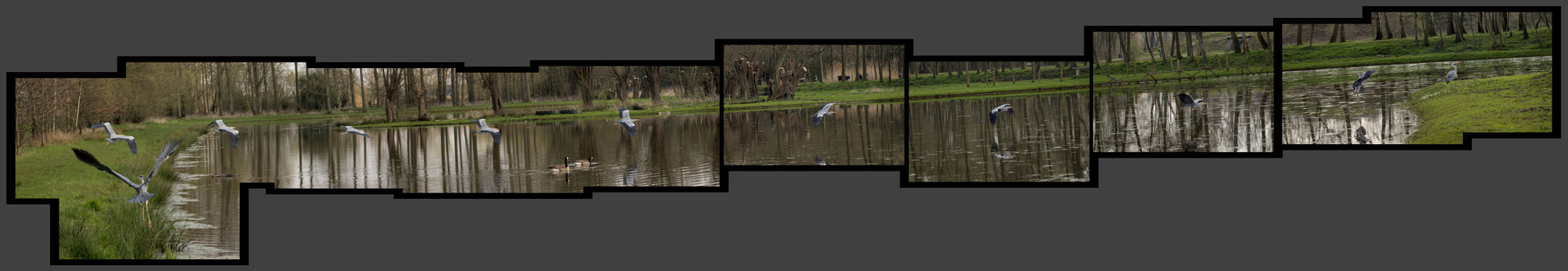
I assume you're still working on this. One thing that bothers me is the left wing of the "first" bird on the left is blocking the second bird. Can you eliminate the second bird? I don't see the point of having it there.
Overlapping is neither good nor bad (I do it often!), but I have to agree with Charles in this case. It is distracting because it is the only place this occurs. See my post today for some other thoughts and examples of muti-photograph imaging.
Fair point.
In my initial version, I had 3 or 4 more birds overlapping in the beginning of the flight (burst mode, until the buffer filled up :-( ). I will try a version without the "2nd" bird.
Added another version, with the 2nd bird removed and another take on the background / borders ...
this might be the final version.
Yeah, I think that is much better.