
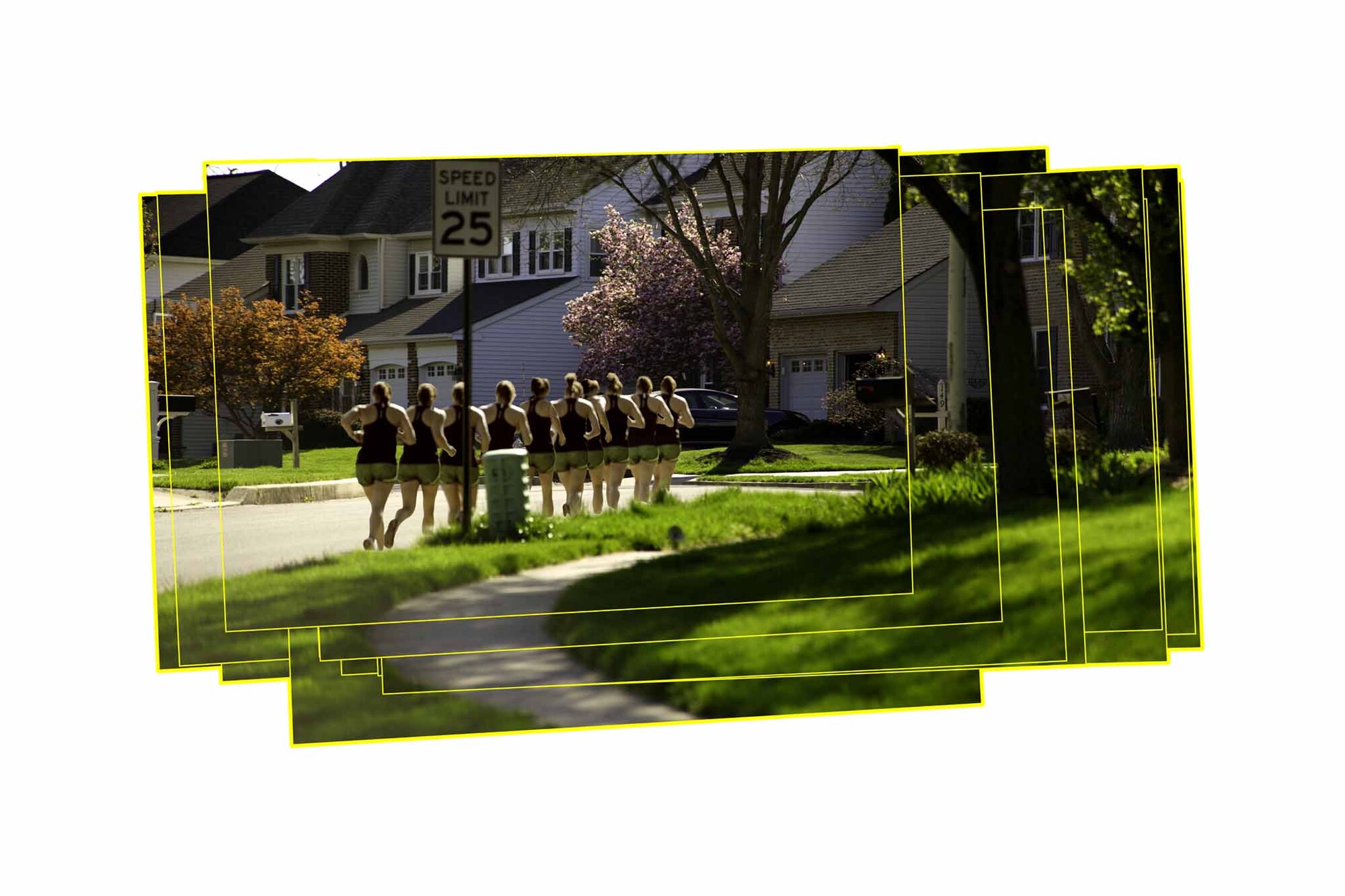
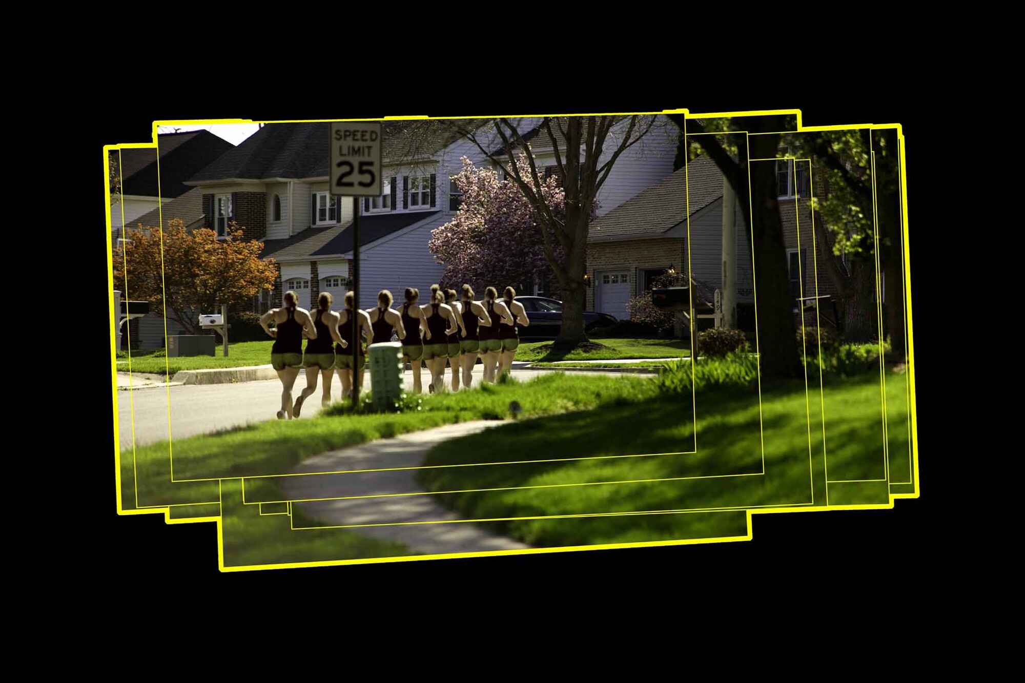
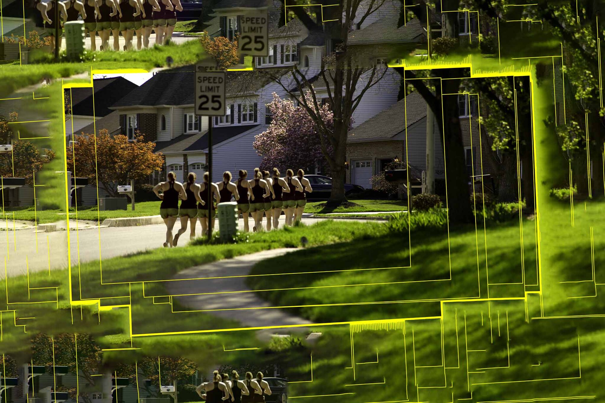
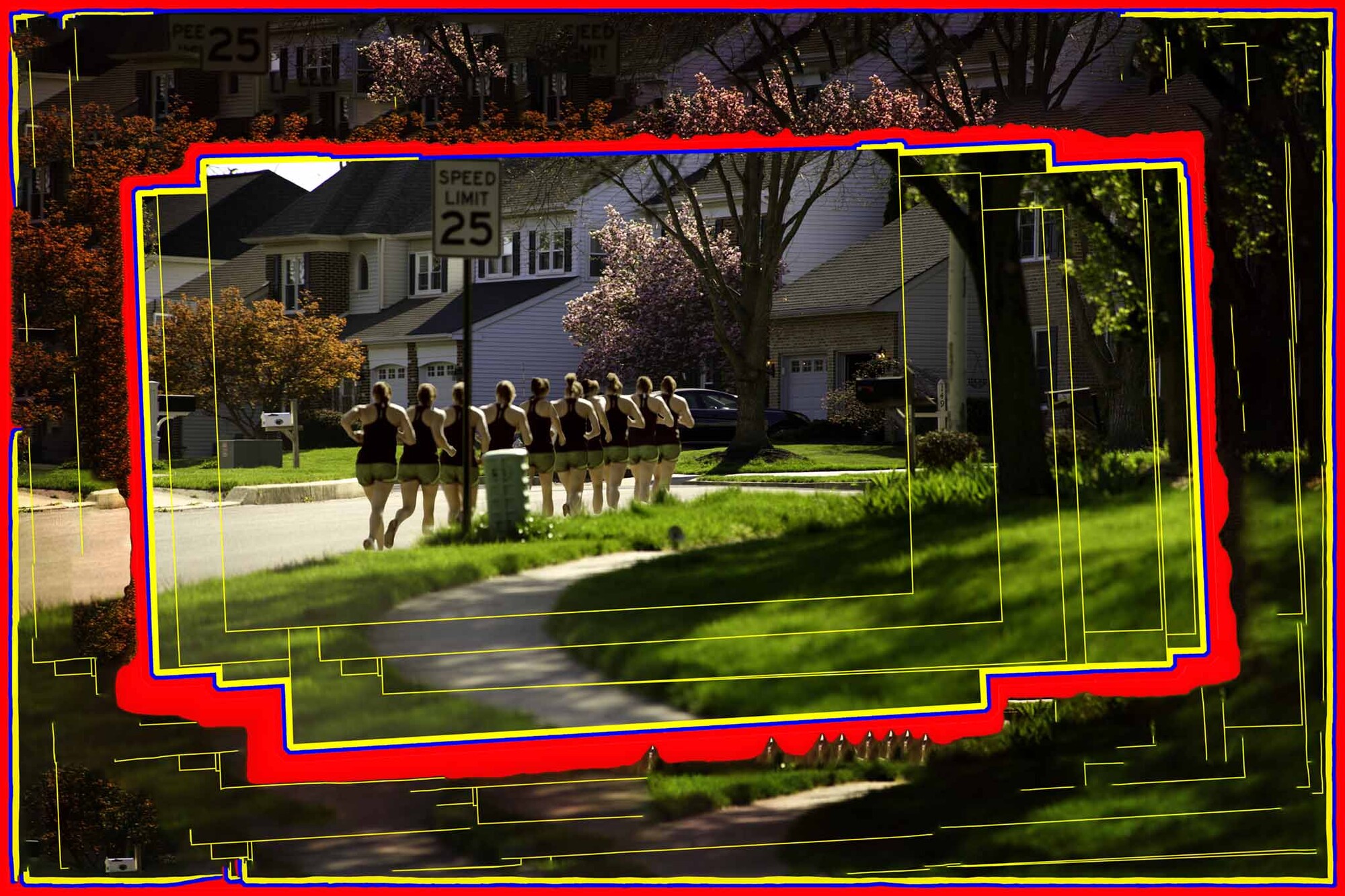
Black, White, or Content-Aware Fill?
Recently, I commented on another photographer's that the fill on his multi-photograph image should be black instead of white since his GIMP software did not have content-aware fill. This was an incomplete statement. Anything other than white would have been better, not only black. For that image, I suspect I would have chosen 50% grey. Perhaps some other color might complement all the individual photographs. His choice.
I was thinking about this tonight while I was editing this assembly so I took the background fill in several different directions. They are otherwise identical.
#1 has a white background.
#2 has a black background.
#3 has content-aware fill.
#4 has additional, heavier borders with content-aware fill.
My intent here is to show that this is a choice and reasonable people are allowed to have different solutions and choose a different path. This is a similar choice we make when matting artwork. I always choose a neutral black, white, or grey mat board. Most people seem to use colored mat boards. (I know I sold enough of them back in the day.)
The canvas size here is 25% wider than the assembled photographs with the vertical growth being somewhat more to achieve a 3x2 aspect ratio. If the aspect ratio were different, the 25% growth might be vertical. In either case, one or the other is normally 25% and the aspect ratio is always 3x2 or 2x3 should I do something in portrait mode, which is pretty rare. This is, as Harry keeps telling me, a matter of personal style rather than some highfalutin artistic-philosophical statement. He tries to keep me grounded.


2 Comments
hmm, I see what you did there :-)
For me, the one with the black background is more appealing.
I have not yet committed on the final edit of my own composition... nice to be aware that there are lots of options to choose from.
nice job pointing this out !
I lean toward the white, though the black background has its own attraction. I think it would depend on the matt & frame if printing.
The CA fill looks to busy and confusing to my simple eye.