
Thoughts?
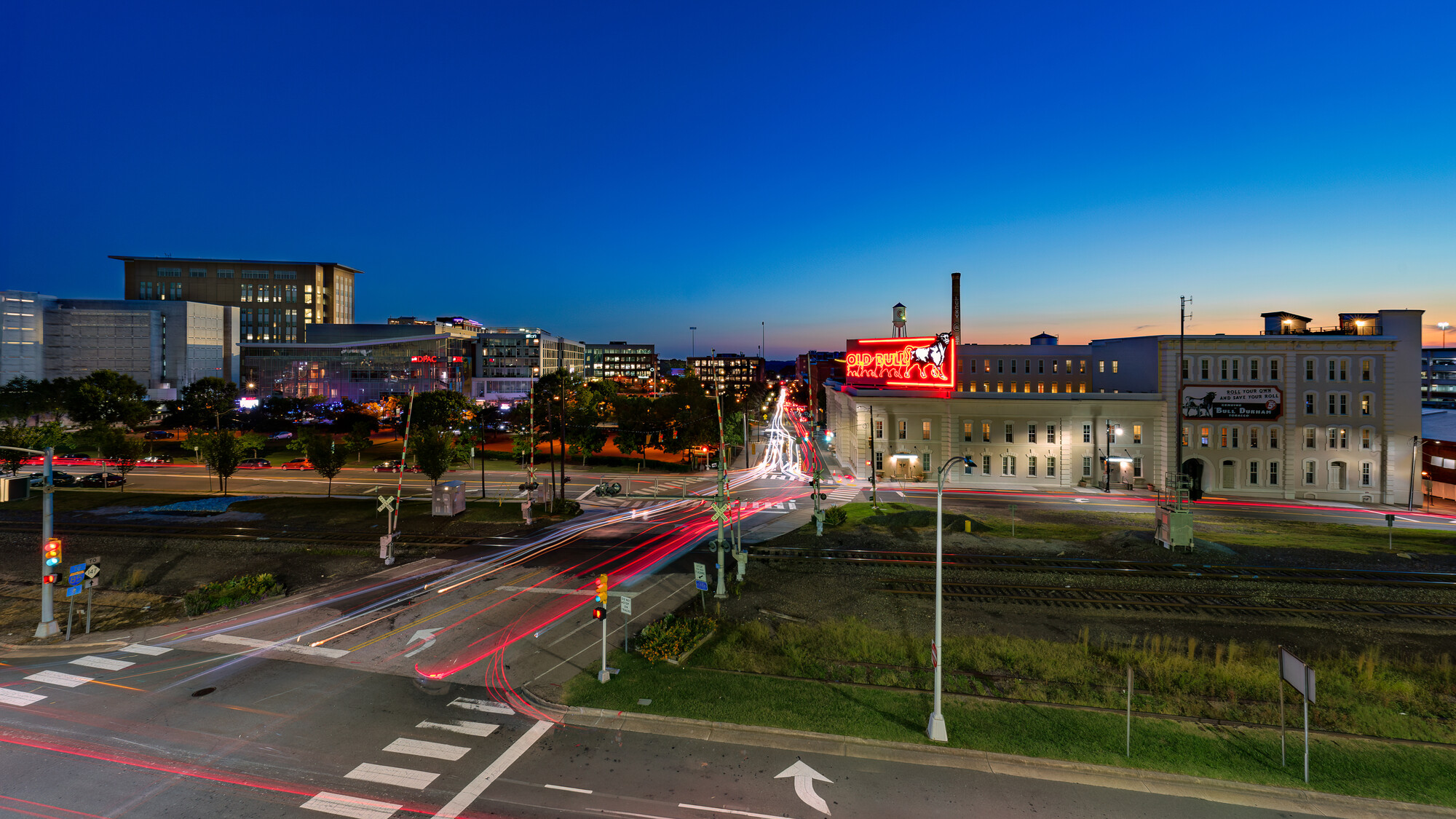
I've had the idea for this shot for a while. This is part of the "skyline" if you can call it that, of Durham North Carolina. This was taken from the parking garage that faces this part of the city. This isn't quite the composition I wanted. The top level of the garage was blocked off for some reason. So I had to settle for the 2nd from the top.
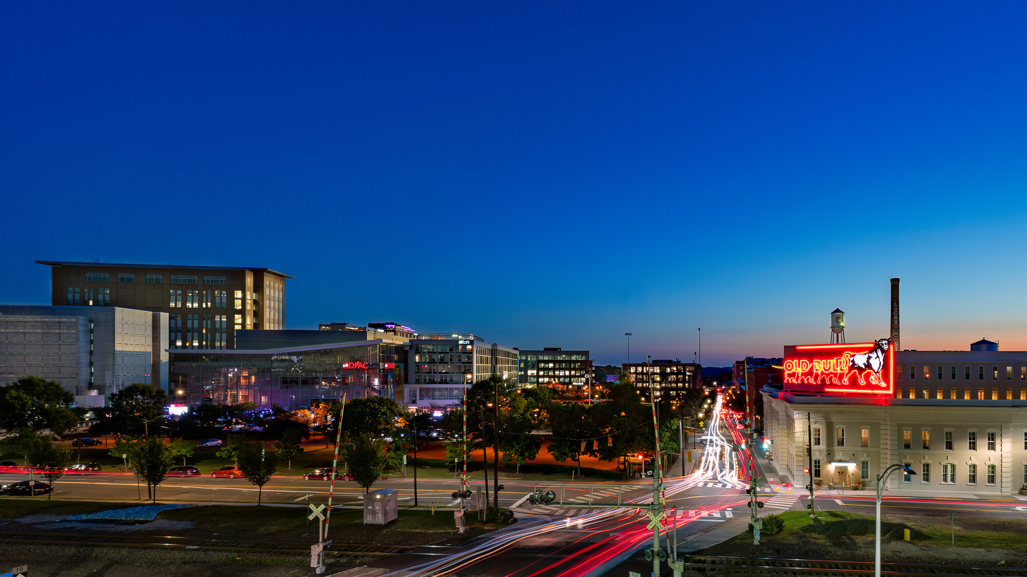
I shot really wide (12mm on full frame) as I wanted to get the entire scene. However, the more I look at the cropped version the more I like it better.
I'm not sure if it's portfolio worthy yet but I do like this shot. I wish I got a better sky. Will probably have to go back. I don't like it that much when viewed on a phone screen but on a larger monitor I think it looks pretty good.


8 Comments
I think in the uncropped version, there is a lot of light in the foreground that distracts from the light trails from the cars. Since the cropped version is much darker in the foreground (which you might even dark a bit more in post), it's much more appealing imho.
I second the crop. That intersection isn’t needed. Try cropping right to the corner of that intersection. Just my 2 cents.
Somewhere in between for me. The cropped is a bit too tight IMHO.
Interesting feedback Kyle. For me, it depends on what you are after - if documenting the skyline is your goal then the first image provides more information.
If however, you are looking for something that better highlights the light trails going down the main street I suggest a third option.
For me the second image is all about the sky.
Thanks Alan. I actually made a very similar crop to what you have done after all the feedback. I think it does look better. I've also been playing with a vertical crop that I also like. Makes me wish I had a 100MP camera. Lol!
Came to say this, nice one!
Thank you!
Also prefer the first one, it looks more balanced finished. I like the road as the leading line. Perhaps include even more of the arrow in the foreground, so its inclusion looks more intentional. The second shot to me is less dynamic because the leading line is less pronounced and the whole upper half is a boring sky..