
December Challenge - Monochrome
I have become more and more of a monomaniac, after for years saying I was largely motivated to make photographs BY colour. I don't know (or care) why I've changed, but it's supposed to be more grown-up, being a "real" photographer in many people's eyes to only do black-&-white. I also note that most of the really memorable photos of all time for me are monochrome. That may be because it is only relatively recently, perhaps since the digital era, that colour is technically up there with mono. Ansel Adams certainly experimented with Kodachrome (in 8 X 10 - imagine!), but lamented the print quality possible. His colour images, published in book form using more modern techniques, are splendid.
Despite my love of colour, some of my favourite photographers, including St Ansel of course, Bernd and Hilla Becher, Michael Kenna, and Hiroshi Sugimoto are mainly known for monochrome. The latter two often make very simple images which have inspired me greatly.
I've always loved powerful simplicity.
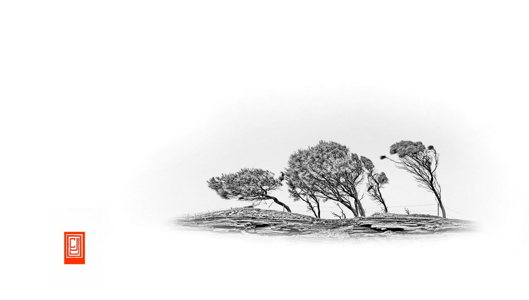
The first image is obviously not mono, but its desaturated look was heading that way. Subsequently I took the final step and also morphed the landscape fragment to lead a little further away from "photographic" reality, as in the second.


6 Comments
Hi Chris!
My favorite of the Trees is the BnW only. The color just takes attention from the bended trees. Yes, simplicity is the key here!
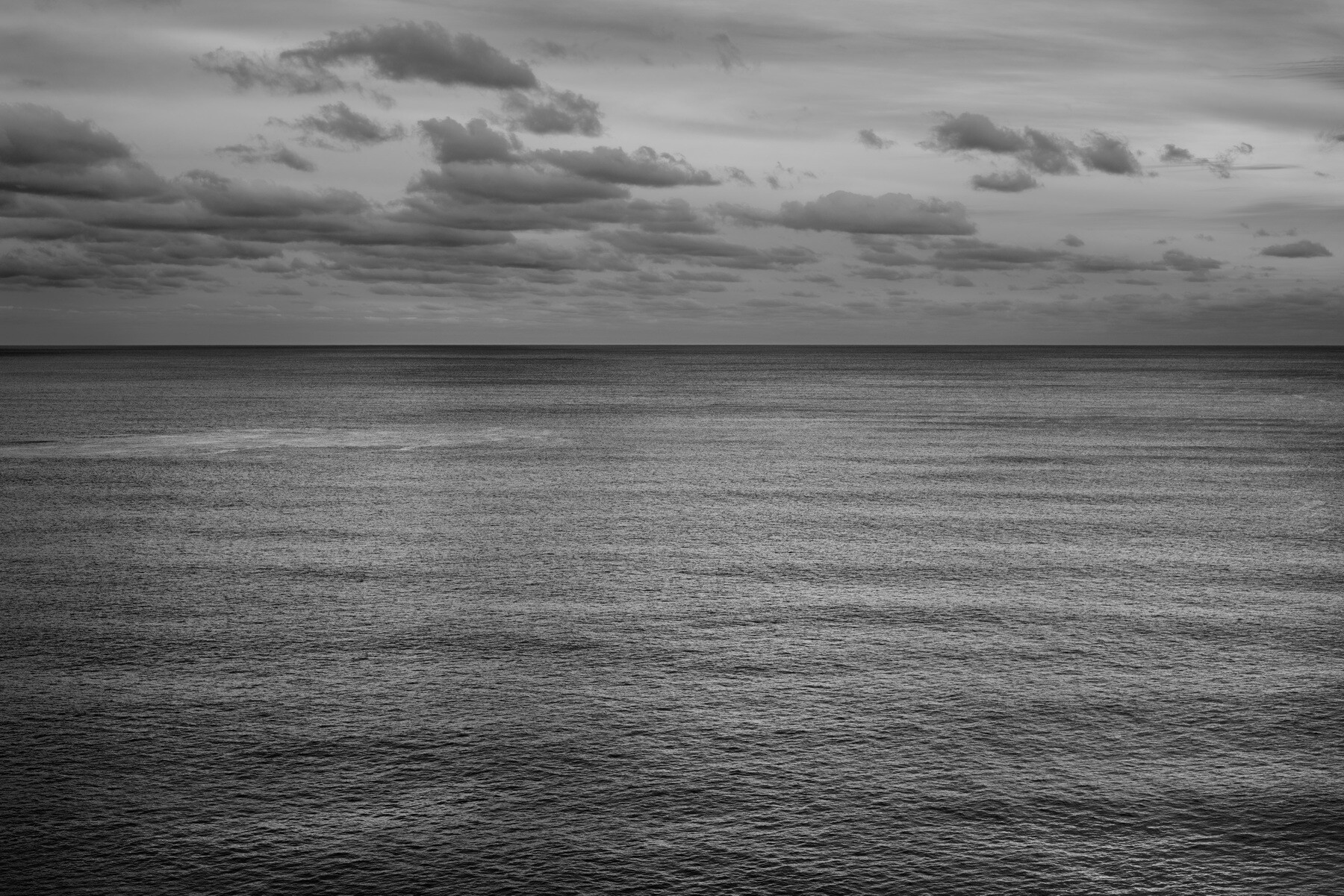
The 1st cloud-water photograph appears a bit boring to me: tiny waves, some clouds, everything quite gray. It is as it is..
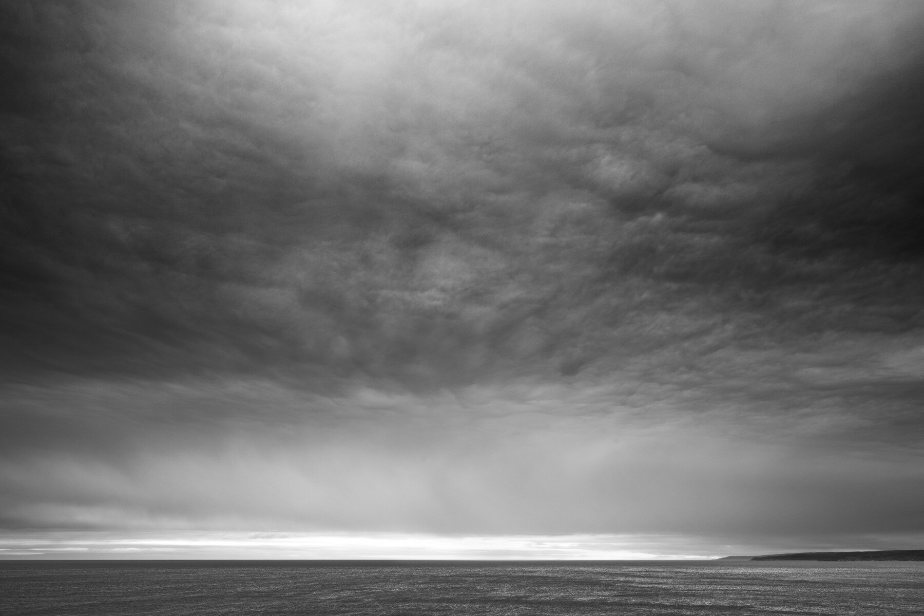
The 2nd my eyes are drawn to the lower layer of clouds, which are approaching me. The upper layer of clouds are quite dark and add a mood of drama and danger. The reason why I prefer the 2nd seacape-cloud photograph.
Thank you! I tried the desaturated look initially to mimic something of the effect of Chinese & Japanese scroll paintings (hence the hanko/chop, with apologies to Asian people for this cultural appropriation!)
In the third image, I wanted to see how simple is too simple - and you think I've found just that! ;-)
I thought many would agree with you. But I still like it.
Your comments on the last seascape are perceptive and hint at its appeal to me too, I think.
I feel that without the distraction of color B&W can place a greater emphasis on the content, plus of course conversion allows additional editing opportunities.
You are well aware of my attraction to trees and minimalism, so the first two definitely grab my attention. Both are wonderful, but I lean ever so slightly to the B&W version.
In both I love the nature of the trees - forced to lean perhaps by some a constant and directional wind from the right.
Thanks, Alan. Yes, those trees are on a windblown clifftop. I diecided to emphasise that windblown look as a painter might. Fortunately, when photographing them from below against the sky you are sheltered from the prevailing winds.
One of my favorite photographers for B&W is Trent Parke.
Nice big tree on the right with their limbs raised exclaiming "You cannot pass!" because beyond the wire fence there be woodsman with sharp axes.
Thanks, Dean. Yes, Parke is an excellent photographer. For some reason people photography is not really my favourite genre, even though I can appreciate good work in it. My favourite Cartier-Bresson image is one of his rare landscapes!