
December Challenge - Monochrome
I note that Alan's challenge suggests one colour, not necessarily black & white.
In generaI I prefer subtler colours than many people, particularly in the USA, who like bold colours that "pop".
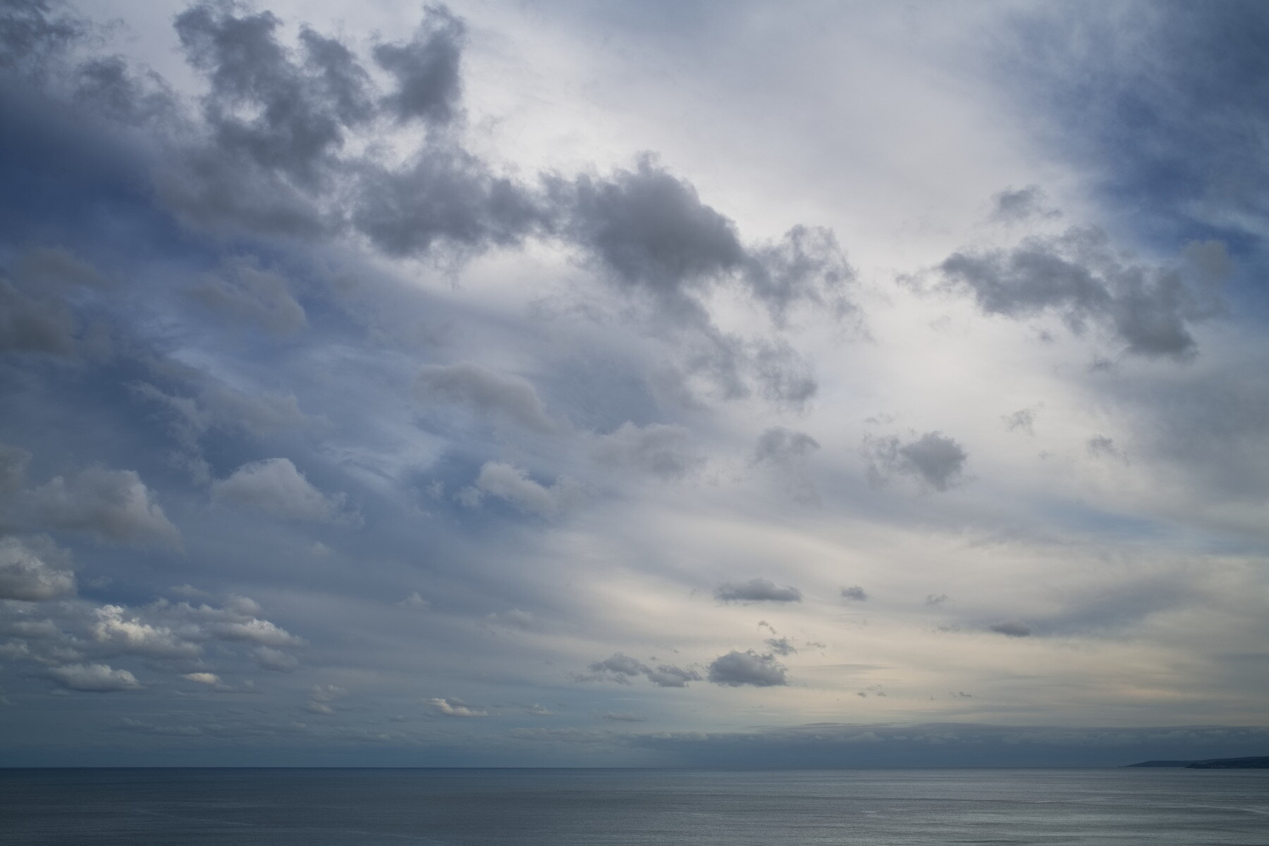
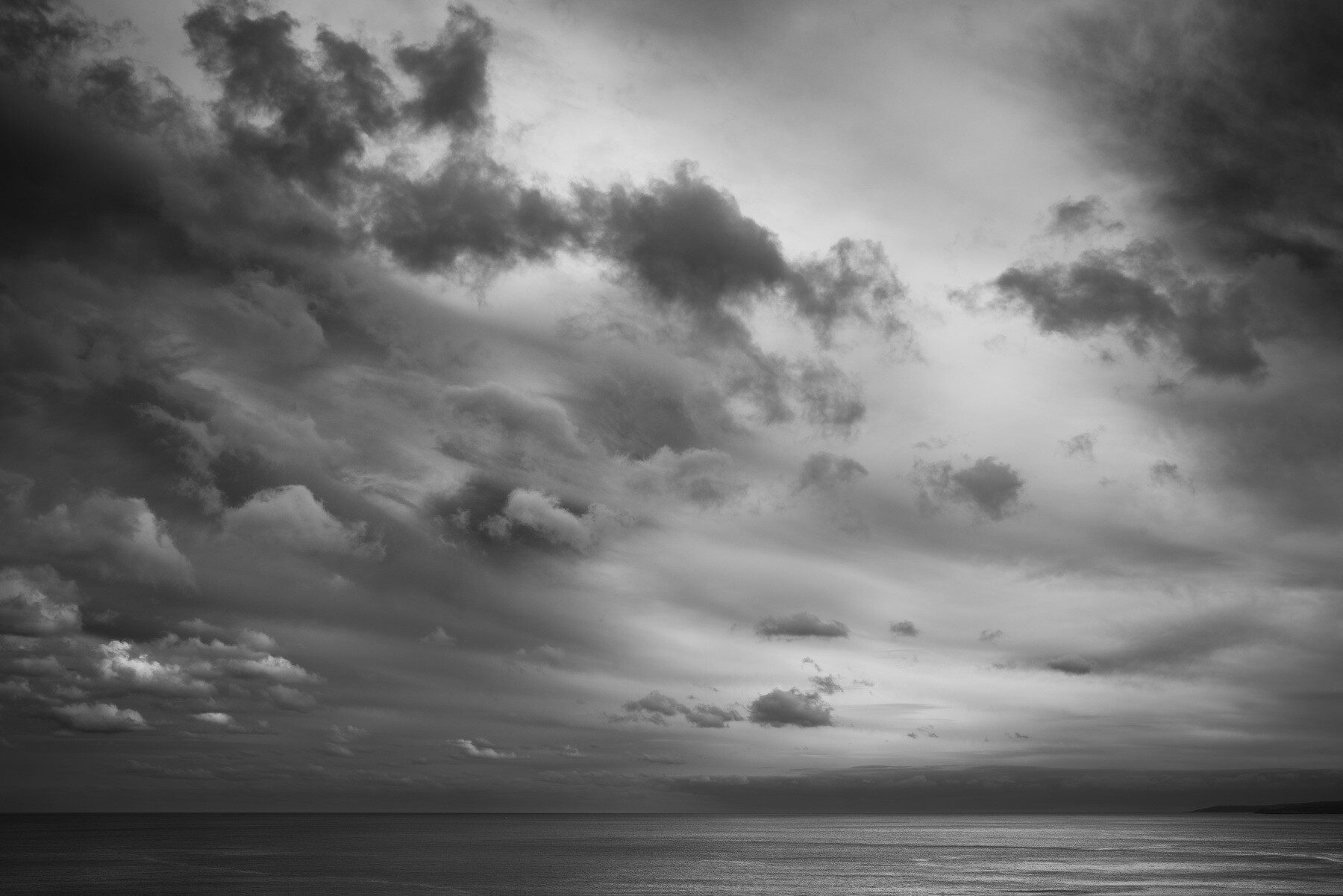
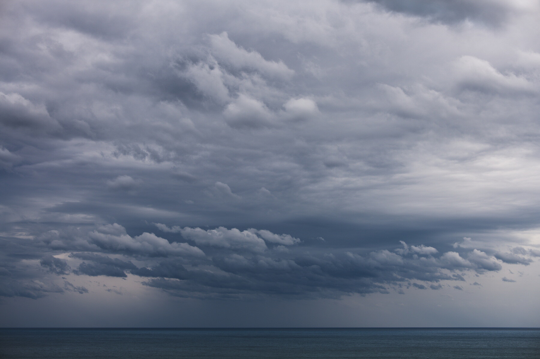
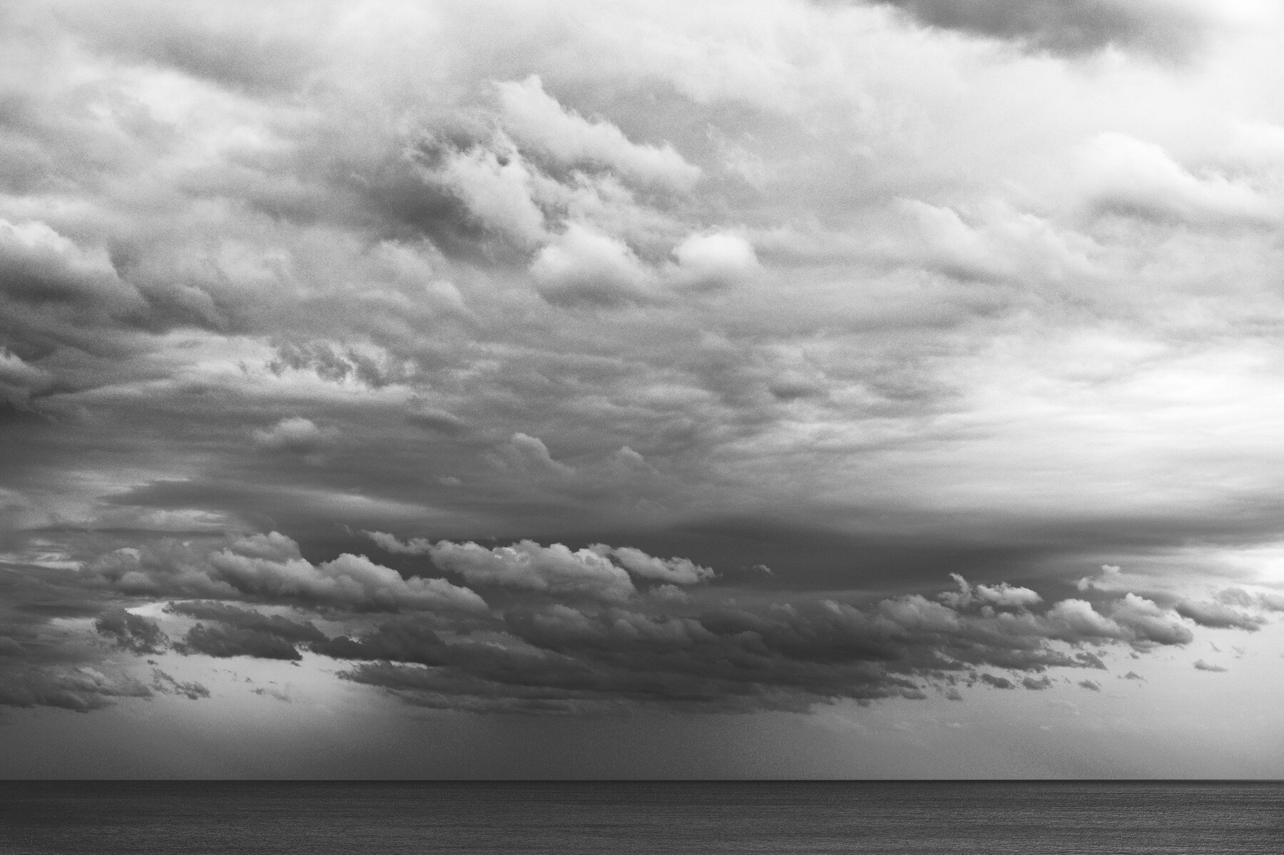
Often I am drawn to the bluish shades of sea & sky, and am sometimes torn between almost-monchromatic colour and black-&-white renditions of such scenes, as in the following pairings.


2 Comments
As I indicated in one of your other posts for some reason my enjoyment of B&W skies has diminished over the years. (I also commented on my appreciation for your skies....)
I love your first image here Chris, with the light hitting the clouds it seems to have a certain depth. #3 is a close contender.
I have to admit the B&W versions do have their appeal (especially the layering in #4) but I am still drawn to the color versions.
Thanks, Alan! I feel a bit the same as you about B&W skies, despite posting a few here myself. I think for me it's partly because on trying to edit them myself, I realise just how much exaggeration they entail if they're not to look totally bland.
In the first image, I think the small, low clouds looking rather dark against high, bright clouds behind them helps to create that sense of depth, with all that air between them. This effect is absent in the second pair.