
December Challenge - Colour or B & W?
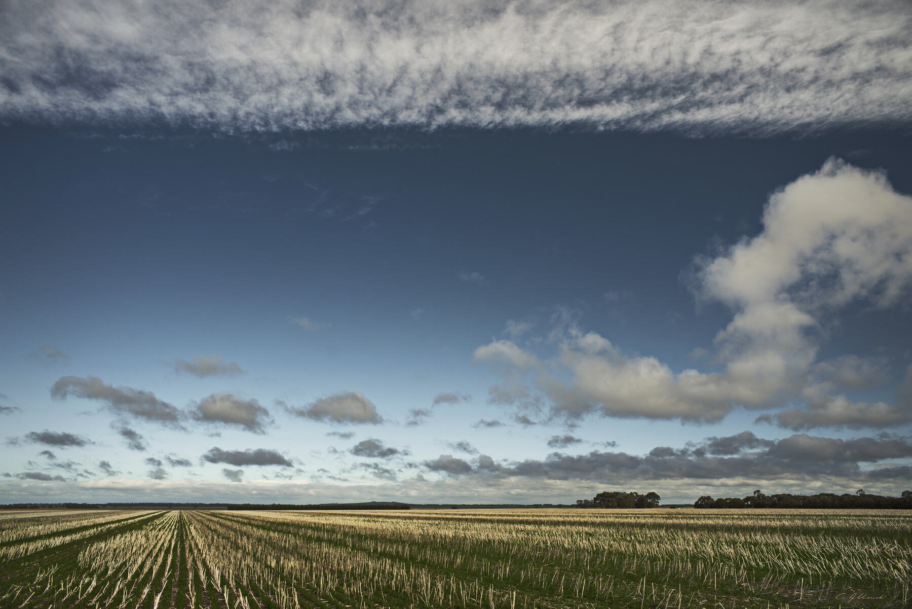
I've always like the calm, realistic colour of this image of a field of stubble, which still reminds me of the fresh clean air on the cool still winter day when I stood before this beautiful scene.
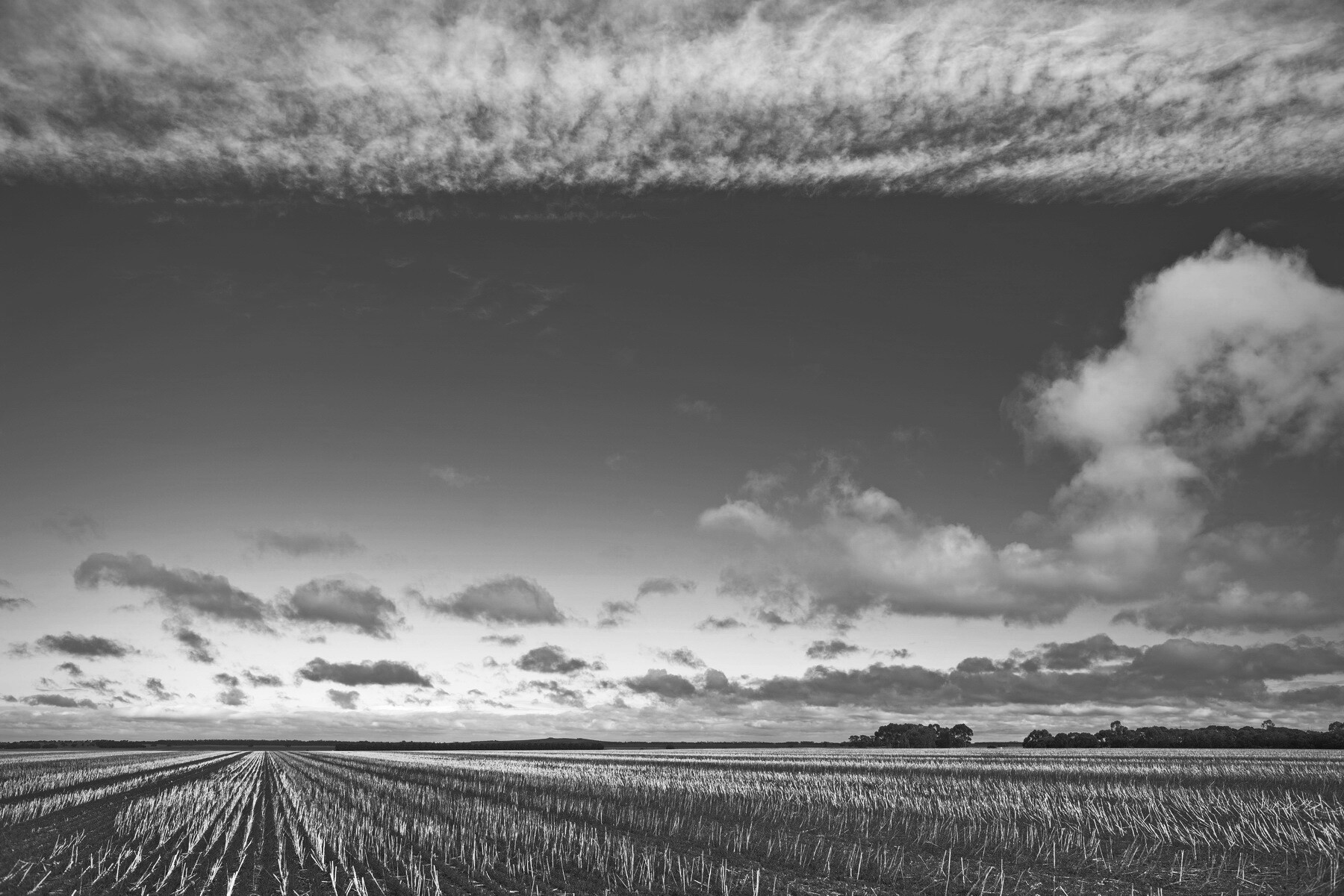
It was inspired (especially the off-centre pattern of rows of the stubble) by a B & W image by John Sexton, so I made the second version, which highlights the geometry and composition of the scene by omitting the "distraction" of colour.
Really not sure which I prefer.


6 Comments
I think both have their individual merit Chris, and it's a difficult choice for me.
I am leaning toward the color, but find the effect of the leading lines of the stubble in the B&W to really pull me through the image.
If in doubt I don't think there is any negative in keeping two versions of any image.
As I may have said in the past, I really enjoy the way you tone your skies. Where many fall in the trap of edging on bright and over-saturated blues I appreciate your restraint.
BTW - this image has just reminded me of a similar attempt I made years ago capturing rows of corn stalks. That attempt failed miserably, you have now provided incentive to try again.....
Thanks for your kind words as ever, Alan. I've actually got two versions saved of the colour image, and this one is a little more "pumped" ( and far beyond the RAW reality, but don't tell anyone what a cheat I am...).
Lovely shot. I think I find the color version to be the more compelling of the two
Thanks, Steven! I'm a little surprised, since your fine entry for the challenge is an excellent B & W.
In the color image I like the color palette, the muted blues and yellows go well together. For the B&W image I like the graphic pattern of the field. But, as presented I'm not sure what the subject is exactly, the sky or the field? They seem to be competing for attention. Perhaps that's the reason you don't know which one's better?
To me, the field with the leading lines converging in the distance are the interesting part of the scene. I'd compose to focus on that, and make that the clear subject. Then in the B&W image I'd make the field it even more contrasty and graphic, almost abstract. And there you have the answer, I'm pretty sure the B&W one will be the one that you'd hang on your wall.
Thanks for your thoughtful comments, Alex. I agree that a really definitive version of the B & W would probably have those stubble rows tweaked for emphasis, but I'm always wary of overblown effects.
As it happens, I actually have the colour version framed & hanging at home, but that's largely because it was one of four "big sky" images I had in my one-&-only exhibition experience so far, in a group show.
I wish I could show John Sexton's inspiring image. It's a rice field and pine forest (no sky at all!) in Japan, shot in 1985 and in his monograph "Quiet Light", the whole book a great inspiration to me. He was Ansel Adams' assistant and has a related but softer style; he hasn't published much.