Creating composite image can be a fun blend of imagination and a range of practical post-processing techniques. Two of the most important skills for creating convincing results are matching light and color. This helpful video will show you a range of tools to check your work and to achieve the best results.
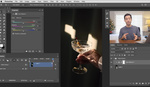
Coming to you from Aaron Nace with Phlearn, this informative video will teach you how to match light and color to create more convincing composite images. Composite photography is something that can come in handy in a variety of genres and can be used both for creative purposes and to solve practical issues. To create a good result, the light and colors of all elements need to match, and while developing a good eye for these is crucial, Photoshop also has a variety of tools both to help you make the proper adjustments and to really fine-tune the results. Even if you are not one to do a lot of composite work, it can be great practice, as it will exercise both your post-processing skills and your ability to read some of the fundamental parameters of a photo. Check out the video above for the full rundown from Nace.


I like the methods shown for creating better composites and as I was watching, the background looked surprisingly familiar. I have a series of photos taken in Namibia on the exact location as the background image and was able to find the same dead tree! Small world I'd say...