
When looking at retouchers’ portfolios, you can separate the great ones from the rest by looking at their color correction. For example, when skin tones are not uniform, it makes the makeup artist look terrible just as much as the retoucher. There are multiple ways to correct color issues, but let’s see one that’s incredibly fast and easy to use for small localized issues, no matter what your photographic genre of choice is.
For this method, all you are going to need is Photoshop or Affinity Photo and the image that you want to correct. A Wacom tablet may be helpful for a more refined correction, but it won’t be a necessity per se. So, if you are on the go, no problem! First, we have to create a blank layer, and for the sake of keeping everything organized, let’s rename it as well:

It’s not rare to shoot a portrait and have a model with a red zit or red scratches. We probably all have heard a model say: "I never have any spots, but today, you know… just the day of the shoot, it had to happen." So, let’s correct this. We are going to use the brush tool ("b" on your keyboard" and sample an area next to the issue. To sample, just press alt on your keyboard and click on the zone you want to target.
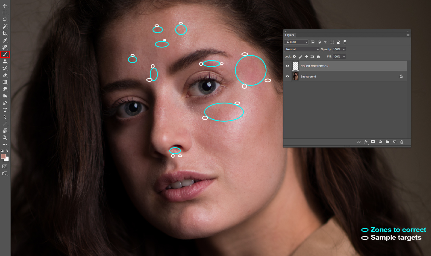
Now that we sampled the color that we should have on the problem area, we are simply going to brush over to mask it, and repeat the process for each issue we notice.


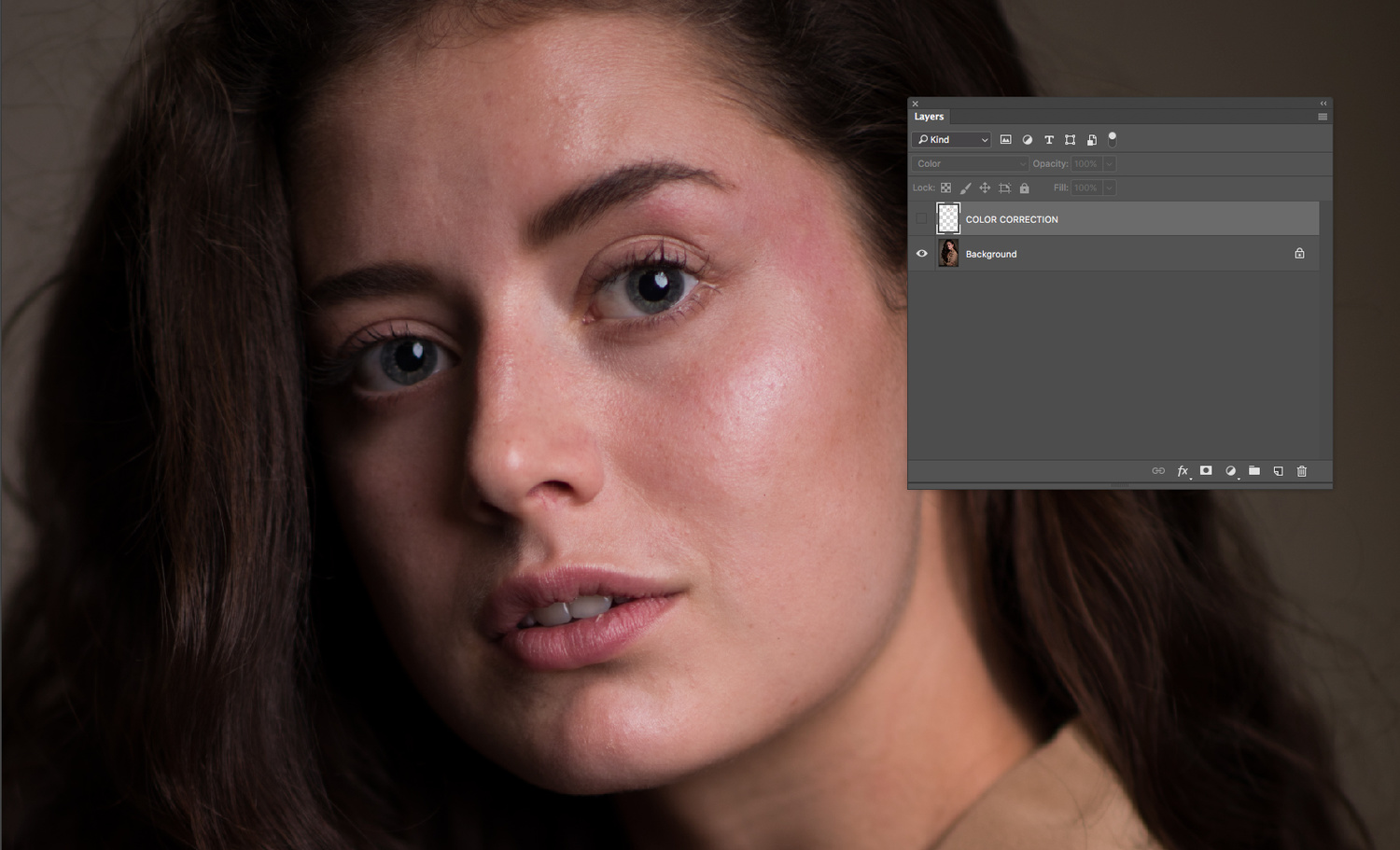
I know, the texture is awful right now and some of you are probably wondering why we didn’t use the corrector or clone stamp tool. Both would be okay as well, but this technique is meant to target only the color and avoid altering the texture. But to do just that, we must change one thing: the blending mode of our layer. Make sure to select the color correction layer and at the top of the layers window, click the Blending Mode drop-down menu (by default, "Normal" is selected), and pick "Color." A faster way to change the blending mode to "color" is to have the layer selected, press "v" on your keyboard to enable the move tool, and then alt+shift+c to change to color.

The Color blending mode is essentially a combination of hue and saturation, leaving luminosity alone. As you can see below, we recovered our texture but kept our saturation and hue correction.

If you want to go further, you can create similar layers that target only saturation or hue using the according blending modes. For an even smoother correction, the wet brush is the tool of choice in my opinion, but if you don’t understand how it works, the clone stamp tool could work just as well! Finally, don’t forget you can always alter the opacity of your layer to get the result you wish to accomplish.
The method allows you to change the saturation and hue of a zone. So, you could use it for other purposes than color correction, for example, to modify the color of individual objects, to create a cinematic look by combining it with luminosity masks, or to remove certain colors of an image when applied to a color selection. But I’ll go more in depth about some of these ideas as well as others in future articles. So be sure to stay tuned!
Is it a technique that you have already used? If you haven’t tried it yet, give it a go and share your results in the Fstoppers Groups so that people can give you feedback and help you improve your work!


It is indeed great having this kind of tips: not-complicated, easy to use tutorials useful basically for everyone. Thanks!
A simple trick that could save a lot of time, thanks.
I find I use the Hue blend mode more often but its very similar. Great for getting consistant skin tones.
This reminds me of other features of these post processing packages. I have noticed in some that using "sharpening" can lead to a rise in digital noise - the actual sharpening process, under heavy magnification, leaves something to be desired.
I love the suggestion, thanks, Quentin. My bigger problem is with wrinkles - particularly on older women. If ever I succeeded in removing their wrinkles, it would look silly - imagine the skin of a 16-year old girl, on a 70 or 80 year old woman! For me, the trick is to soften their wrinkles enough to avoid having them hate the photo, without overdoing it.
Your photo is masterly, BTW - just enough colour - not too little (that would have made it look like a sepia print) and not too much. When I saw it, I though "Damn - this guy's good!" Of course, you probably knew that already :)