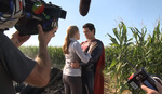
We've covered the pros and cons of color grading many times before on Fstoppers, though when it comes to big-budget movies like "Man of Steel" do you think its overall tone can decide whether it's a financial success? The guys at VideoLab have created a side-by-side comparison of what the latest Superman would look like if it was done the original way, in full saturated color rather than the darker, more gritty version we know today.
It's refreshing to see Superman in his original element, the one we all know and love with the bright red and blue suit as he flies though a endless sky of white clouds. Though with the recent trend in superhero movies as of late, it's been an adventure seeing them in a new darker world. We have seen some humor splashed into the masses of the recent Marvel and DC movies, but for a majority the dark and gritty violence takes precedence. I am all for movies exploring all options... if it's done well.

What do you think? Does color grading in movies today simply put color, or lack there of, to a film or does it do more than that? Can it shape an entire genre of filmmaking and bring an emotion greater than expected to help a movie increase its success?
[via CNET]


Color grading gives a different look and feel to the movie (and trailers), which in turn has something to do with how many tickets are sold. These reboots are exploring the dark side of the comic stories, and DC is known for darker material. When I think of the original Superman, Batman (circa Michael Keaton), and Spiderman, I see producers taking an original comic story and adapting it to a movie with a few artistic liberties, but essentially making a comic book into a movie. The reboots are a way to tell the story of these characters without cartoonesque features of the comic books - as if the screen writers didn't see any comic book art and wrote based on the story itself. I don't mind the darker material because their stories are hard, real people wouldn't get through their lives unscathed, and the color grading reflects just that. Plus, I think the studios don't want the comparison to the original stories like it is a remake.
Color grading aside, the best improvement to the Superman reboot is getting rid of the underwear on the outside of the unitard. That is something I think anyone can agree on.
Superhero movies are getting more realistic and political, making references to real life politics, possible issues and consequences as to if the heroes actually existed, at least on the big screen. The tone of this all (reality) is not exactly colourful and bright. You can tell by comparing any two trailers of old and new super hero movies.
Kick ass the movie has shown us possible realities of being super heroes and its juxtaposition of colourful atmosphere (due to Color Grading) with a dark world works just fine for its plot and the point its trying to make.
Another example which isn't a super hero movie is "Zombieland". Bright colours in a dark word and its color grading works for its plot.
Zack Synders superman on the other hand places you in its dark world with its colour grading rather than letting you watch its realities from your seats as that isn't what it's trying to achieve.
So it all goes down to what you're trying to achieve or and the plot.
The video "What if Man of Steel was in COLOR?" however is not a valid argument because
1. Its Color Grading is out of context and isn't exactly creative in anyway. (just tells us he knows how to create the blockbuster look, forgive me; teal & orange.)
2. The Dark Nights Color Grading is very much Different from Zack Synders Superman and its atmosphere has always been dark.
3. Batman V Supermans plot is not literally going to be a Batman Versus Superman kinda plot. as they are placed in the same context. Although a juxtaposition would be nice indeed.
4. Trust me, Green lantern not being successful has nothing to do with its color grading.
Color grading has a huge impact on a movies success but just not in the way the video portrays it.
"Trust me, Green lantern not being successful has nothing to do with its color grading."
I could not agree more. There are a number of things so awful about that movie that I pay my son to watch it in a different room. Color grading never even crossed my mind.
colored or not this movie is so boring that i use it instead of sleeping pills
Superman, or any super hero movies, are cheesy on their own. The films have people with super powers, does that not sound cheesy enough as it is?
This video giving an example of superman in colour, for me, instantly made it look cheesy.
I think Snyder was right to make it dark and gloomy, to try and make it as serious as he could. You look at Spiderman or fantastic four films where they have more colour in them, and they are cheesier and feel more like a kids film. I think having the colours de-saturated in Man of Steel suited it and improved it drastically.
Sadly, VideoLab lied.
http://furiousfanboys.com/2015/04/viral-video-lies-about-how-man-of-stee...
Definitely take a look at this. Filmmaker Ryan Connolly posted this and though his word isn't sermon, he tends to never post BS stuff. Kind of infuriating that VideoLab did this...
Something fishy is going on here. Read the first comment on the link you posted. Who is fooling who with this edit?
That's fair. They may not have even tried to mess with the original footage. The "mess up" may have just happened in conversion if they downloaded the clips from youtube or burned them from a blu-ray.
I pulled these screen caps from youtube and though the left image from the trailer looks a little different than the "original footage" it is still very muted.
With that though, I feel like their "this is how it should have been" mentality in the video was pretty arrogant. Few would have complained about the color if the movie was awesome. (And in my opinion it sadly was not. That last battle was so boring...) I think a main reason for the muted pallet is Warner Brothers trying to differentiate themselves visually from Marvel as well as through tone of the film.
Just my two cents! I love the discussion on this!
Youtube compression has nothing to do with this. I did my own work and found two random youtubers having no trouble retaining the brightness whilst VideoLab's are severely darkened. Don't take my word or anyone else's, simple printscreening proves that VideoLab's original footage was not actually original.
Nice! Thanks for the screen caps! Sad to see that VideoLab got so many views for their lie.
Movies like this are essentially mindless crap, so all the money thrown into making "look good" will pay off in it being pleasing visual eye candy. That's what these movies are about.
A real movie however relies on a solid script and competent actors to deliver it. Such films can be shot on a pizza budget and they will still be works of art.
Reminds me of the Ted Turner days of colorizing black and white films. Lets change the way one a man's( Zack Snyder) art looks to appease everyone (sarcasm)