
This week, I got a chance to connect with Blackmagic Design to discuss some best practices when approaching color grading video footage through DaVinci Resolve Studio.
Now, let’s get one thing out of the way up front. I am not a computer genius. No, no. It’s not false modesty. It’s not that I don’t know anything after two decades of running still and video through various editing and post-processing software to create assets for my clients. But there’s a point in every digital process where my brain simply starts to hurt when trying to wrap my head around the technology.
My usual response to this is similar to when I got into a minor car accident in college that left me with a bumper half dangling off and no money to fix the problem. A few rolls of duct tape later and I was good as new. Okay, not so good as new. And, yes, my dating life suffered. But it worked for the time being. True that wasn’t how it was supposed to work. But, it was a solution that worked for me.
My photo and video editing over the years has followed a very similar approach. I tend to find an effective way to accomplish what I need to accomplish, even if sometimes the manner in which I get to my destination isn’t always the most elegant solution or exactly what might be deemed a remotely logical approach by those who actually understand the nuts and bolts.
But I tend to get there in the end, even if it takes me a while. As an example, it took me to darn near two years and several Google searches to figure out the right Canon technical LUT to get my C200 raw footage to look how I wanted. In fact, that initial problem is actually what brought me to our discussion today. Having been editing and grading in Adobe Premiere for the last several years, for the life of me, I just couldn’t quite get the colors exactly how I wanted them. It’s not that anything was super off. It’s just that as much as I fiddled in the Lumetri panel, I struggled to achieve the results that I was after. As someone whose work relies a lot on color precision, this was driving me a bit nuts.
Now, if it isn’t completely clear from the preceding paragraphs, I should state that it is entirely possible, if not likely, that my struggles were all my own and not a result of the software itself. But, nonetheless, I struggled. And that’s what led me to try out the free version of DaVinci Resolve to see if I could achieve the results that I was after.
To be honest, I had always been somewhat intimidated by DaVinci Resolve. I learned editing originally on an Avid system. Then I used Final Cut Pro for a while before settling on Adobe Premiere. I knew DaVinci Resolve was becoming the prominent film industry tool for color grading. But, every time I opened it, I would scratch my head and say, “what the heck is a node?” But my struggle with my C200 footage was enough to encourage me to give it one more shot. And not just a cursory glance where I gave up before the program fully loaded. I sat down and actually tried to learn it. And as soon as I got over my confusion about nodes, I quickly discovered a powerful tool that has since become my go-to platform for all things post-production.
There were a number of benefits. One, it was free. That benefit doesn’t require a lot of explanation. Two, somewhat miraculously, using the DaVinci YRGB Color Managed option, grading the C200 footage suddenly was a breeze. The program itself got me most of the way there, and there were only minor tweaks that I needed to make the final jump. And third, beyond the basics, for whatever reason the color grading process with DaVinci Resolve just made sense to me. I can only really compare it to when I switched from Lightroom/Photoshop to Capture One for my still photography workflow. In an instant, everything I was trying to do simply worked better. And just like Capture One turbocharged my still workflow, DaVinci Resolve made getting the creative looks I wanted a far smoother process. Oh, and it was free. Did I mention it was free?
Of course, I shouldn’t harp on the free part too much considering that I ended up enjoying the program so much that I upgraded to the paid version, DaVinci Resolve Studio. It wasn’t that I couldn’t do 99% of what I needed with the free version. But since I wanted to be able to do things like edit 8K footage and have access to a few other finishing adjustments, the relatively minor investment of $295 was well worth the money.
But, even though I did actually read the manual this time, and even went through the lengthy and thorough online training offered on Blackmagic Design’s website, I was still experiencing some growing pains, especially in the area of color. “Now, wait,” you must be saying. "Didn’t he just get done saying how easy DaVinci Resolve made color adjustments?” Yes, I did. The problem I was having was not so much getting the image on my editing monitor to look correct. The problem I was having was ensuring that the image I was seeing in the viewer was matching what the client/audience was seeing once the final film got delivered or viewed online. Again, my work is heavily focused on specific color palettes. So, I wanted to make sure that the image I thought I was giving my client was actually the image they were seeing on their end.
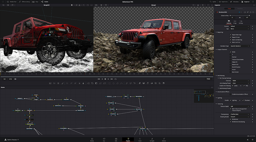
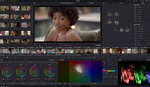
Frame grab of yours truly doing one of many color grading practice sessions with test footage.
This took me down a long rabbit hole of terms like gamma, gamut, and full versus video levels. It taught me more about reading vectorscopes and parades than I ever thought I wanted to know. It also drove home to me the importance of having an external color-calibrated monitor. The color of your computer screen (especially if you don’t make a usual practice of calibrating it yourself) can be vastly misleading. So, despite the protestations of my pocketbook, I plunked down the money required to get a separate grading monitor. I can’t say I wanted to spend the money. But I can say that the benefits have already paid off.
But, like all things photo/video, there are only so many obstacles you can overcome by throwing money at the problem. At some point, you simply have to sit down and understand the fundamentals. Now, I am clearly a long way from being able to teach a DaVinci Resolve masterclass. I am early in my transition to the platform. But I also feel this is the absolute best time to establish a basic repeatable workflow with the program so that I can continue to deliver a consistent product to my clients without fear that my creativity will be undermined by misunderstanding my settings.
Rather than hoard all this information, I thought it might help readers to share in this process as I am learning it myself. Based simply on the number of available user forums online, I know that I am not the only person who could use a little help with understanding the appropriate settings for delivering accurate assets to clients.
Yet, since I am not yet a DaVinci Resolve expert, I thought I might instead reach out to someone who was. So I connected with Shawn Carlson, a Product Specialist at Blackmagic Design, to talk through the program and some of the best practices for getting consistent results. He was incredibly patient with me as I pinged questions off of him left and right.
Now, the good thing about DaVinci Resolve Studio and its color management system is that the program contains a seemingly inexhaustible amount of permutations and combinations available to achieve your result. This is not simply to be confusing. Rather it is because filmmakers have incredibly different sets of needs. Some are shooting Arri large format footage for the next superhero movie to be released on the big screen. Some are content creators shooting footage with a mirrorless camera intended to only ever be viewed on YouTube. Some are using a Red camera to produce the next streaming sensation on Netflix. All of these users might require different color grading settings as well as different output format settings. So, there really is no such thing as one size fits all. That means that, by the end of this article, you are not necessarily going to just be able to do exactly what I do in every situation and get it to work. But Shawn did have a few best practices suggestions which should hopefully help you to get started. Here is a bit of our conversation.
How do you approach your initial project settings? Naturally, every situation is going to be different with regard to the exact project settings required. And later we will go through a couple of hypothetical scenarios to further drill down on the concepts. But are there any universal project settings that almost every colorist will benefit from?
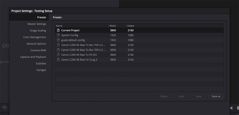
Before getting started on a new project, I suggest making use of the custom project presets at the top of the presets panel on the left side of the project settings window. You can create preset workflows in terms of timeline color spaces, output color spaces, and so forth that correspond to your various delivery needs. This will help standardize your workflow. So, for instance, if you always shoot using Camera Type A and your final delivery is going to be broadcast in Rec. 709 Gamma 2.4, then you can create that project preset and simply load it each time you start a new project.
To do this, simply create a new project. Open the project settings and step through the options on the left to adjust the timeline resolution, frame rate, and color management choices configured to your desired deliverable spec. You may then choose “save as” and name the preset.
At the launch of any new project with similar capture and deliverable requirements, you can load the preset which will help to standardize workflow. As these settings are entirely customizable and easily tuned to a specific project or workflow, there isn’t really a standard to adhere to outside of the project-defined deliverable formats.

One of the most effective changes I’ve made that has helped my color grading is to use the DaVinci YRGB Color Managed workflow. Why did I make the change? Because Daria Fissoun told me to in a YouTube video I was watching. And since she’s the queen of color who I watched when I went through the DaVinci Resolve page on the Blackmagic Design website to learn the basics, I figured it must be good advice. It is especially helpful when I am bringing in footage from multiple different cameras as it is able to read the camera metadata and help get me most of the way to “normal” even before I start making fine adjustments.
What I am less clear on is which color management preset makes the most sense. I’ve been using DaVinci Wide Gamut. My understanding is that by grading in DaVinci Wide Gamut, as opposed for example to Rec. 709, you are giving yourself a wider color range to choose from. But then, how does that affect the final export if you are delivering to a presumably more narrow Rec. 709 color space? Likewise, if you originally grade in Rec. 709, are you limiting your potential grading options?
I understand the confusion, as this is the aspect of the grading workflow most customers I speak with need greater explanation to fully grasp. DaVinci Wide Gamut employs a 32-bit floating-point calculation which is essentially a large bucket of pixel/image data. With color, management engaged, DaVinciResolve detects the format in the metadata of the source clips, but also allows you to specify/override the source media “input transform” (ArriLogC, CLog, Rec. 709, etc.) to decide how DaVinci Resolve interprets the footage and transforms it from its source gamut/gamma into the timeline space for viewing. This also allows you to work with multiple source media formats in the same project, as each can be separately interpreted. Then we edit, add VFX, and grade the media in this “wider-than-original-source” space non-destructively. The DaVinci Wide Gamut/DaVinci Intermediate Gamma is a working timeline color space greater than Rec2020 combined with a high luminance range to preserve the original image data, transformed only upon render/delivery to a narrower color space delivery standard, such as Rec. 709 to Vimeo. In any case, you may choose a new output color space from the project settings at any time to allow for renders to different deliverable formats from the same Resolve Color Management preset, such as Rec. 709 for Vimeo and a P3-D65 for DCI.
One change that I’ve made that gives me a lot more confidence when grading footage is that I have invested the money into getting a color-calibrated external monitor. But, of course, having a properly calibrated monitor doesn’t amount to a hill of beans if the signal going to it is incorrect in the first place. So, going back to our project settings, under the Master Settings Tab and Video Monitoring, there are two line items that I’d like to get a better handle on. Data levels can be set to full or video. What is the difference between the two? And how does this affect your video on export versus when viewing on your monitor within DaVinci Resolve? Should a project be set to full all the way through the process from monitoring to export (or visa versa)? Or does it not make a great deal of difference?
You’re correct about the need for a calibrated grading monitor as the reference you will use for judging the final visual quality of your output file. The DaVinci Resolve viewers show the timeline space. The grading monitor receiving a clean video signal from our Desktop Video devices displays the output space. When connected to our Blackmagic video hardware: DeckLink PCIe and UltraStudio Thunderbolt devices, the DaVinci Resolve Video Output options engage various video I/O features, allowing a selection between displaying video level or full levels, per your specific output/codec needs. This toggle switch will affect the output monitor, not the color page viewer.
Video level defines “super-white” “super-black” levels as “illegal,” and “broadcast safe” deliverables are those that don’t contain “illegal” signals. Full or data levels display the full signal as measured on a 10-bit scale from 0 to 1023. Video levels limit you to black level at 64 to brightest white at 940. The output container and codec selection are relevant to this option, as YUV formats are often at video level, while RGB formats represent the full data level. If you render media for use at a later stage in the post process, say a transcode or VFX pulls, you should render to an RGB full data level format, but for final broadcast deliverables to Pro Res 422 HQ, your render will be to YUV at the video level.
On imported media, DaVinci Resolve will infer the level from the chosen codec/wrapper, but it can also be specified, both in the Clip Attributes on a clip level and in the Advanced controls available in the Custom panel of the deliver page for rendered media.

That brings us to the one line item that seems to have cost me the most sleepless nights since I made the switch: output color space. My current hurdle, which I can’t seem to fully get my head around, is gamma. Specifically, I will go through a project in DaVinci Resolve, grade it and really get it to a point where the image on the monitor is exactly what I want. Then I export the footage and upload it to Vimeo or YouTube and notice that once uploaded, the footage seems brighter and washed out. I’m pretty sure this is me screwing up my export settings somehow, but don’t know exactly what I'm doing wrong.
This sent me down a rabbit hole of trying to understand gamma and output color spaces and how those relate to both the environment in which you are editing as well as the environment in which your audience will eventually see the finished product. Every time I think I’ve got it down though, I seem to run into a video that just won’t stay put.
Can you give us a brief introduction to gamma? Why would someone choose Gamma 2.4 versus 2.2 versus 709-A and any other choice in the Output Color Space section?
Color space refers to the gamut or color primaries, the volume of color available. Gamma refers to the luminance range of the source content or output deliverable. In a linear gamma, these values are represented from a scale of 0.0 to 1.0 in a straight diagonal line, 50% directly in the middle of the graph. A gamma curve represents the shifting of the midpoint to allow for a greater resolution in a particular range, which is why log content appears “flat” when viewed in the default gamma setting of 2.4, as that viewing/output curve shifts the midpoint is shifted to 18% gray These files get imported to DaVinci Resolve, interpreted from the source gamma, transformed into our timeline gamma, then to the output gamma for grading monitor and rendered files. The choice of gamma is specific to the standard you need to deliver files, for instance, broadcast environment versus web versus film. Broadcast/Rec. 709 is standardized to 2.4, computer graphics in sRGB use 2.2, etc.
How does what you choose under Output Color Space affect what is sent to your external monitor? Or does it?
Output color space defines what you will see on your calibrated grading monitor being fed a clean signal from a Blackmagic Desktop Video device (DeckLink/UltraStudio). This is independent of the viewer space.
If, for instance, you leave your Output Color Space on the default, which is 2.4, then should you set your monitor to 2.4 as well? Or should your monitor or both be set for your grading environment, say, for example, a bright office versus a dark studio, without regard to the end-user?
Yes, you should plan to match the display characteristics to your chosen output space and gamma curve. When sending “broadcast” formats expecting a video level and a gamma of 2.4, be sure to set your display accordingly (most are set by default to display in video level vs data/full level).
How does this relate to the color space and gamma tags you place upon export in the advanced section of the deliver tab? Should those match what you originally chose for Output Color Space in the Color Management section? Or are the two unrelated?
By default, upon rendering files, they will inherit the color space and gamma tags determined by the output settings. You may change these in the advanced tab, forcing the appropriate interpretation from the NCLC metadata gamut/gamma tags embedded in the file: aka 1-1-1 represents 709 Primaries/709 Transfer function/709 color matrix vs 1-2-1 based on the SMPTE chart found in our manual on page 190.
Also, somewhat off-topic but somewhat on the topic since many of the readers will be both still and motion photographers who will want to, at some point, pull still frames from the video they shoot, are there any specific steps one needs to take to make sure that when you grab a still from the graded video in DaVinci Resolve that the exported JPG or TIFF maintains the same color reproduction you established within Resolve?
Yes, when grabbing a still frame from the color page, the timeline color space and gamma are used. If the timeline and output spaces match, this will make the stills appear as any rendered file from that project. In some cases, you might want to capture stills prior to a grade or on ungraded material, in which case, you may do so from a YRGB non-color managed setting, so the content is not being mapped into another space.
Obviously, these are a plethora of options because there are a plethora of different use cases. So, it’s impossible to give a formula that will fit every situation. So, what I thought might make sense is to do a few case study examples, situations that would be common to different filmmakers, and do kind of a sample workflow to get the most consistency through color.
Scenario 1: Shoot With Canon C200 in Raw
The final deliverable will be a short commercial meant for both broadcast and web delivery.
Fairly straightforward grade. The video just needs to look “normal,” whatever that means. But they want the final product to look consistent across platforms.
Where should the colorist start in terms of his or her project settings, monitor settings, and export settings to make sure what he or she is seeing is what the client is getting? Is it a good habit to export multiple varieties? For instance, one meant for streaming versus one meant for theatrical versus one meant for TV?
Start with a DaVinci YRGB Color Managed to set, using the pulldown menu in version 17, select the preset for SDR Rec.709
This will set your timeline space to Rec. 709, your output space offers a second pull-down menu to define your color space and gamma (or to separate them into two options) and has defaulted to Rec. 709 Gamma 2.4.
Define your Camera raw interpretation settings, either project-wide or specifically per clip.
Each type of deliverable gets its own render, this allows you to specify a unique color space and gamma setting per format.
Scenario 2: Shoot With an Arri Alexa in Arriraw
Extreme grade
Final deliverables will be theatrical, but will eventually also be seen on television and streaming services.
DaVinci YRGB Color Managed, select DaVinci Wide Gamut.
Your output color space and gamma determined by your delivery specs; could be P3 D-65 for film, Rec.709 for TV, etc.
Scenario 3: Shoot With a Mirrorless and shoot in Log.
Don’t own an external monitor, so will be doing your grading on an iMac screen.
Final deliverables will be seen primarily online on YouTube or Vimeo.
Start with a DaVinci YRGB Color Managed to set, using the pulldown menu in version 17, select the preset for SDR Rec.709.
Mac display color profiles for viewers enabled, as your particular screen is the grading monitor, rather than the processed signal output to a grading monitor.

Obviously, color is a huge topic and this is just the tip of the iceberg. We may need to have more conversations to drill down on color and all the other functionality within the platform. But, with regards to getting consistent color between what you’re shooting, what you are grading, and what the client is ultimately seeing, what would you say should be your main guiding principle(s) when establishing a workflow in DaVinci Resolve?
While we don’t typically make this type of global suggestion for a specific workflow need, in general, a calibrated grading monitor and video scopes will most accurately represent the grade you’ve achieved in DaVinci Resolve. This is the best and really the only way to deliver to a known standard. Typically, this requires a properly setup grading environment; no external light, 18% gray on the walls, sconces for indirect room lighting, including some light behind the monitor for proper contrast. Many facilities and vendors will also require the client to judge the content in the same environment, and some will provide them with a calibrated monitor at their location to do the same in a guided remote color session.
If your work is primarily sent to web streams, you might decide to grade entirely on your computer monitor, which necessitates a high-quality, calibrated monitor set to a defined standard, in that case perhaps ticking the selection box to use the Mac display profiles for DaVinci Resolve viewers. In reviewing my exported files, I typically use VLC player, personally, and I have found it matches Vimeo/YouTube after uploading/reviewing on the same iMac screen. In my tests rendering to the ProRes Master preset, changing nothing, Mac display profile for viewers enabled, Display: Color set to “iMac,” the viewer in DaVinci Resolve on my iMac Pro Deliver page matches the VLC playback visually.
To verify the exported file matches my timeline file, I import the render, place it atop the original in my Timeline, selecting Difference in the Inspector: Composite Mode and the result is black where the pixels match, as any “difference” between them will show in the pixels in the viewer.
Any other references readers might want to access for further information?
There is a good discussion of color and how it applies within DaVinci Resolve in Chapter 8 of the user manual. It’s a good starting point for understanding the color workflow and getting the best results from your footage.
I am well known for writing long articles on Fstoppers, but, even for me, this was a detailed conversation. But I found it to be filled with amazing information and hopefully it could also help some of you. Since our interview, I’ve tried Shawn’s suggested settings with my own C200 footage and bingo, it worked like a charm. No doubt, I will find myself with more questions as I continue to learn the platform, but I already feel miles ahead of where I was before changing over to use DaVinci Resolve Studio. Here’s hoping the learning keeps on going and the creativity keeps flowing. Thanks again to the amazing team at Blackmagic Design for the help along the way.
If you'd like to learn how to make your own videos and don't know where to start, check out our filming and editing tutorial, Introduction to Video. If you purchase it now, you can save a 15% by using "ARTICLE" at checkout. Save even more with the purchase of any other tutorial in our store.


Excellent write-up! Thanks for taking the time to interview a BMD employee and getting their input directly!
This is going straight to my favourites. I thought I had finally figured out how to get my footage display on Youtube similarly to what I was seeing when grading (for a while, in Youtube it used to be much darker, even though everything was calibrated and tagged as I thought it should), but it looks like I just got it right by "accident" without really knowing how. Thanks for the great write-up!
The issue with your washed out colors on the export is a mac issue with how it tries to apply their own ColorSync gamma to everything. It makes sense if everything you're viewing on is all using ColorSync including your browser, phone, etc. but if you view it on anything else it'll look completely washed out and desaturated. I've even had this problem with calibrating the monitor for printing. This is a great write up on the issue and some solutions to fix it:
https://dominey.blog/2021/01/24/why-are-videos-washed-out-on-the-mac-exp...
Thanks Raymond
Late in finding your post but many thanks - this was a very helpful and clearly written article. But a question / further clarification please about Resolve's color management & ensuing hardware pipeline...
This is my workflow on an iMac: in Resolve Color Management settings 1) Rec 709 "color processing mode" and 2) Rec 709 g2.4 "output color space" and then 3) connecting out through a BM Ultrastudio Mini monitor via HDMI to a hardware calibrated UHD 100% Adobe RGB grading monitor. If say the monitor is calibrated to "panel native" profile to show its entire color space ( and not just the reduced Rec 709 color space), I assume the above pipeline 'imposes' or restricts the monitor to display a Rec 709 color space anyway; but Is what I am seeing really exactly the same as if the monitor was instead calibrated to Rec 709? Or are there issues / differences that arise with the way the wide gamut color space is handled or 'limited' as it were by the Rec 709 output, either by Resolve or the BM Ultrastudio ? Perhaps there are subtle differences that manifest as certain color over saturations, etc? I have read conflicting things about this... Of course, I can just calibrate for Rec 709 and avoid the question entirely but I am curious about the way this particular junction of the pipeline works.
Thanks for your time, much appreciated.