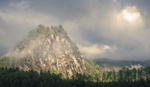
When you think of landscape photography, you probably think of bright and vibrant swathes of color, but black and white images can be dramatic, compelling, and eye-catching. That being said, working in black and white comes with its own challenges and pitfalls beyond those of working in color. This helpful video tutorial discusses seven common mistakes landscape photographers make when working in black and white and how to avoid or fix them.
Coming to you from Photo Tom, this excellent video tutorial will show you seven mistakes in black and white landscape photography and how to avoid or fix them. While a lot of modern landscape photography is full of saturated colors that pop off the screen, we have all seen dramatic classics from legends like Ansel Adams. Stripping the frame down to just its tonality can be a way to create a simpler, more compelling, and more powerful experience for the user. One simple way to make it easier in the process is to switch your camera to its monochrome picture profile, which will allow you to visualize the result as you shoot. Check out the video above for the full rundown.
And if you really want to dive into landscape photography, check out "Photographing The World 1: Landscape Photography and Post-Processing with Elia Locardi."


The difference between black and white images and colour images comes down to what is dominant in the frame.
Whether it is the colours they make the photo, in which case colour is necessary, or the tones, textures and shapes!
Mostly black and white images work because of these. A colour image can have tones, textures and shapes and the photographer should decide which to focus on. Sometimes an image can work as either a colour image or a black and white one but I think it best to decide when creating it.
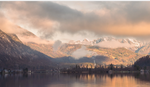
I agree about the tones, textures, and shapes. For example, the photo used to illustrate why not to convert a sunrise or sunset to black and white looked amazing. He lost the warm yellow highlights from the sun, but the dramatic lighting and textures in the mountain looked really cool. I liked the black and white version better.
I taught drawing for yeas. The experience of charcoal drawing really helped me with black and white. Why? because it forces you to think and see in terms of tonality, contrast and pattern.
I think its a dangerous game trying to box people into a set of rules such as these. There are no rules, there is only the art of creation. To state that a Flat image is not suitable for BW is totally wrong. Some of the best Black and White creators out there try their utmost to flatten the image before they start editing so that they can build the tones and contrasts that they envision. There is more to the creation of a good image than simply pressing a convert to BW button and with a little effort and some skill every one of those images demonstrated could look fantastic in BW. Whether they are better in BW or colour is just a personal taste.
Setting his proclivity for saying uh in every sentence I don't feel that the Youtuber gave good examples at all. In every case all he did was desaturate photos instead of doing thoughtful conversion. He just wanted to make his point whether he had an actual point or not. Anybody that does serious conversions knows not to just desaturate. You use the colors you have to affect the relative luminosities. The color wheel and how cameras capture color still matter in B&W if one knows what they are doing.