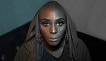
Dropping an object or a person from one photograph into another photograph is an art, and the extent to which the result is convincing is largely dependent on how well you can match color and light. This in-depth tutorial shows you how.
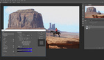
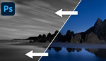
Unmesh Dinda of PiXimperfect likes a challenge and in this excellent video he takes two images shot under very different lighting conditions and brings them together, deploying a variety of tricks and techniques to achieve a rather impressive result.
One tip I’d like to add to Dinda’s video is to label your curves layers as you go. If you’re anything like me, you’ll quickly forget which layers do what and when it comes to tweaking your work in the latter stages, it will save you some time and possibly frustration. It's easy to assume that a couple of curves layers don't really need much attention, but my brain is like a sieve so I'm quite particular when it comes to labeling.
If you’re interested in picking up the plugin that Dinda uses to apply a palette, check out the website of Nino Batista and his NBP ColourmapX for Photoshop. Fstoppers reviewed this plugin a few years ago and it’s an excellent way of speeding up the process of sourcing the colors when using a gradient map.
What do your think of the result? What other techniques could Dinda have used? Leave your thoughts in the comments below.


"Convincing", meaning "fools people".
Good thing photography is an art and not just a science.
I try and light the person to match the background I will be creating, not as much shoot random place and then choose random stock pic off the web that's already been color graded. It matches better coming from the same camera and lens and I save myself a ton of time having a composition idea before shooting. Other plus is my background won't be the same one used in 100 other pics on the web from the same stock site.
This guy is good and almost all his videos are worth the time...