Color has always been one of the most important elements of my work. The NBP ColourmapX Photoshop panel came just in time for me as I have been doing this work by hand and the panel both saves me time as well as improves the quality of my color analyzing.
What NBP ColourmapX Is
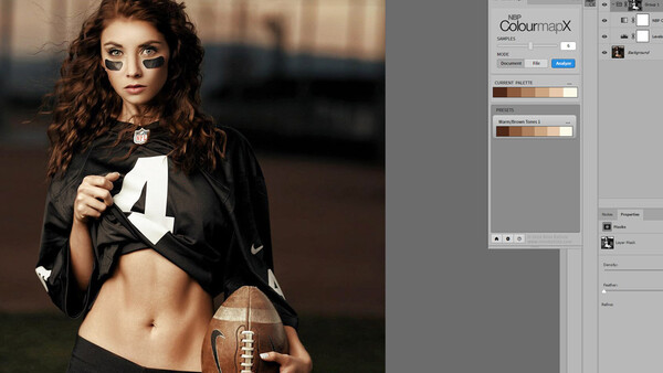
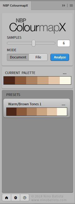
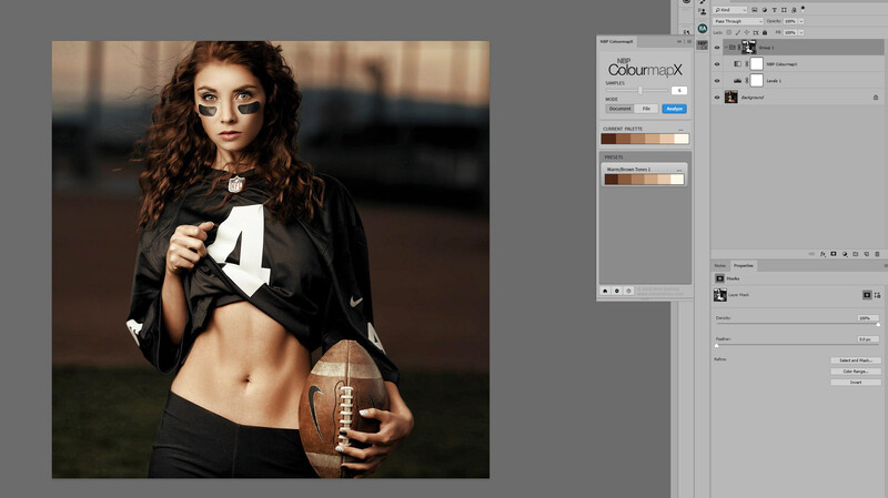
NBP ColourmapX is a Photoshop panel that can analyze any image and create a color palette for what it has seen. You can slide a slider and choose how many colors are sampled up to 10.
The beauty of it is the ability to save those palettes and apply a gradient map layer from your palette.
How I Use This Panel
The NBP ColourmapX Panel has already become an integral part of my workflow and daily exercise.
Each day I like to take a few pics, if they are mine or just something I see somewhere, pull it into Photoshop and analyze and do a grade on it just because each time I do this, I figure out little things and then can apply those techniques and colors to my work as it fits my style and intent.
Using NBP ColourmapX to do this saves a bunch of steps and ultimately does produce a better result for the color analyzing because I am generally too lazy to sample and implement 6-10 swatches into a gradient map, especially just for a daily exercise. So as a result, I used to end up with 2-3 colors and the gradient map didn't look and work as well and required a lot more blending efforts to make a realistic looking grade.
My eyes lit up like a kid at Christmas time when I saw this panel work because it can take those steps and do them virtually instantly and then when I find colors somewhere I really like, I can save the preset and apply anytime.
While most of the time a heavy grade at 100% from this panel may be good for a starting point, or to give you an idea the direction you may wish to take with a final grade it can also be used easily for final grading by combining the opacity of the created gradient map layer with luminosity masks. Then add a curves or levels layer to tweak the contrast if you've applied heavy adjustments and this becomes very practical to achieve a final grade and with consistency.
My First Exercises With the NBP ColourmapX Panel
Far from final or perfect, just a few of my first attempts playing around with the panel on some of my older pics as I always do when messing with a new program or tool.
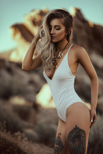
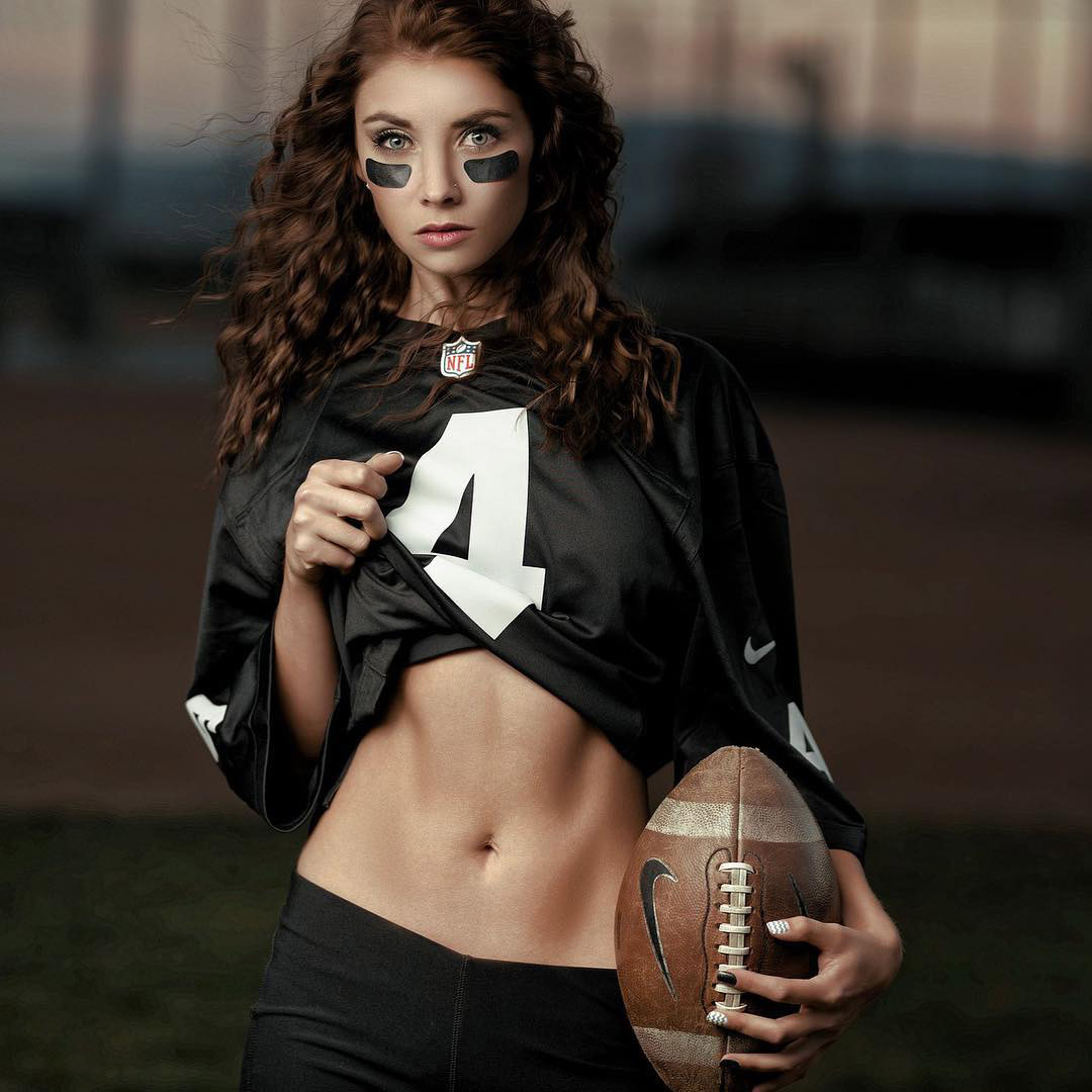
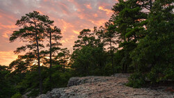
Here is an image I had produced as I had envisioned it at the time.
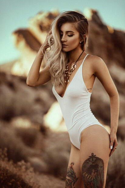
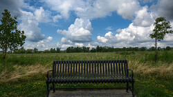
Let's suppose we want to warm it up using a color palette that's vastly different, but an attempt to create some form of color continuity with my above image in the desert. Obviously being in such different lighting it's never going to be exactly the same, but let's see if we can get some similar tones.
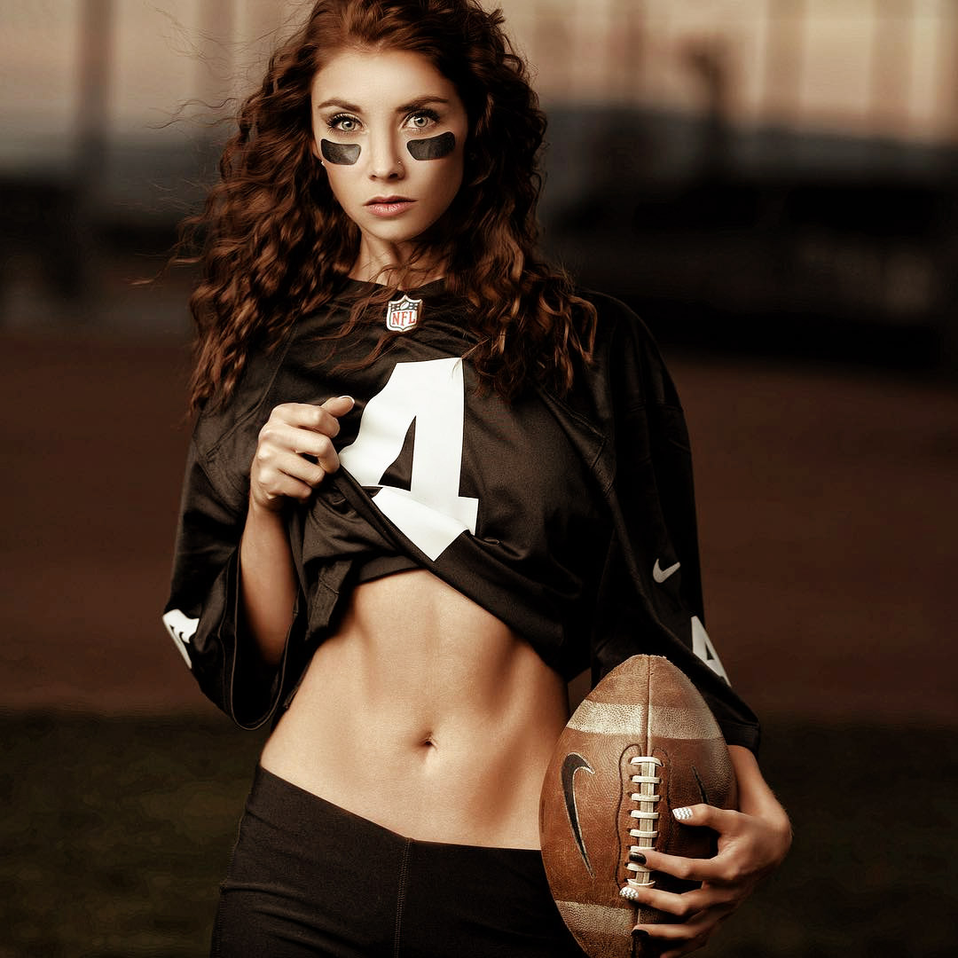
Pretty good right off the bat, but we can quickly tweak it further with a luminosity mask, limiting the grading away from the darker shadows but feathered in for a realistic look like this:
If the coloring can affect this much on an image so vastly different to begin with, imagine how easy it will be to consistently grade images from the same session!
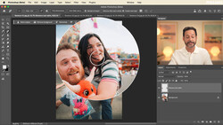
NBP ColourmapX Panel Options
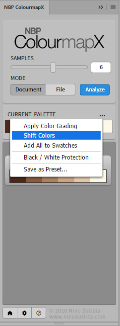
Analyze and extract colors from any source image and examine or save the palettes. On the pallette is a flyout menu with options to shift colors which will give you some variations on the current palette, save the swatches, black and white protection, save as preset and apply your grading.
You are also able to drag and drop the order of the swatches, as well as click on them and modify them with a regular color picker, for example you like the palette but want a certain shade to be more saturated, this can be done in just a few clicks and achieve your vision but still keeping the theme of the palette you chose.
What I Liked
The speed and ability to analyze colors, match grades from various sources and tweak/apply is one of the most welcomed additions to my workflow in a very long time. I love the options this brings into my workflow and it's the type of tool that you can install and begin using on actual client work immediately.
I especially love the ability to quickly see a swatch set of colors from a certain image and it's a welcome workflow improvement over the color analyzing method using Adobe Color which can do similar result for the analyzing but requires a lot more steps. This panel removes all those steps and adds the ability to quickly load that palette into a gradient map layer.
The gradient map layer defaults to soft light blending mode, but you can easily change the mode if you wish to.
What I Didn't Like
The ability to select a part of the image to analyze from that way avoiding something like a sky, or to specifically target just skin tones. This isn't a huge deal, because you could just cut a piece of your sample image and load it that way.
It would be nice if there was a color wheel in addition to the swatches, like Adobe's color palette does just for a quick visualization of complementary colors, etc. Again not a huge deal but that was one of the things I really liked about Adobe's workflow.
Summary
I definitely do recommend this panel as it can be used in so many different ways that it can be applied to pretty much anyone's workflow. It happened to fill a specific hole in my workflow that I really wanted so I love it that much more, whereas someone else may use it for other things but I'm willing to bet it finds a good home in most everyone's situations.
This panel costs less money than the cost of most Lightroom presets and this allows so much more versatility. If you are looking to explore colors and add grades, this is probably the best place to start.
You can buy the panel for only $30 regular price here.


Join the Fstoppers community for free
-
Post comments and join in the discussions
-
Browse the site ad-free
-
Share your work and get featured in the community
-
Compete in the photo contests for fun and prizes
8 Comments
I have not read the article, but it saddens me, that just about any other type of picture could have been used, but was not. So you end up promoting the usual locker-room sexist crap.
The photos used accurately display the usefulness of the product and show the product is applicable to similar work I do. I don't see a problem with the chosen images at all. Anyway, thank you Bill for the post, I've been wanting a tool like this!
Thanks Jonathan Krier - I've been waiting for a tool like this as well, I'm quite excited about it and have already implemented it into my daily workflow.
um if you pay just a little bit more attention, the creator of colourmapX is nino batista. and what you see is what he shoots. should he have used a landscape photo?? smh
I have been doing that for years with a gradient map
Yes, I as well... but this panel creates a gradient map layer, but saves you the steps of sourcing all the colors by hand, which is a huge timesaver if you are doing 8 and 10 color maps. So it's really the same thing but faster! well worth every penny.
i had a fantastic time using this app. i grabbed an image from the matrix, the green scenery and it came out great, i also grabbed an image from the movie SE7EN, and i took a step further with black and white with an image from the vintage Frankenstein movie . CMX is really right on point. very worthwhile buy.