retouch?
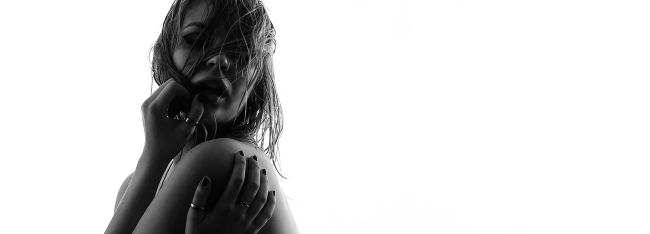
Currently, i am trying a lot of different styles for the overall look of my images ... i am torn between a very realistic and pure look (as in the example) or a higher saturated, "over"-retouched look - my experience is, that the later is far more appreciated ... but basically i prefer the natural approach - maybe you help me out a bit?


6 Comments
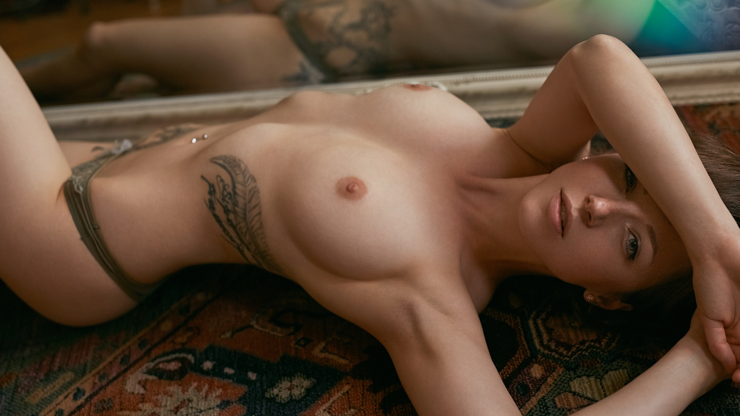
First one looks like a snapshot ... second one looks amazing!
may i ask, why?
on both pics, my approach was kind of the same - and i would even say, the retouch is in a way, the same (besides the wb maybe)
Ofc.
The first one looks to pretend a natural look, with the focused common door and backlight, but the pose is completely forced. Besides there's almost no eye to see and connection with camera is pretty weak.
On the second one it's obviously a posed shot (nothing bad or good), the rug/carpet as background is not that common (May take you to an specific environment), the eye connection and expression is strong, besides the female figure in it is amazingly interesting and beautiful.
In the end it's personal opinion, but I hope to have explained my point of view/taste.
thank you very much! i will think about what you've said about the first one - as i try to use (negative) critic to get better
I can't really comment on the retouching, but rather the choice of backgrounds. The first image against the door is such a beautiful look and pose, and the subject's figure with the dress pulled down on one side is gorgeous. But set against the bright door, it has a simply domestic feel to it that doesn't work well for me against the "glamour" style gaze of the magnificent subject.
That said, it's an unusual juxtaposition of subject and background, so I still find it very bold and of course quite beautiful to look at.
I just can't help but wonder how she would look with the dress pulled down and appearing as if she were surprised by the camera or just plain at home and trying to get comfortable.
I love the mood in the first one. The back lit, dreamy nature really pulled me in. There was something distracting about it though that I couldn't find at first. It was the background, beyond the window. The development, recovery of the highlights probably worked well on the model, maybe the door and window casing. It might have brought too much attention to what was beyond the window, in both texture/detail and color.
I made a rough mask and played a bit. Surface Blur > drop vibrance and sat > warm the area back up (it lost a little warmth with the blur and desat.