Why b&w portraits have more visual impact?
Removing colors from the photo will narrowing amount if the information it is provided to the viewer. Creating less informational distraction from the visual story. What do you think?
Removing colors from the photo will narrowing amount if the information it is provided to the viewer. Creating less informational distraction from the visual story. What do you think?
These photos were taken just outside of a small town in central Portugal.


I really enjoy creating something different with drones. I've had the Mavic now for about four weeks and I absolutely love it.


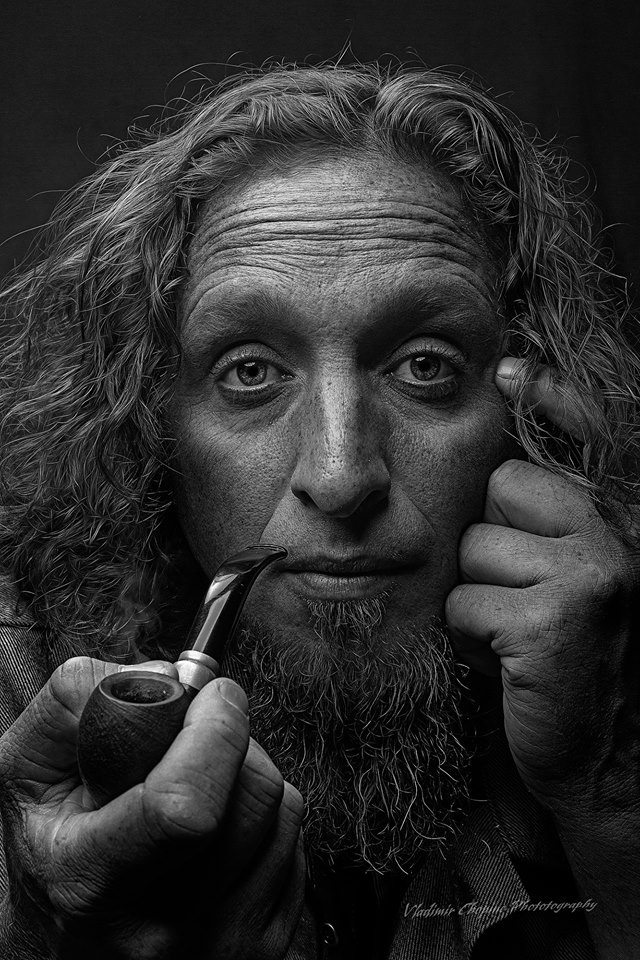
Client came and needed headshots immediately. Set up a single Broncolor Para 133 in the dining room. Delivered 20 pics. Setup, Shoot, Edit and delivered within 30 minutes.
This is a water reservoir for the city of Curitiba, Brazil
Here are a couple long exposure shots using my original 50 year old Minolta SR-T201 and kit lens shooting Fujifilm Neopan Acros 100 II. Both images were taken just at the end of blue hour.


20 Comments
I would argue that it's not only portraits that look better in black and white. Everything I shoot ends up in B&W unless there is a compelling reason to produce color images. For real estate and product photography, there is a reason; the customer needs to know exactly what they are buying and so the photos have to be a reproduction of the subject photographed. But for everything else, the colors are a distraction and, to me, a crutch used to draw attention to a subject when the other techniques of a photographer fail.
Nice image, although I think it could a VERY slight crop off the top.
Thank you for your feed back!
During my years of shooting campaigns for advertising and design clients a high percentage of the work was created in colour. Now, fortunately, I only work on my own projects that are almost entirely made in black and white. To the less discerning eye, it is the colour that will more often that not attract the viewer. You don't have that advantage shooting in black and white so you have to be sure that your story is strong, the light works perfectly and for me, the graphics of the image draw you in. Although I like your attempt in this portrait, for me, with a Western eye the graphics don't work. In the west we read from left to right and our eyes is trained to that line. It is why you will find in any advert, the hero (product) always falls from middle to page right at the bottom. If you were to have taken the hand with pipe to the subjects left hand and his left hand (without the finger that is hitting a highlight) to the subjects right I think you would find a much more pleasing, easy on the eye composition. I would also lighten the eyes just a smidgeon (it's fractional and I mean just a tad, a soupcon, nothing drastic). Please note that this just my opinion and in no way is intended to criticise your creative endeavor but put out there as a suggestion for you to consider.
Thank you. A good critic is always welcome. It is the best way to grow. I really appreciate the time you took.
Like this? Or is this a tad plus a soupcon? I've also burned the subject's (now) right fingers (sorry, mate!) as well as the highlight on the nail. Maybe I'm burning my own, posting this edit.
It's a little better bit, I don't know, still something that doesn't quite gel for me. Maybe it's the pipe (too big ?) or the position of the pipe or maybe the, what now looks like a fingerless, deformed hand to the cheek. The flow is better, me thinks, but, nah, still doesn't quite work. But a bold attempt. What do you think? Definitely needs to crop from the top, even to the top of the brows. Vladimir has made such a great effort so I don't want to discourage or beat up on the image.
Boy! I burnt his hand so badly it's deformed now.
I don't even attempt portraits, but am very interested in composition and any intelligent analysis of art. Your comments made sense, so I had a go. I agree that the pipe's size may be a distraction.
Not at all sure about the crop, but I realise this is a "tight" portrait, whereas I usually like room to "breathe" around subjects.
I'm very impressed with Vladimir's effort. Sure it's better than I could do.
Thank you for effort. However, the hand looks very flat now. Photo lost depth. Flipping horizontally is a nice touch, but now pipe leads away from the character (based on the left to the right rule) not lead toward his eyes. Highlights not always bad, they add dimensions into a 2d image. Seriously I really appreciate the feedback, it is hard to find, good ideas and another way to look at the image. And personally I don't think this is any way close to any perfection as photo, it is had a lot of room to modify.
Fair points you make about my edit, Vladimir. I was mainly trying to see out of curiosity if I could implement BM's ideas, as he seems to know what he's talking about ! I'm certainly no portraitist.
I like your image as is despite agreeing with him. I especially agree about how the hand now looks. And I like your crop; I think I'd find it claustrophobic if the top were cropped, as several have suggested.
Chris - see my suggestion above that I sent to Vladimir and tell me what you think. Best Bernard
See attached - tell me what you think.
I think you're dead right, BM - this is impressive, notably including the tight crop that I would have thought too radical; I didn't even try such when I was playing around with crops in the editing.
Somehow, it leaves an impression that non-essentials have been removed, despite the obvious points of interest in the subject's hair and forehead character lines.
I'm proving I'm no portraitist here...! ;-)
There is a saying that you are what you eat - I've always felt, you are what you photograph. That's because you are drawn to photograph by what you identify and are comfortable with. Over time (a day to a lifetime) that changes and you expand your interest. The mere fact you don't regard yourself as a portraitist but are prepared to delve into conversation and even critique tells me that you have not, like so many others, restricted yourself to a safe environment and you are, as any artists should be, are inquisitive and are allowing everything to touch them. The mind is like a parachute, only of use when it's open.
Thanks, B M - you're very kind. I have a lot of fun on this site, and find it an amazing community of decent people, which restores my faith in humanity. Love your last phrase!
B&W is terrific, but it doesn't do as well if there is little contrast in the scene. Not a hard and fast 'rule', but it's how I view B&W images.
What it does do is give the shooter a chance to do some real dodge and burn in post. Simple things like adding a bit 'personality' to an otherwise nondescript sidewalk or wall can change an otherwise so so shot into something worth printing.
I like your portrait and agree with Phillip about the crop at the top.
I don't believe that portraits necessarily look better or have more impact in B&W. I don't believe they necessarily look better or have more impact in color, either.
Some portraits definitely shine one way or the other. But, personally, I think the best B&W portraits are the ones that were shot with the intention of them being in B&W from conception. In my opinion the lighting should be approached differently between the two. Vary rarely do I see a B&W image that was simply converted from color and had the contrast pushed look very good.
And also, to me, generally B&W images are more distracting than color. I've often thought about why. I think it's because it's just not how humans biologically see the world. But "distracting" can be just another word for striking. Striking is not a bad thing.
Regarding this particular photo, I wonder how adding just a tiny amount of light to the eyes would look.
Hi Vladimir. My belief is that removing the distraction of color results in texture, contrast and composition becoming more pronounced, enhancing the underlying character of an image. This is aptly displayed in your portrait.
Outside of portraiture monochromatic images can also present us an alternate and often interestingly new view of our familiar world.
There will always be a case for color, and I think each medium needs to be considered and selected upon what they bring to the image.
Great image BTW
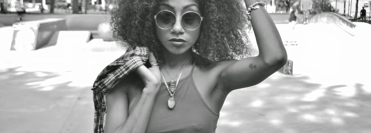
Such an un-natural beauty about B&W. I agree with the affect of reducing the distractions. I find the B&W's are much more intimate. There's nothing about B&W that we've not created. Almost a subconscious medium we love but don't understand, I don't completely understand, why we are so attracted to the form. Picture attached, look at his interest in the viewer. Complete attention of the subject to the viewer. He's ready and listening at the viewers attention. Above all, it feels there is no judgement due to the lack of a color spectrum only various levels of all colors absorbed. That's what B&W is isn't it? Black; all colors absorbed. White; all colors reflected. And everything in between.
Per our comments earlier Vladimir with yourself and Chris - this is what I was trying to suggest - it now concentrates on the eyes, the graphics for me feel more comfortable and by reducing the highlights, ie the eyes and on the pipe and even by cropping the highlight on the forehead, the viewer is drawn in by someone (the subject of the photograph) looking directly at them - it could be your Mona Lisa. As I've stressed to you before, this is not intended to criticize your own creative endeavour but merely sent as a suggestion for you to think about as an alternative. Best - Bernard
Excellent photo. Might have been more dynamic with visible smoke, perhaps with the eyes closed. Your composition is a bit forced with the position of the pipe and left hand.
Next time let the subject participate more in the photo. You may be surprised with the results.
And yes, your comments are accurate. B&W has always been my first love.