More Posts in: Black & White Photography
I really enjoy creating something different with drones. I've had the Mavic now for about four weeks and I absolutely love it.
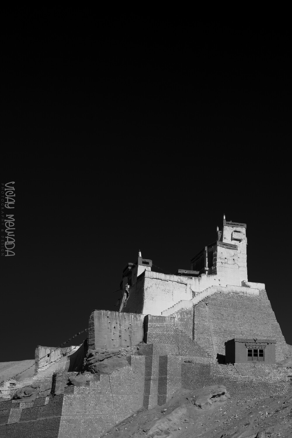
This is a water reservoir for the city of Curitiba, Brazil
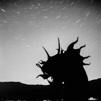
Here are a couple long exposure shots using my original 50 year old Minolta SR-T201 and kit lens shooting Fujifilm Neopan Acros 100 II. Both images were taken just at the end of blue hour.
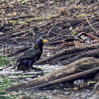
Yesterday, this bird seemed to invite the sparrows to take a bath.
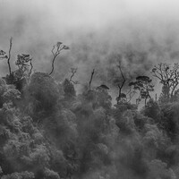
These are views of trees in Urubici, and of Fortaleza canyon in the south of Brazil


7 Comments
changed the proportion and managed to get in the gradient in LR.
I like this, Vijay, but prefer the original, the soaring proportions giving the building more grandeur, and the extra section at the bottom emphasising the massiveness of the whole.
I tend to agree with Chris. The original feels better balanced - the eye being drawn strongly to the lightest areas, balanced by the visual wight of the sky/black.
As a documentary image of the structure the updated image may be better suited, but I don't think this is as strong visually nor what you were after.
Just as an exercise and without thinking, look at both images in quick succession and see if your gut 'feels' one over the other.
TBH I often overthink my personally images and end up reverting back to earlier versions as they just feel right. This (thinking rather than feeling) is something I'm trying to correct.
Hi Chris and Alan. I was for the rectangle proportion. However struggled to have clarity how to deal with the cloudless sky. Hence tried the square version. comparing both, seeing the impact more in first one. Yet still not clear how do I make the sky part more meaningful.
Thanks for your responses.
Less is more with this sky, Vijay! I'd take Alan's point even further. There's a tendency here (on Fstoppers) to assume that every part of the image must have "interest", which is not by any means always the case IMHO. It leads, for one thing, to importation of "better" skies, which rarely work for me, the human artifice intruding.
You use the word "meaningful" which is more laden with symbolism. Looking up into the void, and just seeing the profound space going on forever can be as moving as nature's grandeur in a storm or sunset, if harder to depict photographically - but it can be implied. And your style tends to simplicity - not stark minimalism, but a kind of stripping back to an essence, which I find appealing.
I don't know the building - don't need to, even want to - and I'm not religious, but your first image makes me think of temples, unfamiliar religions, and religions' frequent emphasis on our impotence and need for humility. Your simple image made my mind drift in that direction. I wish many others did something like that!
Again Vijay, I stand with Chris. I think the image stands perfectly as it is - the black sky acts to promote the building. I think in this instance an 'interesting' sky of clouds etc might well draw away from the graphical/minimal feel of the image, and draw attention from the main subject
If you still want add details you could always add a quick sky layer in Photoshop - there's not much else to be done with a blue sky.
I guess the question is - what is the role of the sky? is it to act as support for the subject or ad an extra layer of 'interest'?
I'm not saying that any detail in the sky would not work, but it has to do so in a way it is supportive.
Appreciated.