
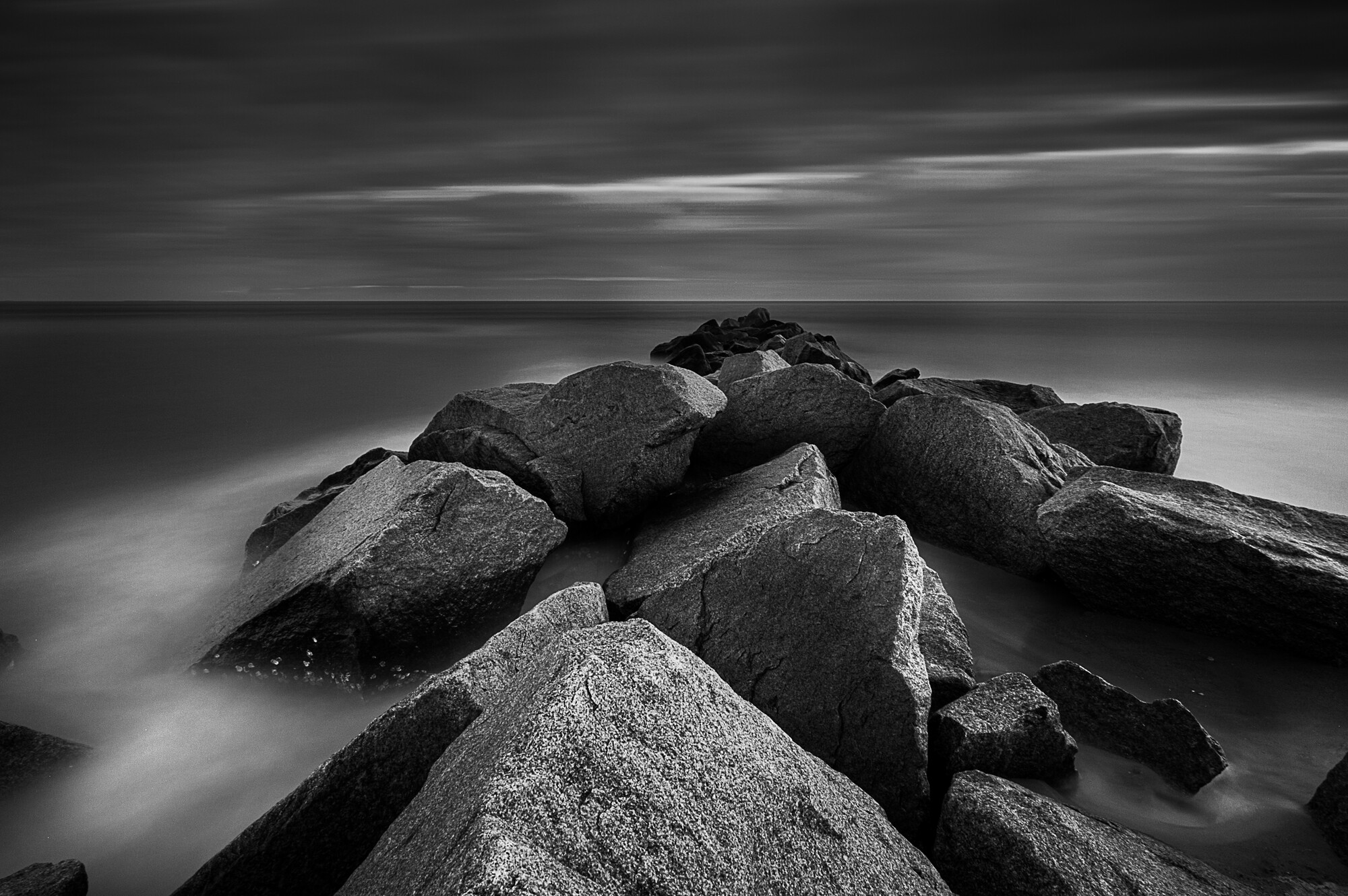
What's Missing?
Hello everyone,
I've been toying around with this photo lately and I keep thinking something is missing. I can't quite put my finger on what I'd like to have different. I feel like I'd like the sky/water a little bit darker but every time I've made them darker it just ends up looking weird to me. I don't know, maybe it's not contrasty enough to may taste or maybe it's fine the way it is. What do you guys think?


17 Comments
Well, the leading lines of the rocks lead the eye to nothing. So I'm getting this sense of being drawn into the image only to land at a rather blank sky. The white clouds cutting through the sky are also very distracting from the scene.
For me, the sky is the biggest issue. It's more distracting than adding, and your leading lines are pushing me into it.
The texture on the rocks, with the wash of the water, and the tones are great. Love the contrast. But I'm fighting with the image.
Yeah I kind of feel the same way.
I agree with Jeff, the leading lines are beautiful however, my eye is being led to nothing. I would say that instead of doing a long exposure of the sky and water, why not try a composite of (long exposure of the water and a standard shot of the sky, I see areas of light that might be interesting.
I wish I would have done the composite but alas I didn’t think of it at the time. I think it would’ve turned out nice. I tried to replace the sky with a different shot from that day but it didn’t really work either.
That's okay I've done the same thing many times, or I've lost some highlight in some little area that I didn't think that I would need to bracket for. The nice part is now you have an excuse to go out and shoot once again :). Looking forward to the follow up shot.
Hi Kyle, I agree with most of what been said. At the same time there is something appealing here as well. What about going with something different?
Or maybe ...
Agree, again.
I do like this!
Before reading other comments (so as not to be influenced) I have to say that on first viewing my eye is anchored at the bottom of the frame by the lightest area of the image.
Once you get past that I think the image is fine. I like the range of leading lines that direct the eye to the horizon and the bright area of sky beyond.
If it were me I would darken (bring down whites?) on the 2 rocks in center/left of the foreground, and perhaps the brightness of the white cloud area leading out of the frame on the left.
Otherwise a strong image. I like the lighting and detail in the rocks and other than the bright area previously mentioned I feel that I am taken on a journey through the picture.
Just a quick edit for comparison.
I actually really like this. I think the rock being bright worked for the color version of this but I agree it's distracting for the black and white version. Thanks for the feedback.
I think that, as other comments suggest, the problem is unfortunately rather fundamental, with the composition and the conflict between the lines in the sky and those in the rocks, which don't meld well, echo each other, or complement each other.
The image is also not-quite-symmetrical. I'm a great fan of asymmetry compared to many, and I agree with Broken (I assume that's our friend's current first name) on this aspect.
Without the composition being right, Kyle, you're sunk ultimately. It's not that the image is profoundly flawed, but my guess is that this is at the core of your discontent. I'd think about composition before even contemplating exposure. And only radical "post" can alter composition. Composition is hard to teach or learn except by doing, until it becomes instinctive; at least that's how it seems to me.
I don't mean to be discouraging, as your work is excellent in many ways, and you have the proverbial "eye". I've also been impressed from the get-go by your openness to CC. Just keep at it.
Cartier-Bresson said "My first ten thousand images were my worst".
Absolutely! I played classical guitar semi seriously for about 10 years. You guys are a piece of cake compared to my guitar professor when it comes to CC. And I don't take anything personal. I just want to get better and there are a lot of talented people on here to learn from. Thanks for all of the feedback.
I'm a little late to this party, but I do have a suggestion. Since the subject appears to be the rock formation, why not crop out most of the sky and the slightly distracting bit of rock on the left side. Highlight just the rocks without trying to lead the viewers away from them? I'm sure there is plenty of detail in the foreground rocks that would look nice in a large print.
I do like it a lot better cropped like this.
I think this is a very pleasing image, if it was mine, I would have it framed and placed in a prominent place in my home, the converging lines terminating at the horizon make this a strong well balanced image, I really enjoy looking at it.
Thank you!