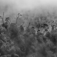
A choice between colour and B&W
Any thoughts on how you use Monochrome over colour?
When I shoot, I usually shoot RAW, with my camera set for Monochrome. This gives me a B&W review on my screen, but saves the file as colour. With a film camera, I never had the option of seeing the review on the back of my camera in either colour or monochrome, I find that I prefer to see the monochrome when shooting.
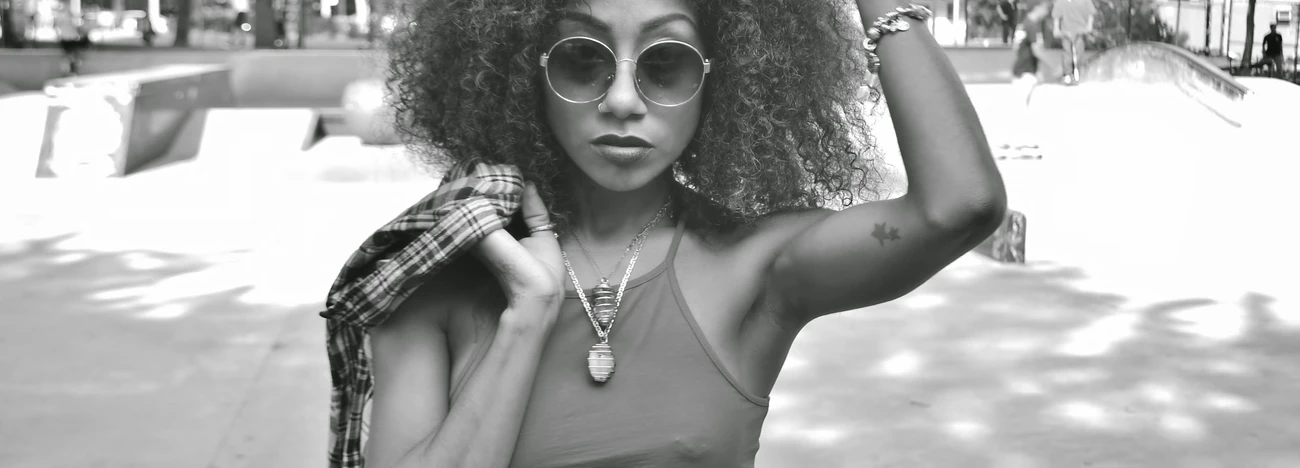
In processing the shots, I typically tune the colour version first, then use that as a base for the monochrome. Usually, I will adjust some of the hue/saturation settings to bring out certain contrasts in the picture. In this picture, I boosted the yellows specifically to highlight the details in the sticking of the yellow designs. I like the look of the B&W treatment much more than the colour, which is true for me with most of my shots. Specifically, I prefer the texture that is enhanced with the use of B&W.


12 Comments
I have a fondness for Black and white but this image really pops in colour...the model has such beautiful skin tone and the red in her outfit look wonderful with the blue tones in the background..so it's colour all the way in my humble opinion
Thanks, Tony. I agree that the colour version looks good, but I find myself favoring the B&W in most cases. Here is a shot that would suffer in B&W...
I do like both..but the colour wins for me 😁😁😁..the black and white image is almost like a 70,s film poster ....I mean that in a good way..sort of Jackie Brown...😁😁
I only shoot B&W, so my prejudice will show here. My eye gets pulled to the red on her dress in the color version, when the focus should be on her beautiful profile.
That is a good point, Chuck. It would be applicable to all of the shots we did with her in that dress. Personally, my eye is drawn to (and likes best), texture and contras, so B&W is what I prefer.
Hey there, I definitely prefer bw (but that's biased from me anyway). What I find a bit distracting here are highlights in the face, they look a bit much specular for me. What I immidiately thought is that this would benefit a blue filter (very common in bw film portraits).
I took a liberty and downloaded your colour photo, put relatively deep plue tint over it (I wonder what would digital camera do if real blue filter was used), converted to bw, put highlights where they looked nice and pulled down gamma so the whole wouldn't be that glowy. The contrast in shirt is not that strong now and shadows are bit deeper as a result.
(I've deleted your photo after the upload)
I see what you mean, Jakub. I typically don't use any filters over the lens, but I have recently been looking into using filters, so your post is very timely. As I recall, I was just a tad over-exposed on this shot and that caused difficulty with the highlights on her face. I also boosted the reds and the yellows to enhance the embroidery, so that would certainly enhance the specular nature of the highlights. Thank you for taking the time to make your own adjustments, I am always interested in how others see and manipulate photography, in this case, my own.
I'm glad I could be of help :)
As far as filters goes, I know nothing about how spectral sensitivity for digital sensors goes (and even if manufacturers publish the data; with film it's easy, each has it in its datasheet), so it's probably hard to predict how it would react to a given filter.
But colouring in software is fast and easy (this one took about 3 mins with all adjustments etc.) and gives results comparable to use of filters with film - e.g. blue restrains highlights and gives less dense shadows and vice-versa with yellow.
General views on blue (and to extent green) filters on portraits are that it reduces contrast and makes skin look better (nicer tones and less noticable blemishes etc.)
I find that it indeed helps with skin tone. About the contrast - for the same (compensated) exposure, it will give more information in the shadows (as they are illuminated by diffused blue light), but that can be adjusted (or printed down) so the overall feel of contrast is retained.
In case of your photo I noticed that it lightened the sky - which increased the contrast of profile against it - and brought up texture in the white parts of shirt...that is additionally to adjusting skin tones.
I think that I made the photo look bit like it would
on film...a man with hammer sees a lot of nails :)
Anyway, colour filtering gives lot of options for bw, for example even your photo above (girl with a horse) would, in my opinion, work in bw with right filter - yellow, green or their combination. Lightening the grass and darkening the figures with really bright spots of sunlight on them. The light blue jacket might be a problem as it would get darker in tone.
I'm so old and have been shooting for over 65 of my 78 years and was lucky enough to meet and become friends with Ansel Adams back in the day. All these years later most of my conceptual visions that I go out to shoot are in black and white by default. The final product seems to have about a fifty/fifty split between BW and color. I always shoot RAW and in color so that I can apply the mixing in LR to achieve the desired BW result -- not all that different thinking from when I was shooting film -- the concept is the same only the tools have changed.
Thank you, John. I hope to have a career as long, and as good, as yours
Strange...
My news feed shows that @emilydoucette replied to a comment on this thread, but I cannot see her post.
Yes i saw that too...but couldn't fi nd the comment ??