
Shipwrecked
Hi all. I am looking for a little advice from anyone who cares to share.
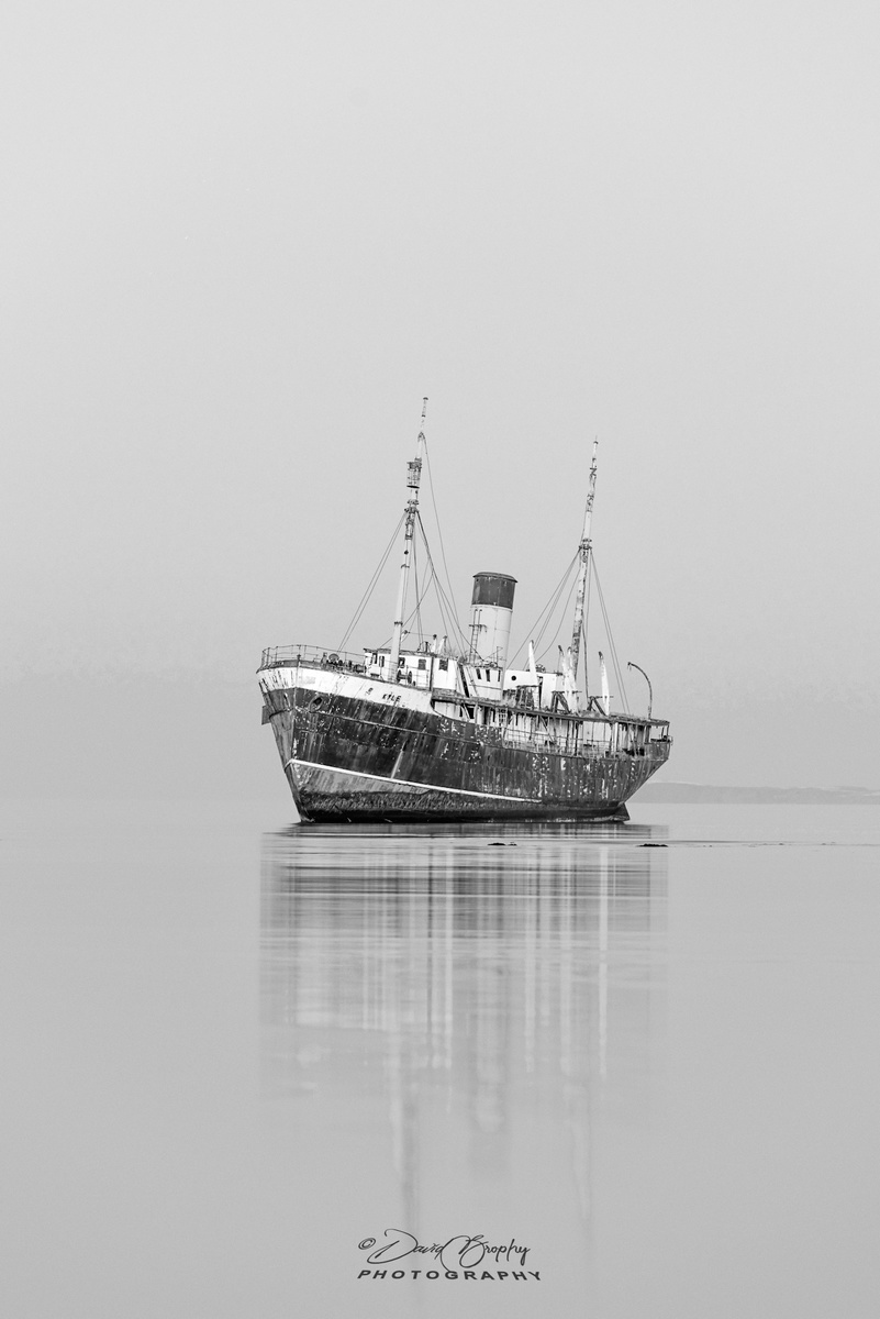
I recently photographed this shipwreck (blew ashore in a storm in 1967) on a late evening just after a light fog and drizzle drifted into the bay.
I like it it color but I also like it in B&W. For printing purposes, does anyone have any editing tips that might produce the best quality print of this in B&W. I had one sample image printed and it did have a slight texture in the sky,but I do not know if that was from my edit or the natural effect of printing an image taken in light drizzle? Most of my editing is limited to LR (no PS) though I also have Affinity and Luminar if anyone has suggestions based on using one of those.
Nikon D810, 70-200 F2.8 at F5.6, ISO 64, 5 sec.
Also, any CC would be appreciated and welcomed also as always.


3 Comments
Hi David,
A very good frame indeed. appreciate your vision and efforts.
No CC but just my instant thoughts.
Mundane, you may want to remove the right horizon and a grey line below. for my perception its a little imbalance.
Further, you may want to experiment with the exposure of the frame as artistic expression. would be interesting to see hi-key overexposed feel and also low-key dark frame with the subject in contrasting prominence. am visualising it and enthu about it.
Happy clicking and art processing. cheers.
Thank you so much! I will mess around with it a bit and repost in the next few days.
Hi David,
After seeing Vijay's comment, I'm inclined to agree with him on the right hand horizon; clone the left horizon onto the right and see how it goes.
That said, it's a really beautiful image, and I don't think it needs alteration.