From a recent shoot
This is part of a contract I have with a property they are wanting to update their marketing images. Thoughts welcomed.
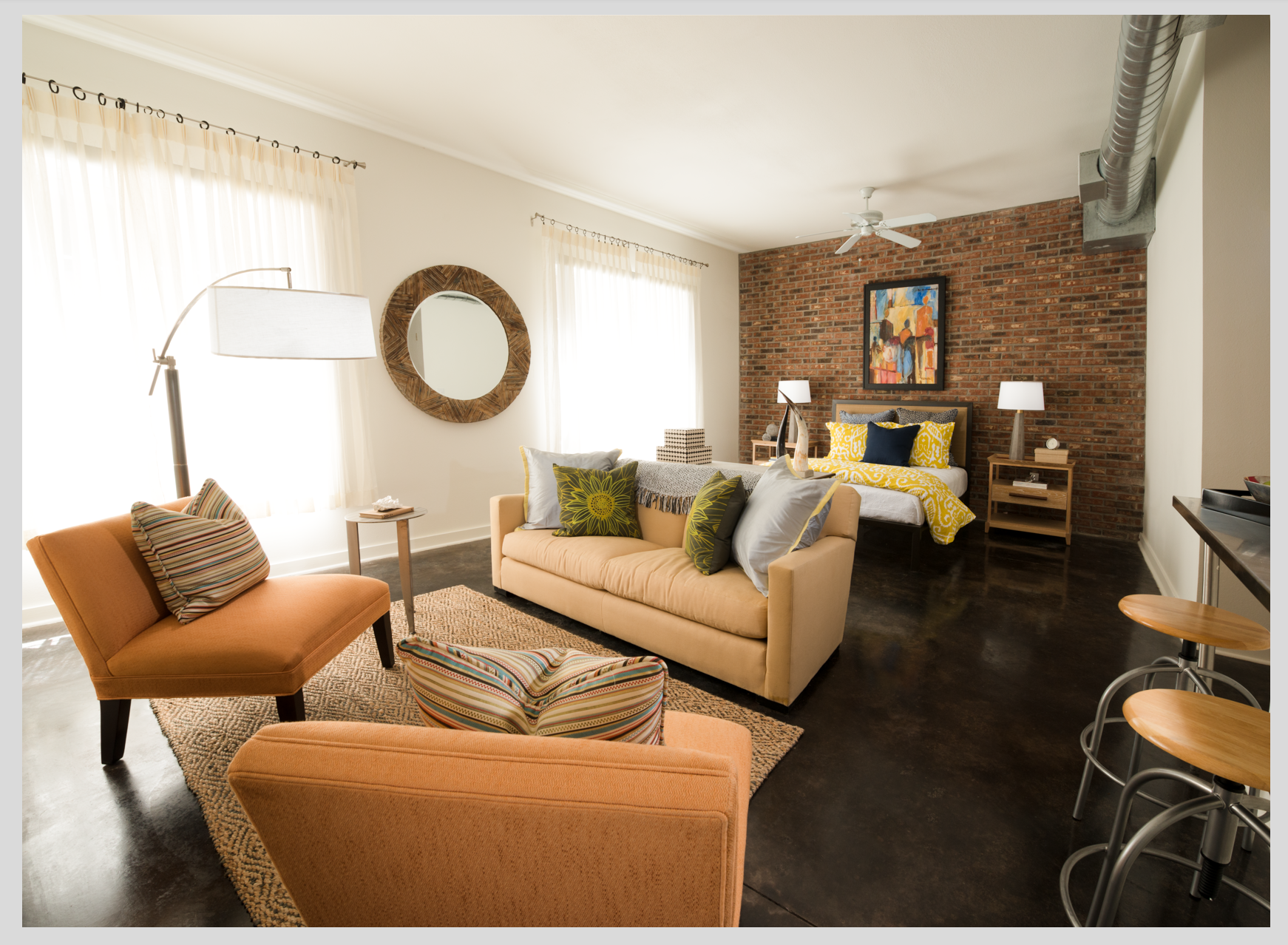
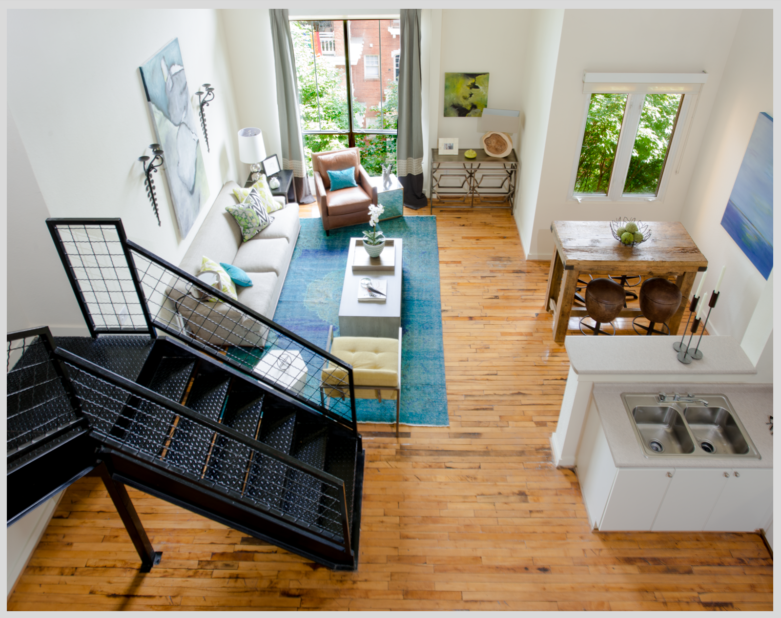

This is part of a contract I have with a property they are wanting to update their marketing images. Thoughts welcomed.
A few shots from the winter of 2025. The last one was inside of the Acropolis Museum. (Unfortunately, I could get everyone to walk exactly where I wanted them to. hahaha)


For iPhone users - a new version of Bluristic has dropped (v1.8) which offers new features and significant improvements in stability & useability.
I am interested in learning Macro/Closeup photography and understanding that Focus Bracketing is a good part of the process, I thought I would give focus stacking a try.
Another visit to our garden using a vintage lens (Canon FD 50mm f/1.4) on my Canon R5. NOTE: With this lens the minimum focusing distance is 18" at which point you have 1/4" depth of field.


3 Comments
Nice work, exposures are well balanced, and composition is solid. Your verticals are off on the top image, but it doesn't look like there's much that can be done without cutting off part of the left chair.
The top-down view of the second image is great, very cool space. If I were to be picky about it, I would want to see more of the countertop and less of the staircase, but otherwise it's a nice clean image.
The lofted shot turned out nicely, especially for multifamily marketing purposes. I often chicken out on tilted shots, but this one works and emphasizes the flow of the room without awkward crop edges that tilt usually induces. It could use just a really subtle horizontal perspective correction where the very bottom floorboard is perfectly flush with the crop line (see how another floorboard comes in at the bottom left corner of the image)
The studio image has a couple issues holding it back. It does show a nice overview of the space but the near chair feels like it closes me off from the room. It would have been ideal to simply remove the chair to increase flow and reduce the large amount of real estate given to secondary elements. The second issue is correcting verticals. Unless there's a purpose for it (accent, material, abstract, or fine art comps) it's usually best to avoid 3 point perspective. A vertical perspective correction would provide a quick fix for this (specifically the Free Transform tool as the correction would be asymmetrical).
Thanks for the submission. Look forward to seeing more work!
Many thanks for the deep feedback, it is exactly what I am looking for. I completely agree with the points especially the chair position. I noticed the vertical issue after this piece and have corrected it in other images since. Will be posting more soon!