looking for some critique on composites
Hey guys, I'm for some CC on my composites. I do cosplay, fine art, and pets (specializing in show horses), so my skill as a retoucher is one of my biggest marketing aspects (especially with the horses and owners).


4 Comments
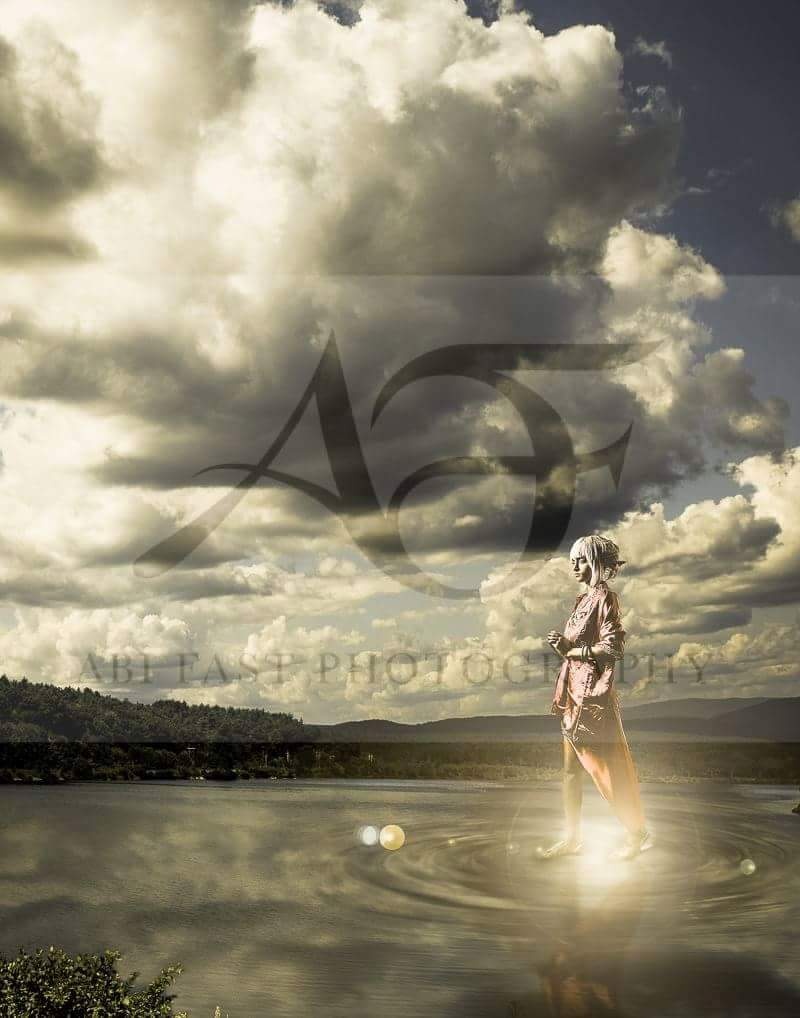
The water mark is extremely distracting it covers so much of the image. Can you give some back story on the image? I.E is the subject supposed to be a specific character? Are they supposed to be normal human height?
Without any content I can't tell if your composite hit the mark.
Right now she is slightly transparent like a ghost and a giant compared the the environment. My eyes are just sucked into the lens flare so it distracts me from everything else. Proportions just don't sit right with me at the moment. The tonality of everything seems coherent though. Looks like a warm filter was placed over the image to bring the tones together.
More info about your intentions and no water mark would be helpful for critiquing.
I actually don't upload anywhere except my official website without watermarks due to an incident involving a classmate having work stolen while in school.
I wanted her to look larger than life, hence the crop cutting out any of the scenery that would made her seem normal size.
Biggest problems I see is focal points. If she's in focus, the background and foreground (bushes) wouldn't be. The sky and model have bright highlights but the water is dull. Maybe more ripples closer around the feet. (ever walk through a puddle?"
i guess your center of interest was not the distracting light and flares....so you would have lowered the brightness a bit.....plus where the watermark is creating a contrast in the sky/clouds. (in my opinion though)