Critiques Needed
Critiques Needed
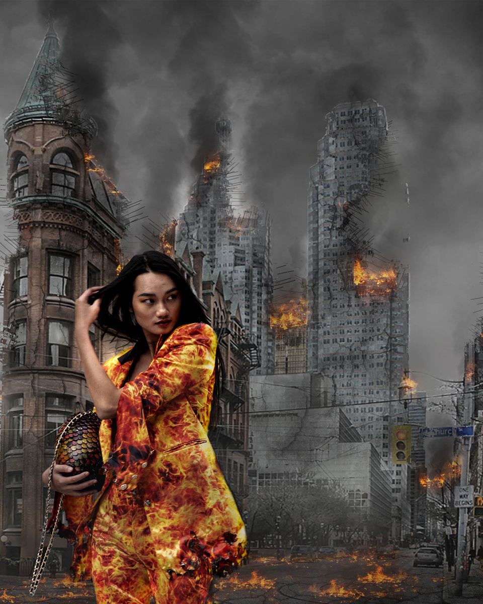
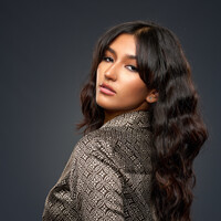
I am fairly new to compositing and want to share this image with the designer and model, hoping for some viral benefits... I welcome any critical feedback that would make it more share worthy, especially related to the technique itself. It's basically a stock background and I added the model (who I shot at a recent fashion event) and some smoke layers so far. Thank you!


8 Comments
When compositing, think lighting - color and direction has to match. The color of the woman does not match the color of the background. She also looks too sharp for the background.
Thanks... I'll keep working on matching her color. Also didn't think about sharpness so that helps a lot too!
In this revision, rather than mute her more (the goal is to feature the outfit), I increased the saturation of the background. Hoping this matches them better for color... also added slight gausian blur to her.
Latest revision... am I getting there? haha
The last image is definitely getting closer. My main issue with the first few is that the backdrop has had it's clarity pushed to fairly extreme levels whereas the model is, I wouldn't say soft, but definitely lower clarity.
It's difficult to put your finger on exaclty... I'm just thinking out loud: For the foreground smoke I would like to be able to actually see the smoke rather that it just being a grey blur. I think the highlights in her jacket are overly bright and saturated... but then the flames in the background are sort of the same... And I think that 's an issue with the backplate you are using to start with. That you're trying to composite onto something that wasn't quite right to start with.
Yup, in your last image she's starting to work but I don't buy the brightness and saturation of her clothes or the flames in the background. I'd probably bring down her highlights too. Possibly though all these recommendations just result in a flat, bland image.
Actually looking again, and like I said I'm stream of conscious here, I don't like your second revision. She matches the least there as that's where she is at her softest and brightest. The third is the closest to being realistic. But I like the first one the best. She jumps off the page the most there even if she doesn't quite look like she belongs...
I haven't helped at all have I? Sorry!
Haha... I love the stream of consciousness comment... great help! I actually misunderstood earlier and softened her up when the bg was what needed it so I put a few field blur points to give it depth.
I bumped the saturation on the bg flames in hopes of avoiding desaturating the clothing, but maybe I need to just bring down the highlights more on the clothing and back off a bit of the saturation all around...
Yes, using a stock background didn't give me much control over it, but the subject fit so nicely.
The model was shot against a grey concrete wall by myself and about 50 other photogs at Fashion Week and everyone is posting the same grey wall shots on IG so I want to be different.
The changes seem subtle, but I truly feel the feedback has made vast improvements so far...
Actually - lovely. Not very photo realistic, but stylized instead. That I find as a strong point. Composition is good. Color contrast is lovely. Grey concrete VS yellowish orange fire.
The only problem I see is the gesture/posture of the model.
Yes, one could say she is leaving the scenery, but what does this tell us? It looks like unfinished story. So massive destruction and fire and all. And simply a leaving woman. Additionally the devastation is not story-wise realistic too.I would have chosen a more mystical look of the woman or even put her down the street even in the back - leaving from us.I would also leave a trail of fire from her.
And I don't like all of your corrections. They are all in the wrong direction. This image is never meant to be photo realistic. The warming of the buildings and the blur are quite ugly. Compared to the original image.