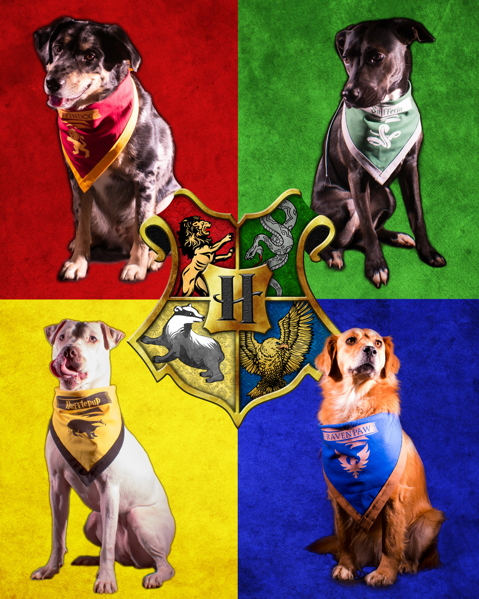
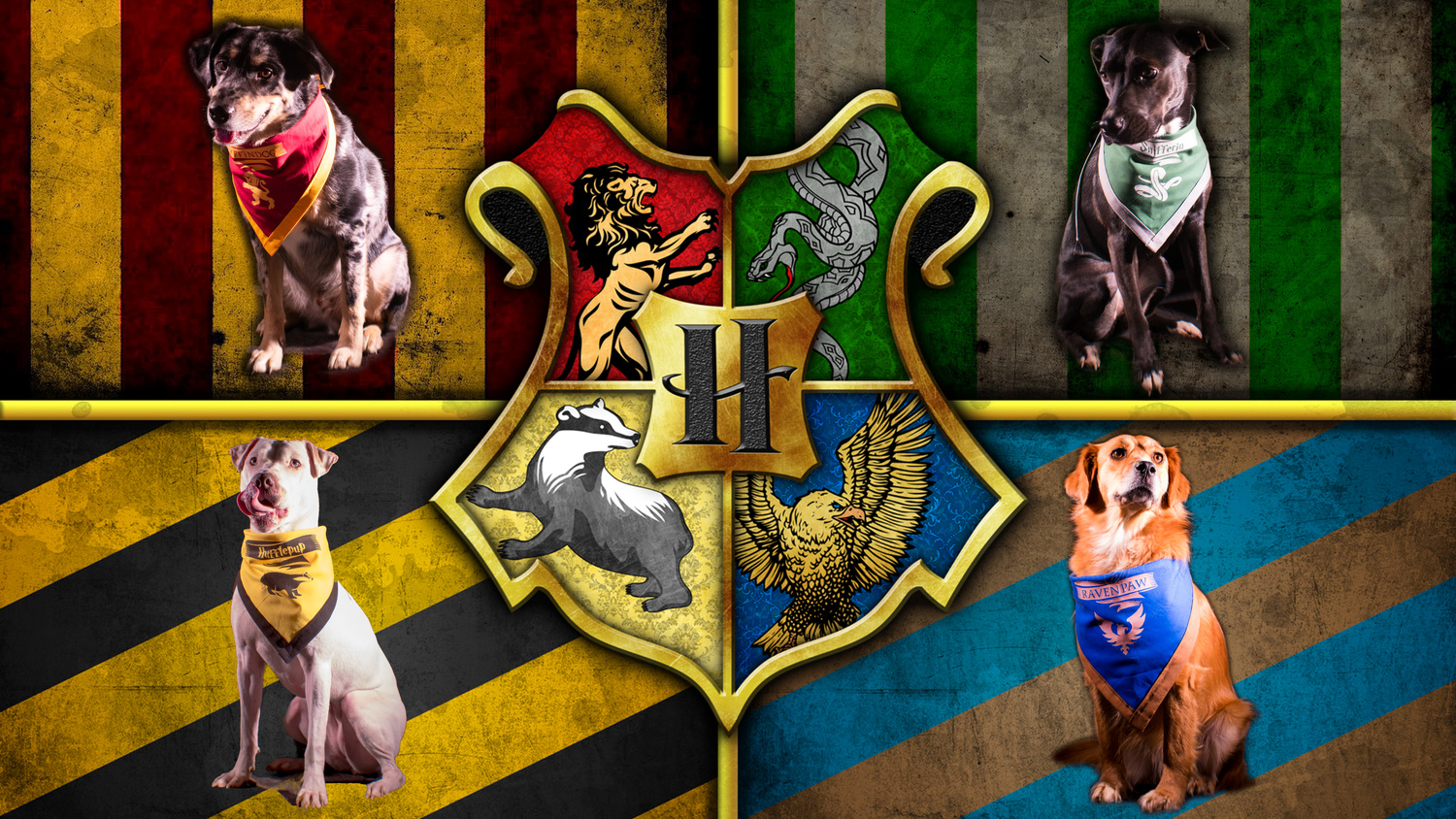
"Dogwarts" Commissioned Wall Art
I was commissioned to create a Harry Potter wall piece with family dogs. Would love feedback on how to improve my compositing. Any good videos I should watch? People I should start following? Feedback welcomed.
I was commissioned to create a Harry Potter wall piece with family dogs. Would love feedback on how to improve my compositing. Any good videos I should watch? People I should start following? Feedback welcomed.
It looked like a pursuit, but in reality, it was a peaceful movement.
I see these comments on many photos - BTW - those who are putting comments like "Needs Work" should elaborate to say what is needed according to them.

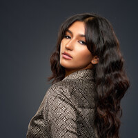
Mia is a natural in front of the camera. She knows where the light is and plays to it in a soft, knowing way.


3 Comments
I prefer the first set, mostly there is more space over the dogs and they are more prominent in the image. It's an art piece and you have done well with it. :-)
Im glad to hear that, Orv. The 1st image is actually my second draft. My client wasn't in love with the striped background, so I created a background more to their preference from scratch. Doing that allowed me to switch it to a portrait aspect ratio.
I agree about the first being better, Logan, simply because the dogs are framed in a proportion more suited to their sitting form. Also, as the images are fairly "busy", the stripes, especially with their different colours and orientation, start to produce a dizzying, confusing effect for me. For the same reason, if the coat of arms could be made to not overlap the dogs without it all being too spread out, that would help. Also, it's inconsistent in being in front of the top dogs, and behind the bottom one.
Can't comment on your compositing per se, as I don't do any.