I need some advice please.
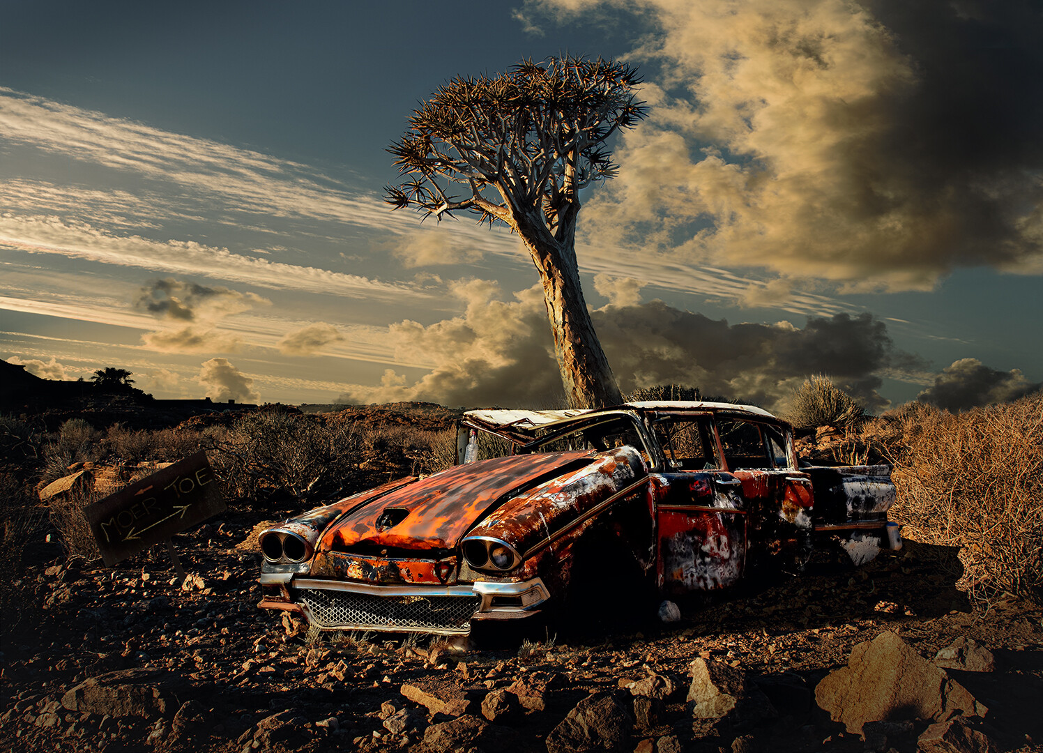
This is a composite of 4 images, sky, landscape, car and sign, all shot at various locations over the past xx years . I would appreciate some feedback on - Does it all hang together & what can I improve on it ? Thanks
This is a composite of 4 images, sky, landscape, car and sign, all shot at various locations over the past xx years . I would appreciate some feedback on - Does it all hang together & what can I improve on it ? Thanks
It looked like a pursuit, but in reality, it was a peaceful movement.
I see these comments on many photos - BTW - those who are putting comments like "Needs Work" should elaborate to say what is needed according to them.

Mia is a natural in front of the camera. She knows where the light is and plays to it in a soft, knowing way.


4 Comments
I think it looks cool! If you had not said it was a composite I don't think I would have been able to tell.
The only thing I would say is the sign is a little hard to see. Maybe increase the shadows in that area?
Personally I find it a little busy, maybe because everything is so tack sharp, The various elements all compete for attention, it's hard to know what the subject is. Also, the sky looks unnatural to me. From the perspective I think it should have depth towards the back of the scene, but there is no haze at all.. It almost looks like the sky is the reflection on water, covering a relatively small amount of space, but then was planted into a vast scene. Or perhaps it was shot straight up, I'm not sure, expect that it doesn't look quite right to me.
Also, there are some details lost in the shadows, in the front wheel and, the sign on the left, as the previous commenter pointed out.
Looks real to me
Hello Theo! You're leaving yourself open here! I must say at the outset that when it comes to composites, I always ask myself what the reason is for doing this. There are many clever things that can be done in photography, muliplied a hundredfold with the advent of digital tech. Techniques are a means to an end, but don't make a great end in themselves.
I know that we like beautiful skies - I more than most, even, I suspect - and that Nature doesn't always deliver. This, I suspect, is the reason for the popularity of sky replacement on this tech-focussed website.
Looking at your image, the beautiful sky looks as if the bottom third or so is missing. if you look at a partly cloudy sky, you will see that towards the horizon it looks compressed with a streaky look missing in your sky. This is obvious in the example I append, where there are vertical and diagonal streaks in the top half, but near the horizon there are none. This is a common giveaway on faked skies, and evident here. (Alex has touched on this too.)
The tree looks too centrally placed, and its base conveniently hidden behind the car. Maybe if you hadn't told me the number of components I would only have thought the sky doesn't look right at first. I can't even say why, but the car's outline doesn't look right against the background. I suspect it's a perspective issue, of relative sizes of things.
I understand that you might just be interested in honing your skills here, and good on you for that! However, my view is that one of the fundamentals of photography outside the studio set-up is its unpredictability. So if Nature doesn't deliver the components of an image I have in mind, I look for what I can do with what's offered, or else just enjoy the proverbial journey.
I hope you don't find this harsh; I do admire your effort and dedication. I suppose if you really master this, you'll fool me!