
What am I missing?
What am I missing in this? Anything? I feel that I did a decent job, but you know how it is! Another set of eyes can always help one grow!
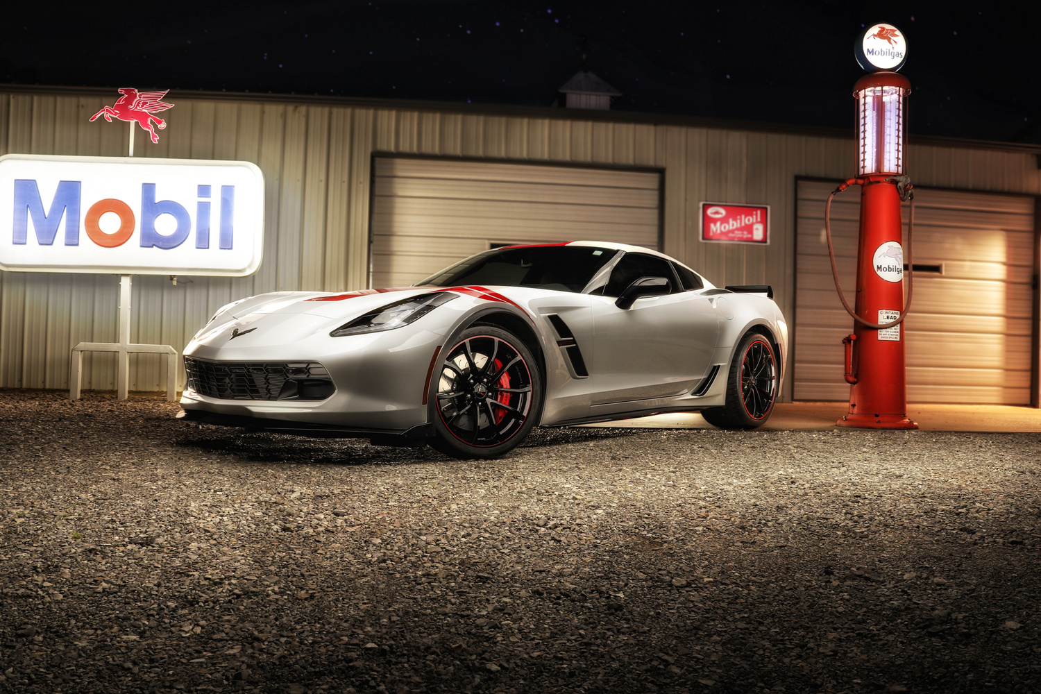
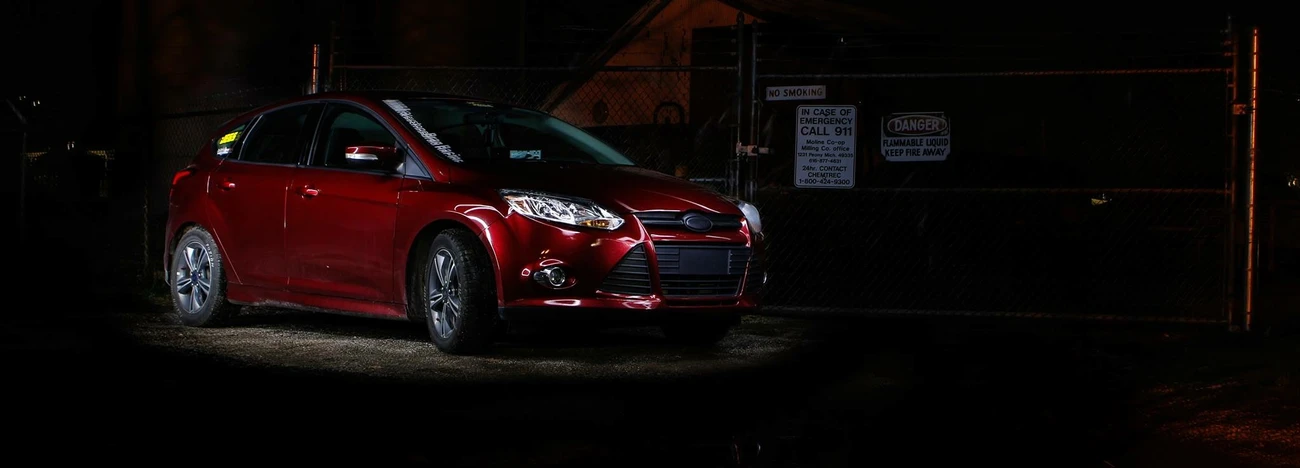
What am I missing in this? Anything? I feel that I did a decent job, but you know how it is! Another set of eyes can always help one grow!

I loaded this into a group called The Art of Meddling, and it was rejected. The picture is a very good example of what you get when you meddle.

Kalama Eagle Sculpture: Kevin Stone
Mr. Stones website: https://www.kevinstonemetalart.com/


Glad I was already in my car before the heavens opened. It went incredibly dark, but it didn't last for very long, and the sun was soon out again.
I just messed about with the photograph of a luscious, large green tree against a nice blue background with the clouds, but I decided that was boring, so this is what I did to it.
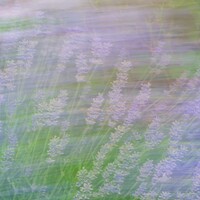
I'm going to be trying this again because I rather like the outcome of this on my lavender in the garden, which has finished for the summer now, so I couldn't go and do it again.


7 Comments
The car looks well, but the background is a bit bright. You could introduce a bit of shadow to the Mobil signs and the building.
As a graphic designer I would say there are too many elements competing for attention in this photo. The Mobile sign, the car, and the gas pump and bright light on the extreme right are all competing with each other with no single element taking prominence and drawing the eyes into and through the photo. I would like to see the car closer to the camera and more prominent. Maybe also tone the light values down in the background. The sign, pump, and other elements should compliment the car but not compete with it.
You can see more clearly the competition from the three main compositional elements in the photo I've attached. The similar light values across the photo also compete for attention and draw the focus away from the car.
I did a really, really quick and dirty edit of the photo to bring the car to the foreground and tone down the light values in the background. This wasn't meant to be a polished edit, but I think you can see the difference where the car is now the primary focus in both size and light value.
Brian and Geoff, I too think there is competition in the photo, but I think the lighting is what takes it. I took the original, increased the contrast, decreased the brightness as a new layer. I then took the original and brushed the car with highlights over. You get the multiple points of interest, and the sign still makes the glow across the hood. I didnt clean up the colors from the increased contrast
Hi Jodi, I like this edit much more. I do get what you are trying to achieve with the composition. The toned down light against the building in the background puts more focus on your main subject. Your eyes are drawn to the car more immediately now. There's still some competition from the bright Mobil sign, but as long as you see that and this composition is what you are striving for then congratulations! By the way, your first effort was very good technically - sharp resolution on the various objects in the scene, and individually each object was well lit. My suggestions were just to encourage you to look at overall harmony of the various objects you chose to include in the scene, and how to make them work together for a more visually interesting composition. Well done!
Great job geoff! Love it! What light are you using?