More Posts in: Architectural Photography
A few shots from the winter of 2025. The last one was inside of the Acropolis Museum. (Unfortunately, I could get everyone to walk exactly where I wanted them to. hahaha)
For iPhone users - a new version of Bluristic has dropped (v1.8) which offers new features and significant improvements in stability & useability.
I am interested in learning Macro/Closeup photography and understanding that Focus Bracketing is a good part of the process, I thought I would give focus stacking a try.
Another visit to our garden using a vintage lens (Canon FD 50mm f/1.4) on my Canon R5.
NOTE: With this lens the minimum focusing distance is 18" at which point you have 1/4" depth of field.


9 Comments
Consider how you're cropping and framing the projects. Especially the first two could be really nice with some minor changes. That first one needs to be rotated slightly and not sure if its distortion or what but still a bit wonky and could use correction. Getting rid of the sloped fence in the foreground helps quite a bit though.
Second image again could have been cropped much closer. And remove the sign from the front. Personally I'd also remove whatever the blue things in the right most windows are. Could've probably been a bit stronger of an image if you had taken a few feet to the left or right so its either a straight on shot or it isn't. Right now its kinda this awkward in between place especially with the garage cut off. I'd rather see the garage than the neighbors wall.
The other two are much better though again on the bottom one its kinda this strange not quite straight on but not quite angled position. Its also just a really dull house though to even bother with.
I do think the lighting especially on the second one is terrific though.
You did a great job minimizing excess, however the ratios aren't MLS friendly. I also believe the agents would appreciate showing the lot size at the expense of art. Definitely a hard line to balance.
I also agree with the not quite straight comment. For OP, Scott Hargis discusses the importance of correcting almost one-point perspectives here:
https://vimeo.com/27731420#t=8m42s
But some photographers really don't like one-point, so keep at it if you mean it.
edit: since timestamp links don't work on fstoppers, skip to 8m42s ;-)
Good to keep in mind if ratio and MLS is important but Reagan didn't mention that so I didn't make the assumption.
Thanks for the feedback. The second one was difficult due to the fact that we had the huge tree in front so you couldn't really shoot at a 1 point as you couldn't see the stonework around the front but a true two-point you couldn't see the front door because the tree blocked you out. I agree with your crops but like was mentioned having to fit into the 800px x 600px crop the MLS gives us makes it very difficult personally. It's finding that balance to really get the best shot I sometimes find really hard to do.
Overall, you've got some good stuff, and you're on the right track. I think if you make some tweaks, your work could be much stronger.
These other comments cover my thoughts on composition, I would recommend toning down some of the HDR-ish stuff going on in the first 3 pictures. The house and ground in the first 3 are way too bright to be dusk shots, so they look very unnatural. The roof in the 2nd image appears to be the brightest part of the image, which should never be the case for shingles of that color and tone.
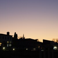
I can't tell what time of day the 3rd image is supposed to be, the garden/ground is very bright, but the sky looks dusk-ish, so you need to make those things make sense when put together.
The 4th image nails the balance. If you did much in post for this, it isn't obvious, which is the way post-production should be, unless you are intentionally going over the top.
Thanks for the feedback. I find it funny you say that as only the 3rd photo had any HDR done to it. The others are either directly from the camera (the 4th), or using lights to help fill in some dark areas (the first two). I do agree I could have burned in the roof on the 2nd image to help tone down the look. It was taken in a driving rain so it was not super easy to get the shot I did get.
Oh wow that's really nice for being in the rain. I've done those shots out of necessity, but have never made them look that good.
I was saying "HDR-ish" as I wasn't sure if they were actual HDR or not, but because some of the shadow areas seem a bit bright.
Now that you mention it, I can see the extra lighting in the first one. I think light painting should be used to make certain areas "pop," and in the first one it seems like the ambient shot is fairly bright, so the areas that you lit don't stand out as much as they could. Does that make sense?
All that being said, I think any realtor would be positively blown away by any of these shots, and I hope you share some more of your work with us.
Nice photos. I would make them a bit brighter or lighten the shadows.
I like your images they just seem too flat, like the shadows have been opened up to far. A small pop of contrast I feel does them good.