EDITED - Pre/Post Abstract
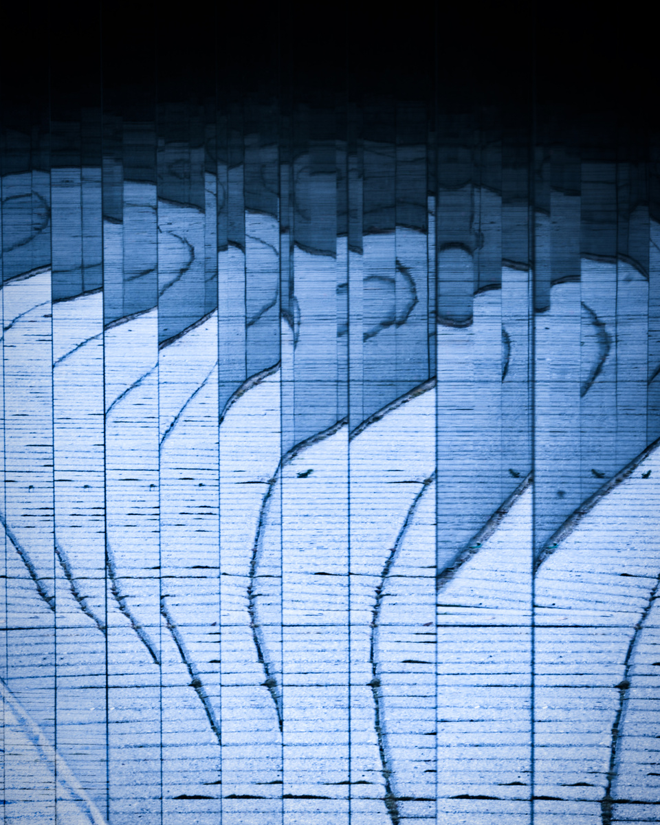
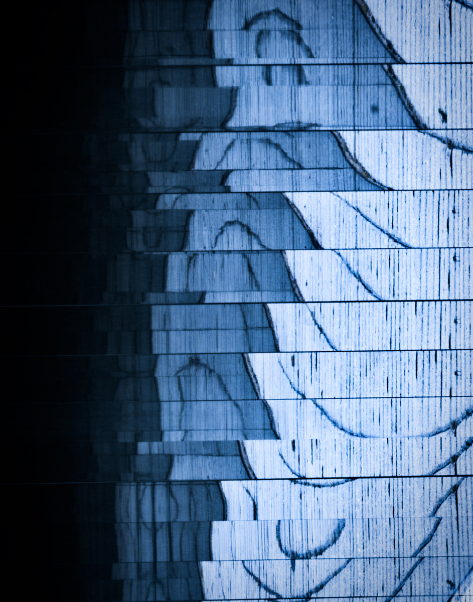
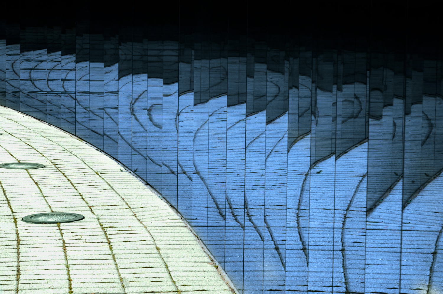
This is the NJ Vietnam Memorial. It is fully in the round and made of polished marble. The reflections are amazing! And, of course, I had to play a bit! So as Joe often says.... too much?
Feedback welcome
EDIT - here is a more consistent "post" of the "pre".


7 Comments
Hey Ruth,
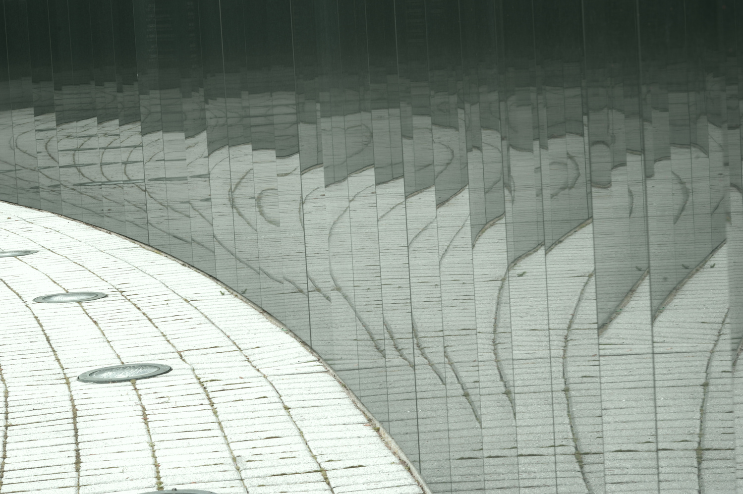
First two are real abstracts but I prefer the black and white shot. The first two lack the elements of the curve that the black-and-white shot has.
That is the original unedited too! Shot in black and white. I'll have to play with that one a little and put it in the black and white group.
Thanks for the feedback Reed!
Not too much for me, Ruth! I like the blue abstraction, pretty well indecipherable, whereas the last one can just about be "read" - making it real, not abstract in effect for me. I particularly like the first, with that sky-like tonal gradation.
Thanks Chris! I am really happy with this one. Yea!
You can't beat a good reflection - it's something I love playing with myself!
Being abstract I don't believe there can be 'too much', and these certainly don't suffer.
I like the blue tones, and the B&W offers something different with the way it plays with straight lines & curves.
All work for me, but one thing that strikes me in the third image is that the verticals slope to the left (surprised Chris didn't mention it...).
Barely looked at that one, Alan. So prosaic... ;-)
Agreed! I only posted that to show the original. Ug!