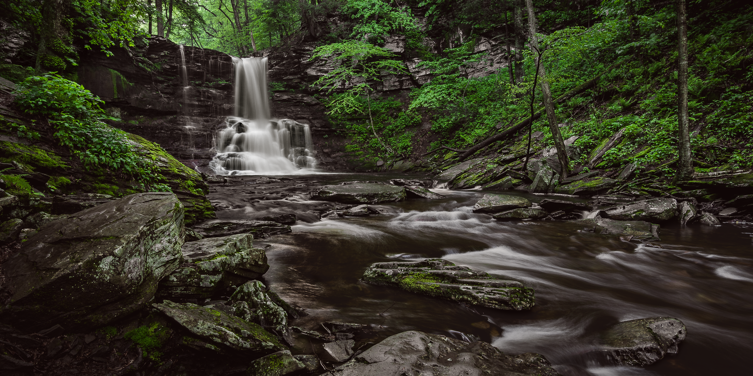
Waterfall at Daybreak
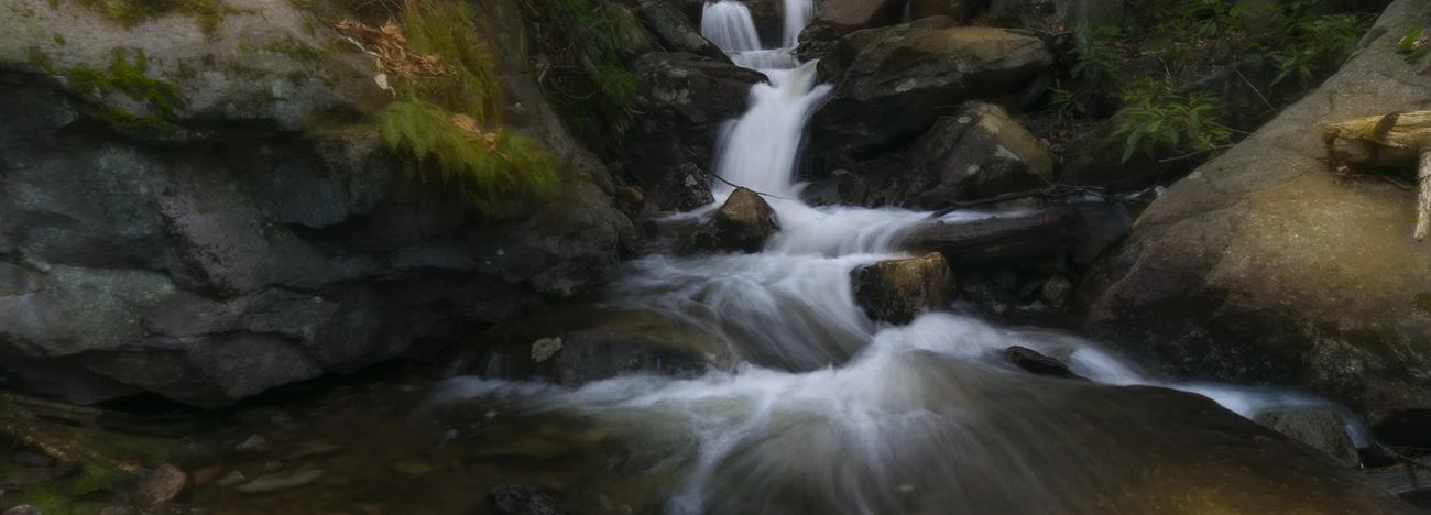
Here’s a shot I took last weekend while hiking a location Joe Cole told me about (thanks again Joe). Bottom is the RAW image (down sampled to post) before process. A couple of days ago I posted a partially done version to get some feedback to see what anyone had to say, and received some good useful constructive criticisms.
Thanks Chris Ward, Alan Brown, and Phillip Breske.
CC welcome
So I shot this just before or at sunrise (5:30am?) so the light levels were pretty low, sun light was nearly non-existent even at the very top of the tree canopy. I liked how this gave this particular water fall area an extra cool light temperature and almost perfectly even lighting from side to side.
For my finished image, my goal was to have the surrounding environment be an integral frame work for the falls, I didn’t want the waterfall to be the ONLY focus, I wanted to maintain that particular cooler lighting, not add any warmth, and enhance the wonderful play of stone and foliage which in the low light was the only other main focus. The new spring green foliage here was very close in color, not perfect, but there was very little diversity so I decided to play that up by keeping the hue as close to true, then add a bit of ‘energy’ to it by increasing its luminosity. Once I did that, I then reduced the reds, oranges, and yellows (and any blue reflected from sky) to enhance the neutrals in the surrounding environment and create a more minimized overall color palette. I also wanted this final image to have a bit more visual interest (contrast, minimal color), rather than ‘let’s just re-create it tone-for-tone.’
Nikon d7200 16mm 2.0” at f/11 ISO 100 ND 10 Stop Filter Tripod Tasty Trail Mix
Process:
- Used the one shot, no stacking
- Crop image
- Set base tones: slightly reduce exposure, reduce highlights, greatly open Shadows and Blacks, increase mid-tone whites, reduce overall Saturation, slight Dehaze, adjust Contrast with Tone Curves
- HSL: No Hue adjustments, Saturation: Reduce Red, Orange, Yellow, Aqua and Blue, Slightly reduce greens. Luminosity: increase greens.
- Color Grading: 5% - 7% increase in warm tones
- Selective Dodge / Burn throughout scene
- Stop and eat a fruit bowl with walnuts
- Water Fall required extra base toning (fun trial and error too) with adjustments to Exposure, Highlights, Whites, Shadows, Blacks, Dehaze, extra mid-tone tonal contrast
- Overall Sharpening and Subtle High Pass Sharpening


5 Comments
Thanks for the explanation Joe, it is certainly helpful to understand the process and creative thinking.
Copied from your submission to the Landscape group
;
Wonderful work Joe - I love the final image. The removal of the green color cast has created more definition and isolation in the rocks, and throughout the image in general.
I like the way you have held back to highlights in the water flow - this is creating less of a pull on the eye and more of a lead in to the falls for me.
I appreciate the creativity in limiting colors - the viewer is transported through the frame to those lush greens framing the fall itself
Definitely different, definitely inspiring!
Thanks Alan and thanks for your earlier tips.
I figured this shot would be a good addition to this group because of the conceptual forecasting I was doing along with being as technically sound as I could be, a good example of how I mixed the two I guess.
Something is wrong with the bottom image. The sky brightness is blooming around the branches which indicates the exposure was too high and "overloaded" the pixels, causing the light to spill across the outlines of the branches. But the values of the brightest pixels is way below 255, 255, 255. Surely there was some processing before this image was uploaded.
YUP, sloppy mistake. Proper image posted (hopefully).
There was processing on that RAW but it wasn't supposed to be there. It was a reduction in Exposure which I was using when measuring values for the waterfall. When I went to move it to photoshop to export for .png I didn't remove that Exposure setting. When I export like that I have it automated so I don't have to go step by step, so I just didn't bother to look at the exported .png of the RAW image, and then I didn't bother to review the image in this post (which by the way is a night and day difference), I just posted it and moved on.
Thanks yet again, apologies all around.
Thank you Joe! Both for sharing this beauty and for the information. I found it very helpful. This a a prefect example of the potential of the group to impact all or our work!