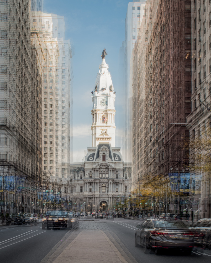
On a recent trip to Philadelphia I took a series of images to experiment with as layers. This is one result. Just experimenting/trying to create something interesting.
Feedback appreciated (whether good or bad) as always.
On a recent trip to Philadelphia I took a series of images to experiment with as layers. This is one result. Just experimenting/trying to create something interesting.
Feedback appreciated (whether good or bad) as always.
I respect that you want to try something different. This is the kind of image that might look better if it were in a collection of other similar works. The soft colors are what I like best.
Tip: Spend time documenting what you have liked or disliked about making this. This will help you repeat the steps that resulted in good results and avoid mistakes.
Thanks for the honest feedback David
Hey Alan,. I've been enjoying this journey you are on! While I like your trees in this style a little better, this is a unique take and a common city scene and I love that. My only suggestion/question is ... Is it straight? It looks like it is tilting right. Although that could be an outcome of the ICM. Or...?
Regardless, I like it!
Thanks Ruth. I've been missing your input on FS lately. I'm someone motioned the leaning as I thought so too but using guides in PS it seems true. Not sure if this is an optical illusion or if it really is off, but the end result is the same. I'll go back and modify.
As I rarely get to the city I wanted to experiment and play with some new (to me ) techniques
Good to see you back online!
Thanks Alan. I have had images that I have intentionally made crooked when they were straight because if I didn't they looked crooked. It would be interesting to see this edit as it could throw off other lines
:)
Hi Alan. I have been seeing and appreciating your work since a while now. Such good concept leads to stop and think more. Sharing my bit. if you do not like, please ignore.
if I am to make this image, I would have thought of having the cars in long exposure, with mid ground layered buildings and perfectly sharp tower at the end as focal point. in the composite composition, tower could have been in perfect centre. perhaps stepped down buildings in your layers. a little more contrast and usual tonal and colour corrections.
yet, its an interesting frame. realising so much practice needed for such frame. good work.
Thanks Vijay, I value all comments so don't fee you aver have to hold back.
I did actually take some longer exposures, trying to catch the flow of the city but unfortunately they didn't offer too much aesthetically.
I think the tower is pretty much centered but the road median is not in alignment with that. Perhaps this is something I can work on when down there next.
Ttterriibblle cccammerrra-a-a shake here, Alan! Suggest you try propranolol. Or actually use that tripod.
This works better for me than the trees, conversely to Ruth's reaction. I suspect it's because the "jitteriness" the technique introduces "works" better for me with the linear elements here than with nature's irregular forms. I too like the soft tones, and the rendering generally..
Regarding the issue of the camera being tilted, it is indeed puzzling. Playing around in my software, and trying various lines, it tells me that the left edge building is rotated about 0.3 degrees CW, and the right about 0.1 degree ACW. This would seem to suggest that the image is rotated about 0.1 degree CW. However, "correcting" for this, the image still looks NQR. The tower in the middle is vertical according to the software, but LOOKS tilted CW to me.
I think there are a number of factors at play here; residual convergence (of a subtle degree many would deliberately leave, to avoid the "looming" look), and a purely subjective visual effect due to light and shade, especially on the tower. I've tried correcting convergence, rotating, and introducing horizontal shear, and it still never looks quite right. Also, I wonder if the old building at extreme right is a pre-curtain wall building, or simply for aesthetic reasons tapers slightly as it goes up. I'd try combinations of geometric alteration until it LOOKS right, if possible.
Which just goes to show you should stop this nonsense, and get back to proper photography! ;-)
Crikey mate, when you comment go go way 'over-and-above'.....thanks for the amount of effort you have put into this.
This is all part of the learning experience, trying to expand the boundaries etc as we go through a period of uninspiring weather and environments.
No fear - I have not given up 'proper' photography,it's just that results haven't been exciting and it's fun to learn & experiment with new techniques.
BTW - you are in agreement (cahoots?) with my wife, who likes to call these my 'shaky' images.
Thanks (as always) for the input.
I used to feel dislike for this kind of work. However, after seeing good examples, I now realize that this style can look appealing. The issue is that it needs to be executed just right. It's hard to describe. Behance is a good place to search for this sort of work.
Here's an example for you:
https://www.behance.net/gallery/89540701/JAPAN-2019?tracking_source=for_...
Thanks David, though the link provided just takes me to someones shots of Japan and nothing related....
The photos in the link are not exactly like what you are doing, but they show how a technically imperfect image can have a great effect if used in the right way. That's the point I want to get across.