Hi All - some (freezing) fun at the beach yesterday. I posted the first few I looked at in Winter Beach Abstracts 1 and then got to these which I think are better! There are 4 versions for close to the same image below. Each, however, is different and I would love to get an idea of how they work. I would like to post one to my profile and am curious if there is a standout here.
First - close to natural color
Second - more saturated color
Third - black and white
Forth - a dreamy, definitely arty take.
Feedback welcome and wanted!


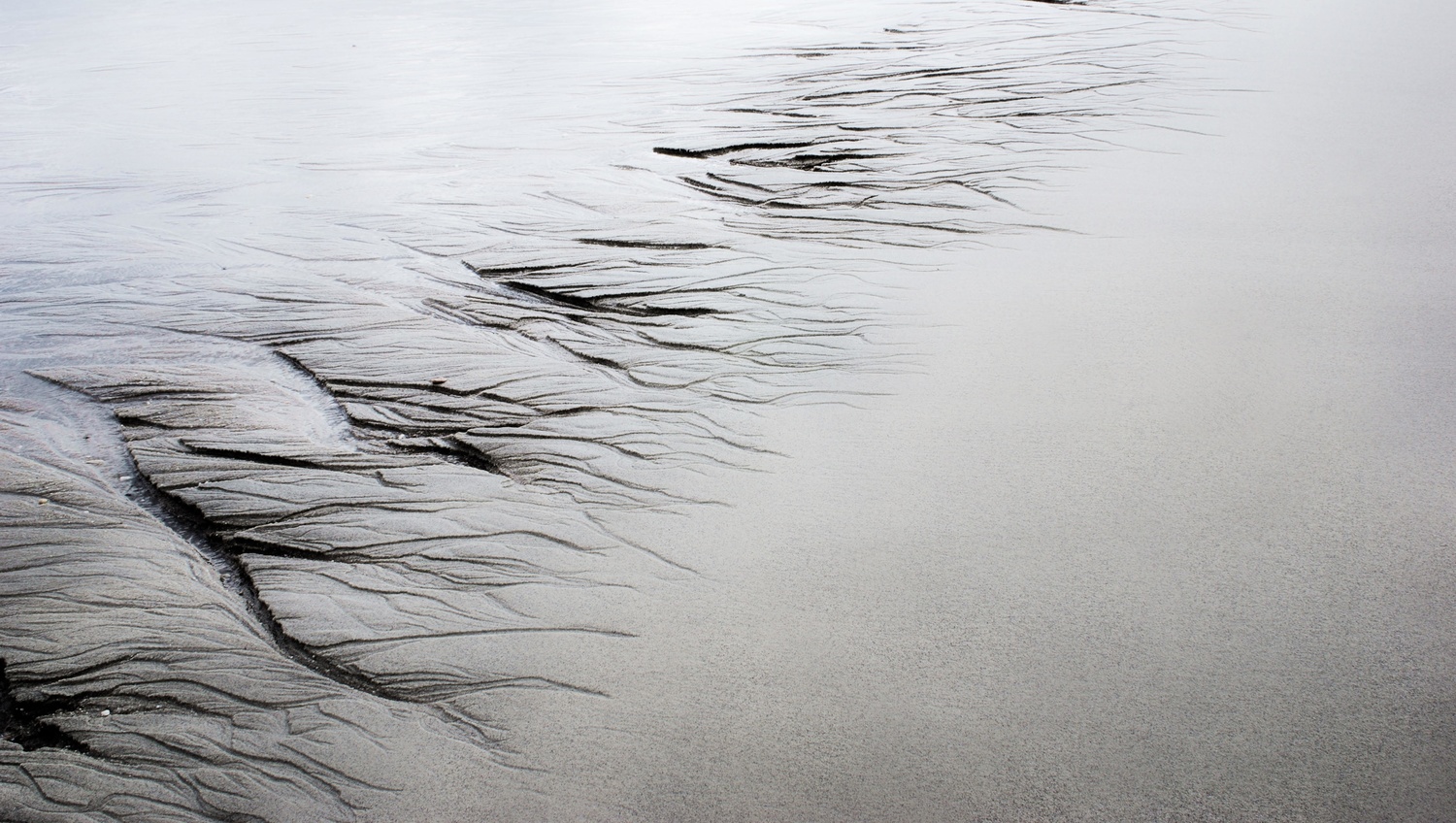
Great series Ruth ! The standout one for me is the first one. I like the gradual grading of colour which makes the middle design look drought burnt trees which is exactly what our landscape looks like at the moment :((
Thank you Sandra. There is a definite bleakness here but for me isnt a negative. Thanks for chiming in. I miss seeing your beautiful work!
Hey Ruth, my choice would be 2 or 4. Number two I would fix top left, better you cropped the image a little so it fall out the frame as well as top right. The last hard line have to leave the frame so it fades out.
Last frame just a little crop and bottom right. This picture is serene
I totally agree about the crop. I'll match it to the first one. I'm glad you like the last one. I didn't expect it to get any votes and i like it! Thanks for the suggestions Paul!!
Hi Ruth! For me, the second, because the colours are the best. Me like pretty. I like the detailed composition and crop with regard to the corners & edges as it stands. They're all fine in their own right. There is a nice delicacy in the fourth, which might have been overpowered by colour. I'll have to try some of these on my next photo excursion. You've inspired me!
Exciting! I will have to inspire you about 100 more times and then we'll be even!!! :)
Tnanks, Ruth! That's very kind. You're a very positive presence on FS, with your imagery & enthusiasm. :-)