Hi folks,I,'ve only just joined this group,primarily to join in the discussion that Ruth started.." to be or not to be artsy ." Anyway I,ve trawled through some images and found this one from last year.I think this could be described as minimalist but I,d like your thoughts..good ,bad or indifferent..I,m open to all critique as I don't really get precious about pics I,'ve taken..and the end of the day they,'re just pics !!😁😁
I don't want to knock this, I wish I did it! Great eye there on a fairly straight image, and I couldn't mess with it in PS anymore.
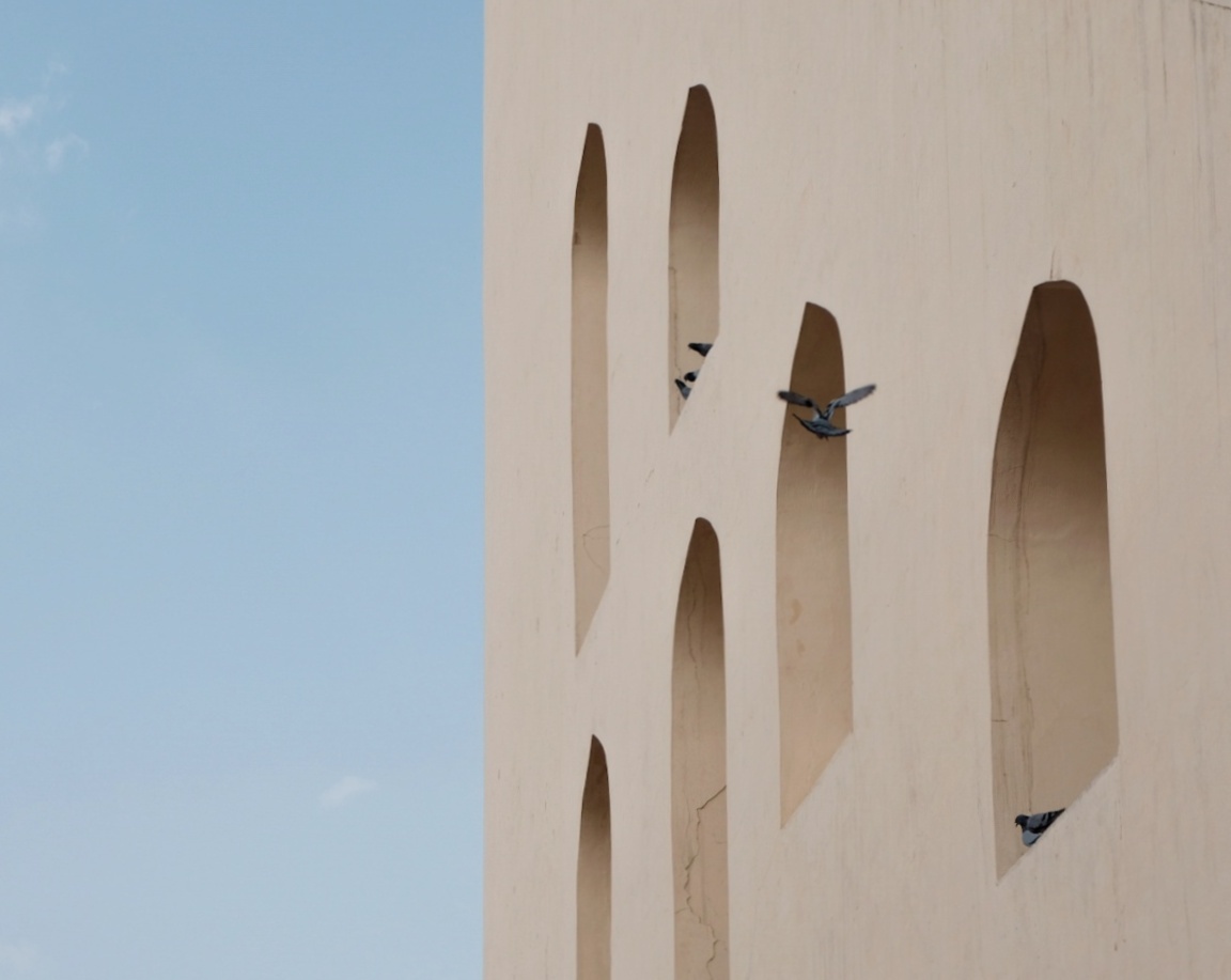
I just about like the squareish format, so I hesitate to tell you to crop the sky to get a more vertical aspect ratio to match those windows...and make it 2/3 building, 1/3 sky. Or better, crop sky completely. Maybe experiment with darkening under the window arches more, but again, it's good high key as is. The birds pop out better as is with lighter shadows.
Also new here, so forgive the presumption to technical correction. Btw, after a long time, I too am finally not caring anymore, it's time to laugh too.
Hi there scrambled....I will see what it looks like with your suggestions...I only have the free version of Photoshop (Photoshop express )And it's very basic so if I darken the shadows it,ll darken the birds but will crop the sky and see if I like it....but thanks for your input....btw...there are much more important things going on with the world than people's photo,s..don't you agree !!! 😂😁😁😁
All feedback that is genuine and respectful is welcome! Gkad you are here and participating!!
I,'ve just had a thought....if anybody has the time or inclination please feel free to download the image and do your worst...I,d be interested to see other people's ideas and interpretations !!!
My only nitpick would be the bird in flight. It blends too well with the shadow under the arch and I wish there was a little more contrast there. Other than that, the only suggestion I would make is to correct the slight perspective distortion along the right side. With a photo as graphical as this, I like to see perfectly vertical lines. (This is a quick edit on my phone, so it may not yet be perfectly straight.)
Hi Phillip...it,s definitely better with the straightened right side...( I never even noticed it to be honest )..so thanks for that..I will see what I can do about the bird 😁
Agree all round Phillip!
Hi Tony - I can't resist an offer to play with an image! First though- this is not a commentary on yours. I really like yours as it is. This is just for the fun of playing.
I like the abstract nature of the windows so I took everything out but them. Fun!
Keep the cool images coming!
Ruthie
Hi Ruthie 😁 that definitely plays tricks with your eyes or perhaps your brain😲😲😜🤤
Hi Tony, late to the party but had Phillip not mentioned it I would have suggested cleaning up the verticals.
I like the concept of the image and the fact you have kept control of the saturation.
My viewpoint is that we al have different tastes and opinions, the only one that really matters is your own.
Great to see you here, I look forward to more images/comments.