
First Foray into Minimalism
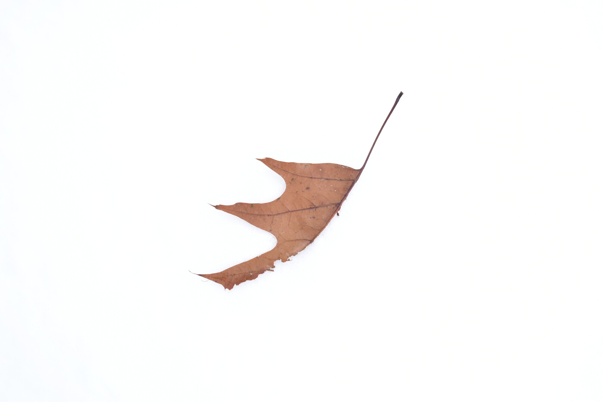
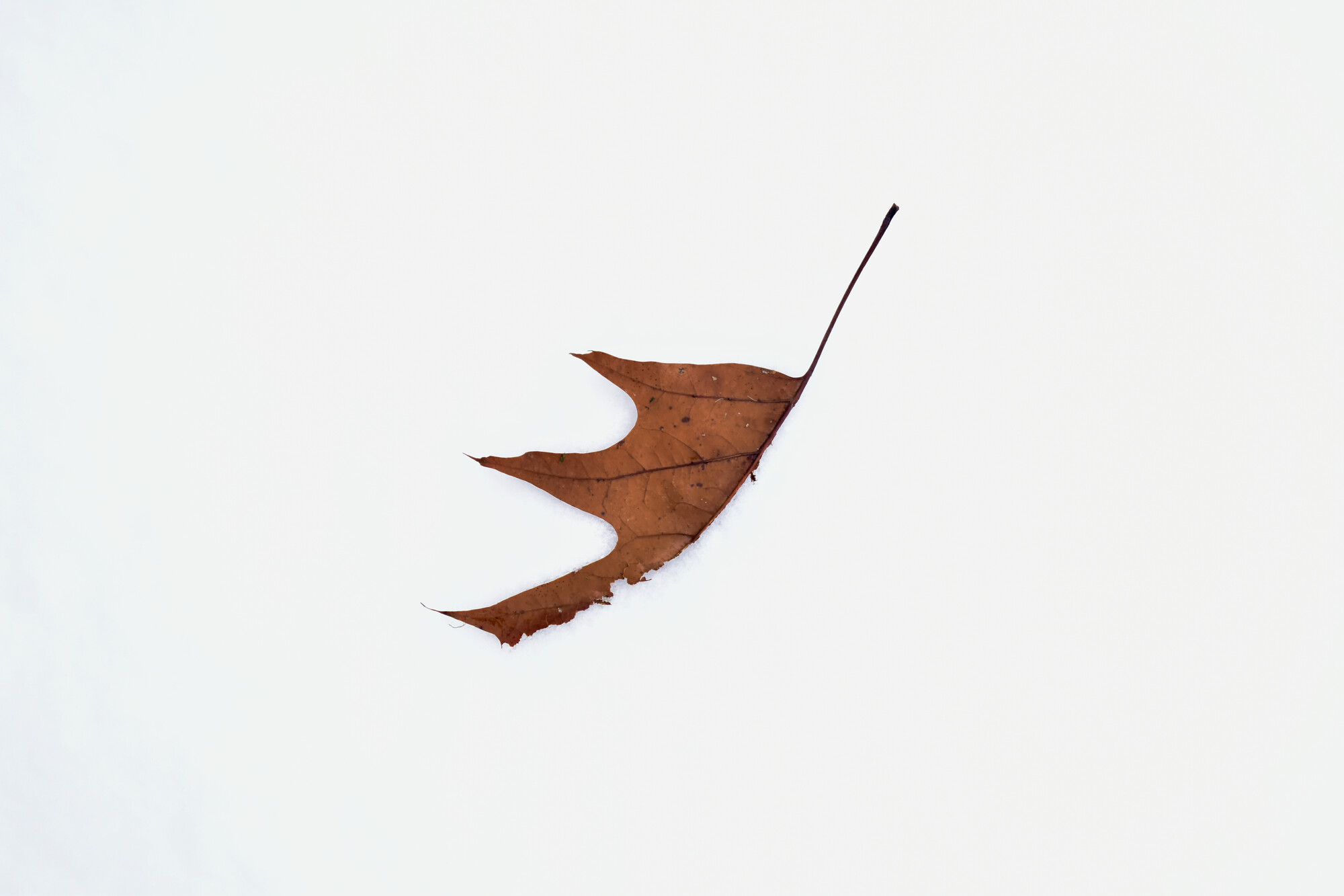
I had this in my portfolio a while back, and I thought it was quite good but it got a bunch of low ratings with no explanation. I was wondering if any of you here in Minimalism, Abstract, Experimental had thoughts on what I did wrong. The first is the original file, the second photo is the edit I had on my portfolio. Feel free to make your own edits if you feel inclined.
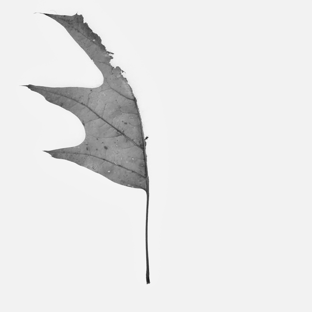
Edit: After feedback from the group, I re-edited the photo and added it to the post. This would be the third version, which I edited to a better framing for my liking, and made monochrome (thank you Chris). Though I like the new framing, it is still centered, so I'm not certain about that. Feel free to offer advice on the edit, especially the crop. The final version is available on my portfolio for voting.


19 Comments
Well......Minimalism is not just a small subject sticking out in an empty frame. With the leaf placed somewhere on the thirds place ("rule" of thirds) or nearer the edge and some dramatically textured surface at the bottom, this would sure be great.
I get the idea of recomposing it, but what do you mean by "dramatically textured"? To add a little backstory, this was a leaf on freshly-fallen snow, so there wasn't much texture there.
Check these out. These photos have dramatically textured backgrounds.
https://muxing23hao.lofter.com/post/1f38f0aa_1c8c5b5db
https://muxing23hao.lofter.com/post/1f38f0aa_1c8e6ca3b
https://muxing23hao.lofter.com/post/1f38f0aa_1c8e6cbce
I found a picture from the snow that was more textured. I'll see if I can bring it out in this one.
https://fstoppers.com/photo/458920
I think it's a fine image, Matthew, but frankly the sophistication of the average Fstopper is low. People seem to want drama, spectacular landscapes - the bigger the waterfall, the better - garish colours and high contrast. So take heart. Friends of mine I tell about FS tell me it's rubbish after a casual look! They haven't found the right corners, like this Group of Ruth's and the right fellow photographers with aligned interests.
I think Hunter is being harsh. A small subject in an otherwise empty frame can be a perfectly good image. I tend to like asymmetric images, and like Hunter, would have placed it off-centre, but not on the "thirds" - personally I think that rule is crap. It's a good guide for a total newbie who will invariably plonk the subject in the middle, because, well it's the subject, right?
Some fine photographers here do centre the subject, so I'm not suggesting a preference for asymmetry is "right" - just a preference.
Although I don't like over-processing, I find that when I do something very simple like this, a less literal depiction of the subject comes to mind, and I might make it B&W, although I love colour in general.
In this case, the colour is appealing. There is a faint shadow, especially under that long curve. Little subtleties like this are important in such a simple image, and I've tried to preserve and emphasise it in the 2nd & 3rd edits, along with the textures in the leaf structure (using Clarity and Sharpening) in all three. If you could bring out more snow texture elsewhere that could be interesting, but the contrast range here might preclude that.
Yeah. You're right. I'm too harsh at this. Take my apology, Matthew, but there's gotta be something in the frame beside the leaf.
Try a snow png in Polarr (https://app.degoo.com/share/fDcJQD6roqE3IR).
That's a download link from my own backup. It's gonna work.
It wouldn't be right if I asked for what I did wrong and got offended when someone told me I did something wrong. I'm a complete newbie at this, so any critism is better than what I had before.
I definitely see what you mean. I'll try a re-edit sometime today. I do like it in black and white--that's something I never even considered.
Have fun!
Hey Matthew! Welcome!
You took a brave jump in as snow images are always tough on this site. The blaring white page always makes snow look dingy. At least when you open the image, the black background is more complimentary.
I like the leaf and I like your editing. For me, the simple subject can't support a center composition like you have. I'd play with the cropping a bit and I think you will see more favorable feedback. I tried a couple for fun but this a personal preference. And out in a tiny vignette for depth. Probably got a little carried away with the drama lighting on the second but I love fiddling!
Good start though. And we'll done on the exposure for snow!
PS. - kind of reminds me of a bird this way.
I certainly like the bottom right corner a lot as a position for the leaf. That was where I had planned to place it, and it reassures me to see that you did the same. I had never noticed the snow issue, but now that you point it out I see what you mean.
Hi Matthew, thanks for being willing to post. I see what Hunter was after, a little side lighting (eg taken early or late in the day) would have created some texture on the snow and brought out more detail in the leaf & shadows.
However, as a pure minimal I'm not sure this is needed. Like others I think his could use a bit of a compositional change. I always look for balance between the subject and negative space in such images, and I feel with your subject being proportionally large and sitting dead center it is demanding all the attention.
I do like the strong graphical lines of the leaf and have made a quick crop adjustment to better match my own taste. This can be used as a comparison but I would encourage you to explore and find what matches your own and fits how you want the image to present (even if that is dead bang in the middle).
Like Chris implied the rule of thirds should not be thought of as a 'rule', more perhaps as a starting point as you strive to find balance in your image.
Keep shooting, and we hope that you will be a willing voice for others seeking feedback so we can all grow together.
PS - you have just inspired me to look back at one of my own images, created in a similar vein (except on sand) that could perhaps benefit from a change in crop/saturation (may pop a little too much....);
I'm glad to have inspired you.You've been one of my favorite photographers to watch for some time now.
Thanks Matthew, I am both humbled and deeply honored by your remark.
I only just realized that my own shot I mentioned is actually featured on the home page of my website - check it out if you want to see before I make changes...…
https://www.alanbrownphotography.com
I see what you mean. It also reminds me a little of your photo of the leaf trapped in ice, although I'd be willing to bet the ice provides enough texture for Hunter.
https://fstoppers.com/photo/468867
The third image is beautiful. I would not have thought of the orientation. It is perfect. Great job!
Thank you so much! You gave me the confidence boost to re-add it to my portfolio.
I like your B&W Matthew! I wouldn't call it centred at all. I like the fact that the stem is central, but the leaf "points" away, creating in my mind an appealing compositional tension. The tight crop suits the formal, "typologlcal" style, echoing a botanical guide. The image reminds me of Karl Blossfeldt's work; our Dear Leader prizes a print of his she owns (envy, envy...). You might also be interested in the "Dusseldorf School" - the Bechers are favourites of mine, but did blast furnaces more than leaves!
I do think that your original orientation is reminiscent of a bird as Ruth points out, which animates the image, and the blank snow echoes a sky it might fly into.
Which all goes to show how imagination, experimentation and creativity can make art in various ways even from a leaf whose job is done. Look at the responses you've inspired! You clearly have something to offer. Keep at it. I look forward to seeing what you come up with.
Many thanks for your kind words. That is something that I love about our community here on Fstoppers; it has enormous potential that allows us to grow together. I look forward to my continued work here on this group. As Ruth said, "It works because people respond."