
Airplane Museum
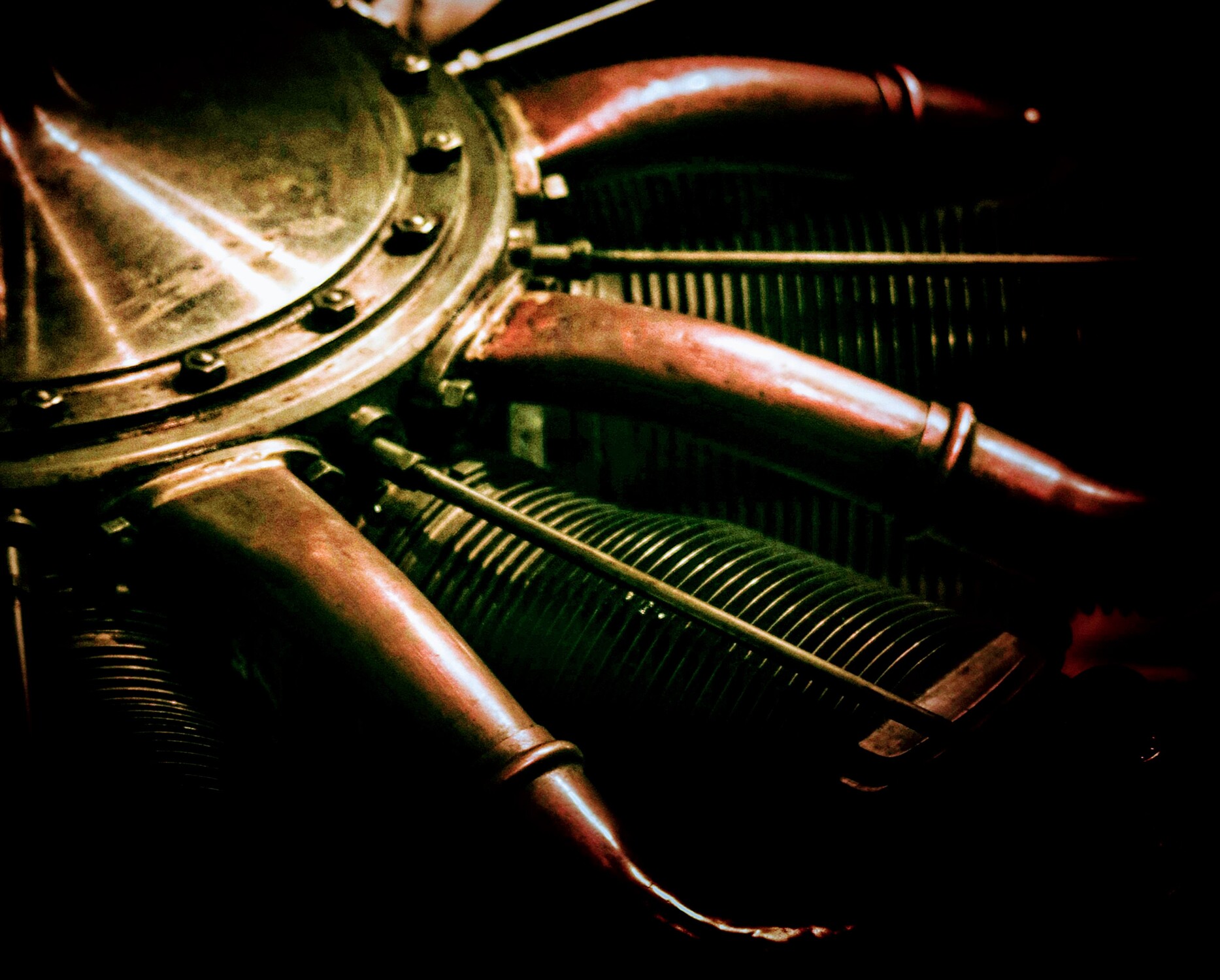
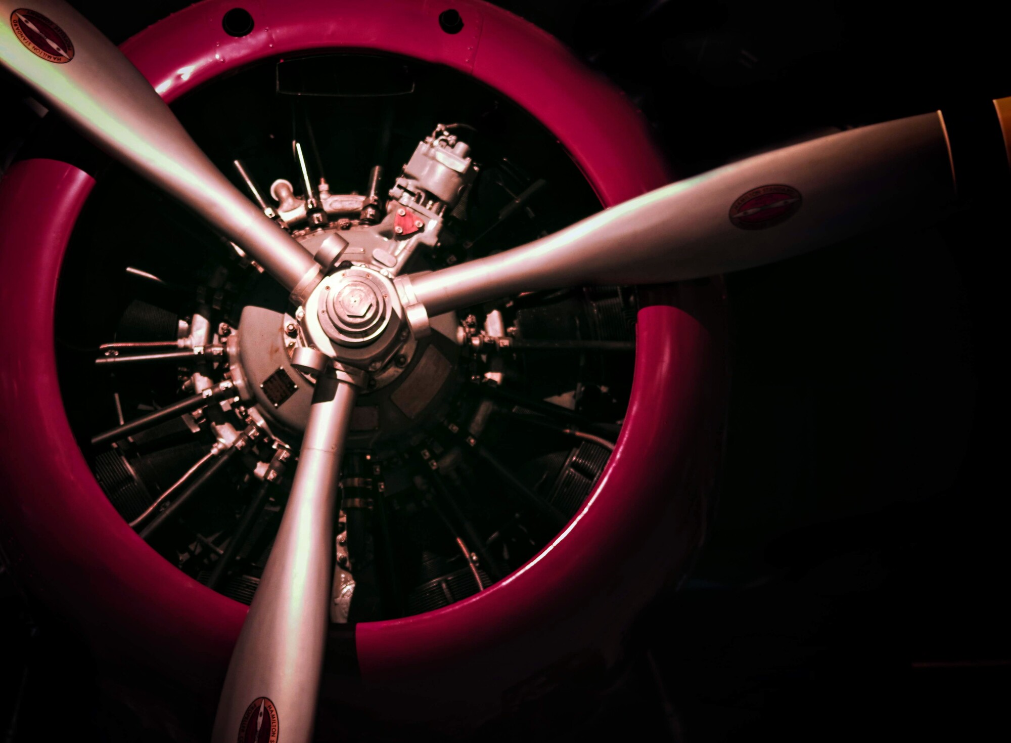
Recently (before we had to stay home) we went to check out a school for my daughter. Nearby was an airplane museum. There were some beautiful old planes and I had fun taking some of the engines and whatnot. I love the first one but I'm afraid I just missed on the focus. What do you think?
Feedback welcome!


10 Comments
On the first one, I do find my eye naturally going to the top right quarter of the image, which isn't in focus. This does however force my eye to examine the whole picture to find the focal point, which I think may be a good thing. I love the composition. The second is better in terms of focus, and I like the color. Good job.
I like the first one more than the second one :)
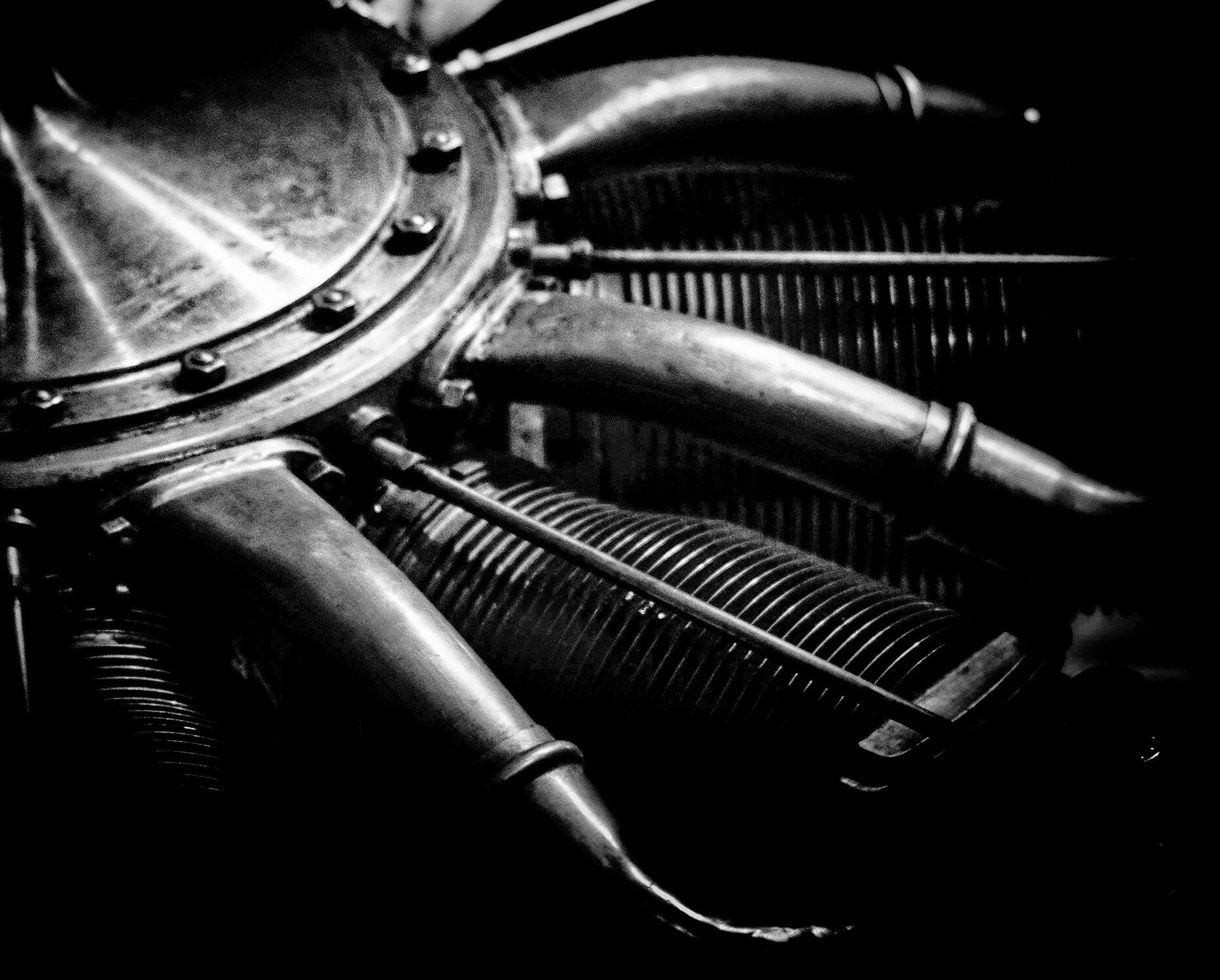
I love the first one as well. Focus seems to be in the lower right which the upper left is indeed brighter drawing the eye.... Dose that hurt the image for me? Not really, I still love it. The balance is really nice, and I feel that matters more in this case. I wonder what this would look like in B/W...
Good eye Joe! It is nice in black and white. I didn't expect that. What do you think?
I love them both, very nice! The colors adds but once taken away, it doesn't remove much from the image either - if that makes sense. You got my support for the current Contest. :)
I think you should. Besides the theme is so broad it hardly means anything. I'd love to see the reaction as well! Thanks for the support too!
You certainly take a wide variety of photos, Ruth. I especially like the oblique one, and it does work well in monochrome. I find that that colour versions of such images somehow lend themselves to markedly desaturated renditions. I think you may have encountered an issue which is a major problem in the steam museum I love as a photographic cornucopia - strongly coloured ambient lighting. In my case, it's green skylights, and here it may be fluoros.
In this edit, I've desaturated, and specifically pulled back the green some more, although you may like it. Sometimes a bit weird is good!. I've also mega-sharpened and used Clarity to diminish the focus issue.
You seem to have shot at f/4, which would suggest maybe focussing on the bolt heads, but it's not a classic selective-focus image.
This is a great edit! Indeed, the lighting in this museum was difficult. Almost every room seemed to be different. I think your edit is an improvement. I'll have to look up Clarity too. Is this a piece of software or are you referring to this feature in typical software packages? I use polarr and the clarity function in it pixelates too much if used more then a tad.
Thanks, Ruth. I use ACDSee, which seems to copy PS. Clarity in both increases contrast in fine detail, a bit like "sharpening", which only exaggerates edges, without creating detail out of nothing. Our eyes, and for that matter film (acutance), do something similar. The point is that these things make images subjectively sharper if used judiciously. Clarity and sharpening highlight textures, at the cost of noise.
I'd have focussed on the edge of the crankcase and shot this at f/11 and f/16, and gone for sharpness overall, as there isn't a broad enough depth in the image to make selective focus marked enough to use to good effect (not that I'm very good at that anyway).
If your life lacks tedium, you could always do a 100-image focus stack and get it REALLY sharp. Maybe a 10-stop focus bracket too, and deal with those dreadful blocked-up shadows in HDR. I don't know how you can sleep at night, Ruth! ;-)
Hi Ruth. I love the composition of the first image, but as you find it a little soft. Everything leads nicely to that bolted section - I think it that were sharp the image would be great.
Perhaps a trip back where you can use a tripod/smaller aperture or even focus stack as our friend Chris suggests?
I'm not sure if I actually prefer the image with the green cast or without (or maybe somewhere in-between?)