
A Moment in Time
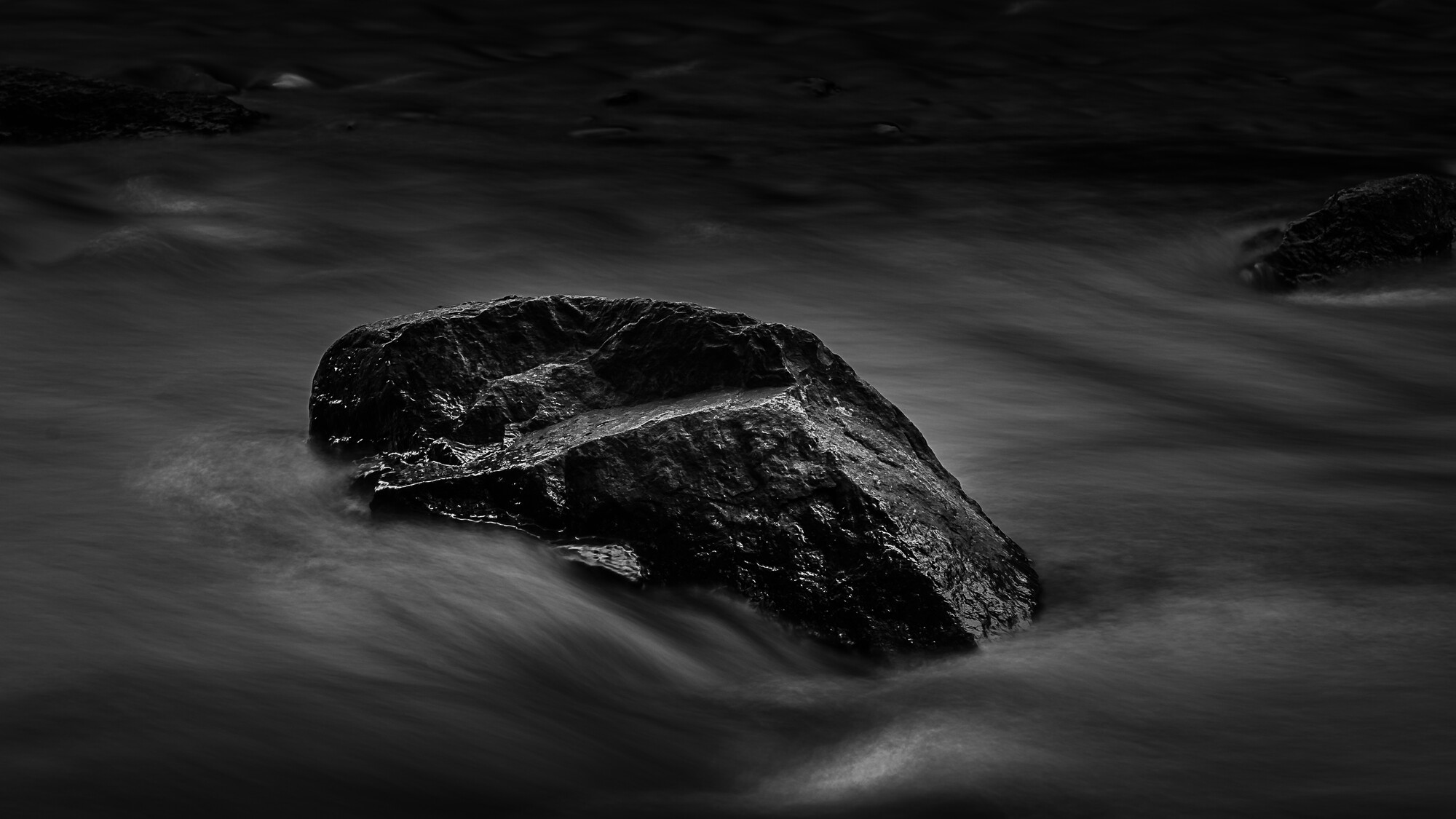
Haven’t posted anything in this group for a while. This isn’t quite what I was envisioning in my head but I still like it. I’ve recently upgraded cameras and it’s inspired me to get out and shoot more. I think I want to make the edges darker so the water just kind of fades to black. What do you think?


10 Comments
Definitely a striking image! I think the low-key tone of the image is a little harmed by the shades of grey in the water. It all kind of looks the same. Maybe that's what you were going for, but I'm not sure if it works as well. I want to see some sort of contrasting tone in this shot. There also seems to be some form of haloing around the upper edge of the rock. I also find myself being drawn to the upper portion of the image, perhaps because it is the darkest part, so I think the darker edges all around would help that. I like the way the water plays with the rock though, and the other ones in the background to give it a less isolated feel. Overall, it looks good, and take my criticism with a grain of salt. I'm not an expert at black and white photography, so I can't say if what I've told you above even makes sense.
Hey Kyle! Nice to see you. I agree with Matthew and all points. I think if you brought up the whites you'd lose the slight halo and the contrast would benefit this image. I like you idea of fading out on the edges. You could run with that even more. Lastly, if you have more image in the original, I think off-centering would be nice.
Sounds like a lot of criticism but in reality it is due to it being a solid image! I'd love to see you add an edit I'd you decide to give it a try. This is a cool image. Focus is spot on
I notice that the better the picture, the more nit-picky the critiques have to be. If there isn't something really wrong with an image, it invites further scrutiny to the finer details.
Thanks for the feedback Ruth and Matt. I noticed the halo as well when I was uploading (it's funny how it's easier to see sometimes on a thumb nail). I originally had the water brighter/more white but I thought it was a little much. I might revisit that and see what happens.
Perfect!
What about something like this?
Oh yeah. That's much better. I looked at that picture, and I just went "Wow". That's how good it is now. You fixed all of the issues I mentioned.The water looks better, ther haloing is gone, the edges are more alike, so it draws the attention to the rock. I don't know if you did anything to the rock, but it captures my attention and won't let go. Excellent job!
Thanks!
👌
Ha, I see the crop/highlight edits I was about to suggest have already been acted upon.
Great image Kyle, bold choice going low key.
Good to see you back!