
Solo Subject Collection
Solo Subject Collection
For my local fair this year I am doing a solo subject collection. I have to have 10 photos, and the editing done to them can only be the basics. I have included the 10 I choose for this collection, and I am looking for some advice or constructive criticism. Thanks!


3 Comments
I like the boots the best, cool idea. The flowers all look pretty good, but watch the edges. The one daisy petal almost touches the edge and on the shot of the leaves one leaf just barely touches. For the quarter I would level it make liberty and In God we thus horizontal.
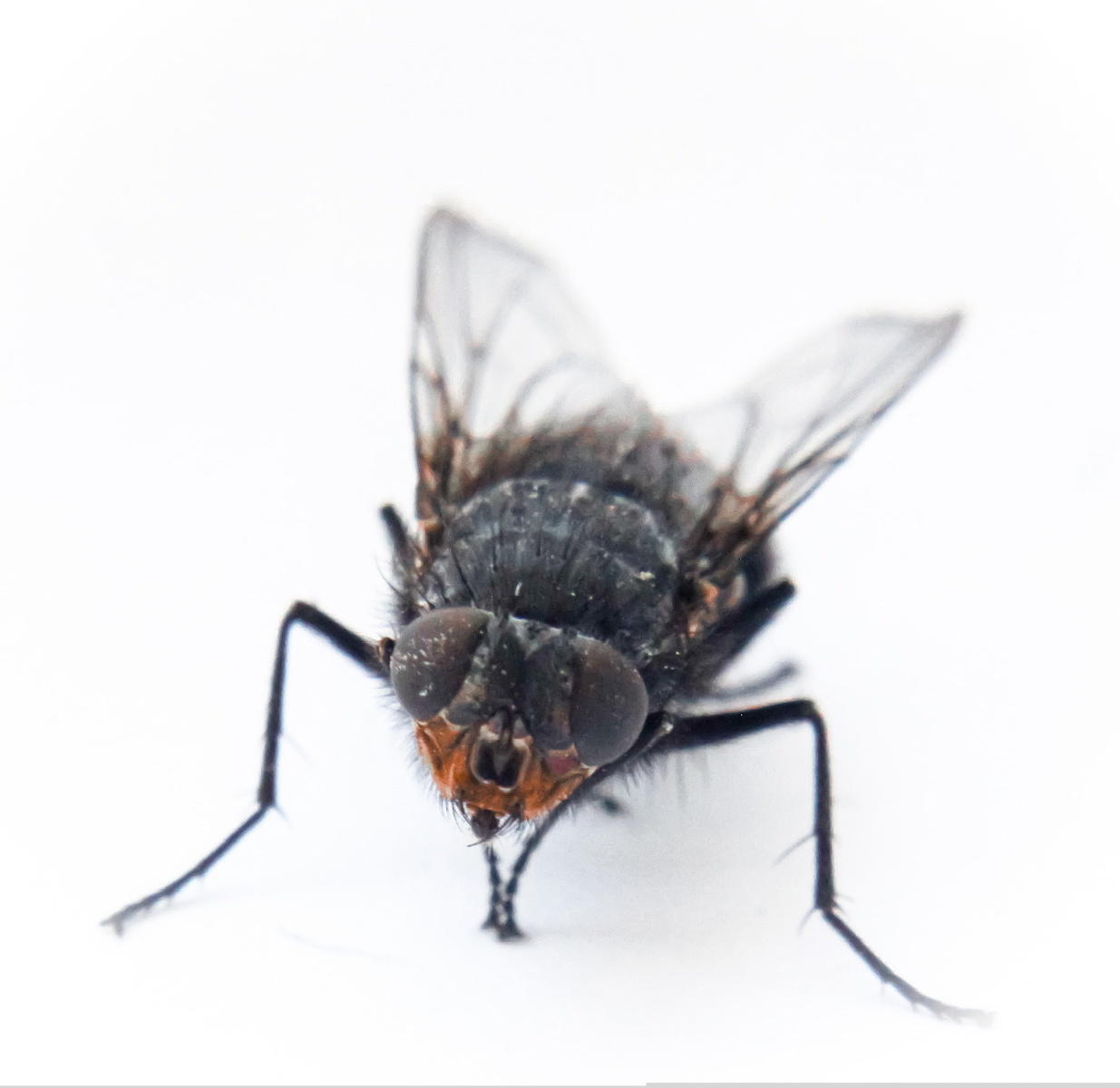
I think the fly is the weakest of the group. Shooting a dark subject on a white background can be tricky. The subject winds up under exposed and the background blown out. Also it doesn't seem quite sharp. Not sure why could be camera shake, diffraction from too high fstop, or too much noise reduction.
Hi Chloe. It is always difficult to critique a number of images.
For the coin photo I would crop - it is rare that compositions work with the subject dead center, especially if the frame is not balanced. See below for something you can review as a comparison.
It looks like flash may have been used for the leaf photos. It's not the most flattering light but the black background helps the leaves 'pop'.
Others are good, (like the composition of the flowers, love the uniqueness of the boots) but I agree that the fly suffers from the striking white background. I think you have done well with the limited depth of field, but sharpening the eyes would raise the level.
I hope this helps, and good luck at the fair.
Hi Chloe!
I'll take these in order and hope it makes sense! It is hard when there are a bunch or images (unless they are a set which I don't think these are?). No worries though!
1). Nice lighting and color. The coin can work as a solo subject but not a centered one at this scale. I'd recommend an off centered crop. Also, I love your trick with the boots and something creative like that here would be cool. I would definitely try a shot from a side angle across the top of the coin rather than straight down as another alternative.
2) thumbs up for the leaf! Nice editing from the original post.
3) try not to cut your subject (particularly is something as simple and clean as this composition) in half with an element in the background. If I had a dime for every time I've done this and didn't notice until post...
4 & 5). Nice work
6) best of the group! I'd think about trying it again on the sidewalk with something under the heel and get rid of the curb but still, nice job!!
7) least favorite of the group. Sorry. If you post separately you would probably get some good suggestions on this one.
8). Great depth of field. I wish you had gotten a little lower and therefore more background though the looped pages but this definitely works. Nice!
9 & 10) these are nice.
Overall impression - I see some creative hints in the coin and the boots. Push this further Chloe! You are definitely on the right track.
Keep them coming!!