More Posts in: Minimalism, Abstract, Experimental (and more...)
Was down in Austin for a bit on a work trip. I've always heard how beautiful the skyline is from the river.
Was a little let down by the clouds, but what can I do!
My two favourite images from my recent night time adventure in Tenerife. Foregrounds and skies were shot separately and blended in PS.
Hi all, I was looking for such a group but see that although there are many members there hasn’t been a single post. Is there interest out there in getting this group going?
Views from Atacama desert, Piedras Rojas and Valle de la Luna


16 Comments
No 3 for me..like the contrast between the blue and white and has a cheerful vibe 😁😁....p.s...don't actually know what banding is 😶😶🤔?
I'm not sure about banding either.
Banding appears when you have a very soft gradient between colors and there isn't enough colors in the BIT to cover the range, so colors are skipped showing a sharp change in colors instead of a smooth transition - Banding. :)
Thanks Tony!
Beautiful, Trees, Flowers, very nice!
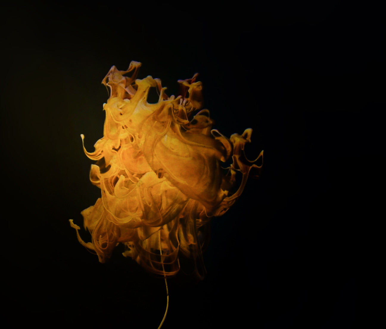
I only see slight banding in the rod image in the corners. On the orange image I see a weird... dodged, vertical, brush stroke on the empty right half?
Thanks for the definition and comments. That weird line in the orange is actually an ink stream in the background. I wondered if it would be called out as distracting. I'm glad you did! I need a critical eye on these and you always provide great feedback. Thanks Joe!
I personally like number 5 the best. I enjoy the contrast that the B&W version brings, and I enjoy how the orange sticks out on the black in number 1. My only problem with some of them is the color almost gets lost at the edge, mainly the right side of the orange.
Thanks Chloe! I get what you are saying about the color. Hmmm. I will have to think about this. 😁
Lighting these is more difficult than I ever expected. I need high light to get the shutter speed fast enough to freeze the motion while not reflecting on the glass of the tank and at the same time avoiding a flat, overly lit scene with a shadow of the ink on the background. Yikes! It's all good though! I love the challenge these present.
These are all so cool Ruth !!!! Love the first one ! Someone once told me there was some banding going on in my image and I had no idea what he was talking about, so thank you Joe for the explanation.
Thanks Sandra!!!
I like the black and white one best. It looks most real and 3 dimensional.
I like these in black and white too. Thanks for the input Charles!
Love them all, especially #1 for the mood, with #3 being my fist pick (gorgeous depth within the 'bloom'). I'm not seeing any banding myself.
Thanks Alan!
Beautiful work Ruth!
Thanks Troy!