
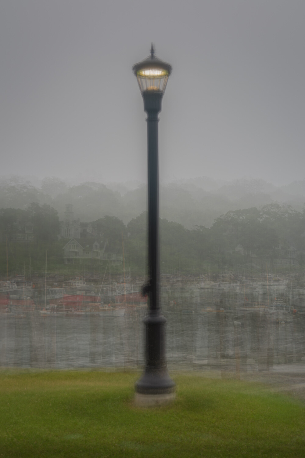
An evening at fog harbor - feedback requested
This is an image I have been working on and not sure it is the best it can be. I'd love to hear feedback from members, both novices and veterans alike.
Suggestions;
- what is your initial reaction (feel before see/analyze)
- what are key elements that you like/don't like in the image
- how would you change it to better suit your personal taste
All feedback (good or bad) is encouraged, and the only comment that is wrong is the one left unvoiced.
Thanks for you help with this.
Update #1
Following comments on exposure I have added a 2nd image for review. Do you feel this is an improvement, yet still conveys the mood set by early evening fog?
Update #2
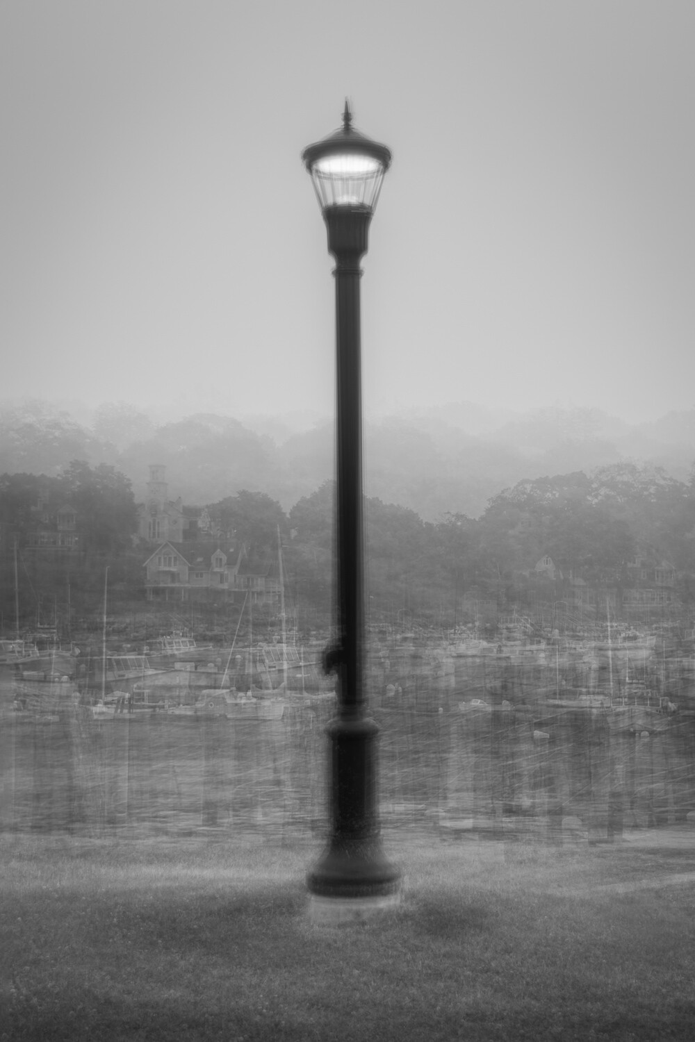
Just for further comparison & debate I have added a monochrome version.
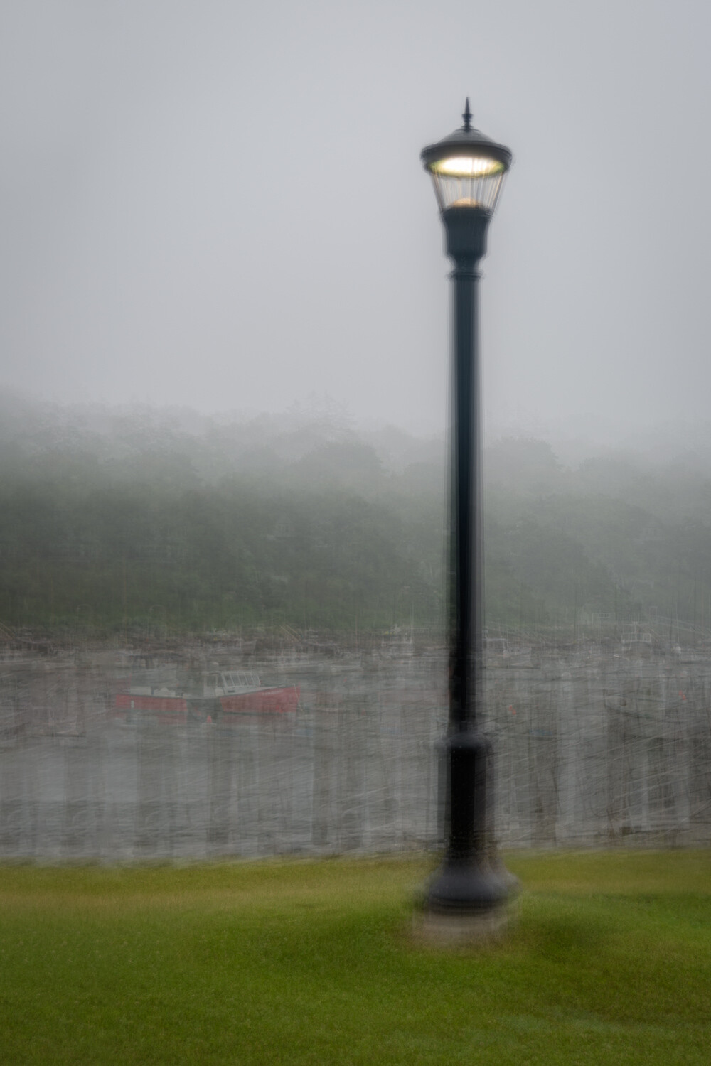
Update #3
Taking comments into consideration I have completely reworked this image;
- less confusing background - check! (at least I did what I could...)
- asymmetrical composition - check!
- use of a tripod - check! (just trying to get on Chris's good side...)
If nothing else it provided a practice session to help develop those skills. I'd love to know how you feel the last image compares to those that went before - sincere opinions only please, that's how we learn.....


19 Comments
My first thought was "That's a little underexposed." Then I realized it had fog in the background, and that was on purpose. I do like the composition as a whole, especially the swirl in the grass. If I had been doing it, I probably would have taken out some of the stuff in the background, which just seemed a bit distracting to me. It is by no means a bad picture, in fact it's quite good, but I still prefer some of your brighter and more minimalistic images (like the trees) for this style.
Thanks Matthew. I actually make a conscious effort to display some of the background elements where I feel they help tell the story.
This image did start out brighter, but that did not reflect the mood and atmosphere felt at the scene (and that I'm trying to convey).
I do see your points though and appreciate the feedback, and of course I'll take your comments into consideration if I re-edit.
I had the first reaction as Matthew did; felt it was flat till I realized it was a foggy day.
I like the post, and I don't like the post; is that fair? I like that it gives us an anchor in the photo and I like that it's using inverse rules... IE normally we are drawn to the brightest point in a photo, this time we are drawn to the darkest. I like that.
To my tastes I'd punch the colors a little even though it is a foggy scene. I also want to see more of the background even though it is abstract. I know this technique requires taking photos while keeping the subject in the center; but I wonder if there is still a way to stay true to the technique and still get a off-centered subject?
Thanks Joe, as with Matthew I feel the mood is lost by brightening.
I have place subjects off-center in the past, but it basically means shooting them in the center (to make best use of guides) and then cropping in post.
I appreciate your feedback.
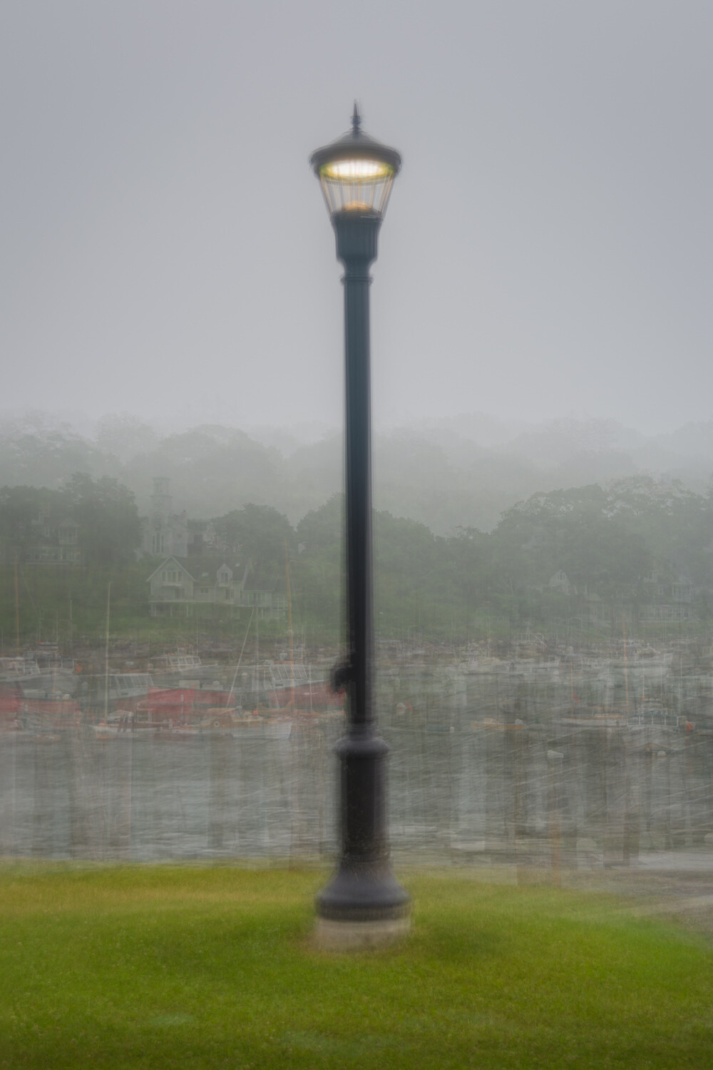
### see my 2nd edit - improvement?
I definitely like the second edit better. I think that it brings out a little color without losing the atmosphere.
I like it, you were able to punch it up without loosing the mood of the shot. Nice.
That is an unusual effect just above the grass. Looks like a gauze curtain. I'd like to see the image with a person, maybe with long dark hair and a long dark coat looking across the water. The post could be balanced, offset by a shorter vertical figure, sharing that horizontal space.
Thanks - I agree on the person, but that would be just about impossible with the technique and extremely difficult to achieve a natural result if adding in post.
Yes. Much nicer to have a suitably attired friend along with you to pose in the picture.
Some say it's good to have a human figure in photos like this. It would give scale to the lamp post for example.
Come to think of it, YOU could have been in the picture with a timer going. Ha ha.
Someone else mentioned a tripod. I concur.
Maybe a long black wig and a wide brimmed hat in your kitbag, and a black trench coat. You get the picture?
Hi Alan! First impression - moody, sombre, but attractive scene, the lamp not quite penetrating the gloom. Victorian London?
Definitely prefer the darker version! I might even desaturate further - rather the opposite to Joe in this case.
Shared many of the others' reactions, though - might be better with some asymmetry, the distraction from included detail (though I respect your attitude to this) and the gauze-curtain effect.
For me, this image illustrates well our different subjective reactions to a key aspect of this technique - your incluson of detail indeed helping to tell the story, but my finding it jarring. I would be happy to guess "the story", mindful of the question of leaving things open for the viewer to ponder.
I'd "change it to better suit [my] personal taste" with a tripod...
;-) Couldn't resist!
Ah Chris, what if I told you a tripod WAS actually used, and that each of the 21 images used to build this was pin sharp (with the 'shaky' effect the result of the different angles layered on top of each other)?
That would be a lie (the tripod was in the back of the car) but I think I could sell you that as the result would be similar :-)
Asymmetry would be difficult at this point, but I'll consider next time a similar subject presents itself (I'd basically have to shoot wider and crop to achieve that).
Interesting that you prefer the darker image and suggest decreasing saturation - that follows my own instinct and just shows how subjective art is.
As there seems to be consensus on the cluttered background I think I may have to revisit that.
Thanks as always for the input - perhaps you should discard your three-legged friend at some point and give the technique a whirl.
NEVER!
Scaredy cat...…….
Hey Chris - does update #3 do anything for you? I think it's the best I can do with this image at this point (and my questionable level of expertise)
Nothing lacking in your expertise, Alan. We're all learning, can all gain skill.
Now I see it, I'm not so sure about the asymmetry, Alan! There's a formality about the image, of a symmetrical object from an era of much symmetry, that the central placement is, after all, possibly better. If you had cropping room, I'd think asymmetry would require the post to be balanced by, say, a low object, - but then you have the difficulty with two subjects. Add more stuff and the whole point starts to become lost (not to mention impossible to shoot!)
After a bit of playing around, here's a more subtly asymmetrical framing I like. I wasn't conscious of it, but now I look, the red boat provides the balance. I think you may have just overdone it.
But I definitely prefer the tonality of the first, that sense of light struggling against the gloom.
Which suggests to me that your initial idea had it. Liston to others, but don't follow their advice?
Incidentally, why not use some slightly defocussed images in the mix? (Like a second-rate Orton effect!) I guess that occurs to me because the sharp detail continues to be a slight irritant to me.
Thanks Chris. I'm actually glad that you picked up on the red boat as the intent was indeed to provide a sense of balance.
I'll perhaps try re-cropping and seeing if I can drop some of the sharpness from the details, just to keep pushing.
Yeah, always listen to others, but only take advice if it works for you.
Hi Alan, I perhaps may have sounded similar in your earlier frame. This time will reverberate in your given format.
INITIAL REACTION: My perception was searching something which is in focus. However, the strong scaled foreground was shouting to hold back. but after a glance the vision kept wondering. There was a sense of discomfort as contrary to the way mind Is trained to see, the supposedly usual element (central, big and obvious) was not something to hold on to.
KEY LIKE/DON'T LIKE: Besides the above, the hazy house followed by church (?) was the resting spot. the fading background grey-tones were good interments to go to pale overcast even sky.
PERSONAL OPINION: ICM elements could be complementing to hazy and (so called) sharp elements. ICM elements could be even more "shakier". Since the light pole too is not in focus (ICM?) it could be placed off centred. and a little scaled down. ICM elements could be made to lead vision move around in the frame. even if no particular focal element, the composition could define clear entry, the path and exit.
cheers.
Thanks Vijay, I do see and appreciate your viewpoint
The overall objective was to create something more impressionistic than literal, so providing for an 'in-focus' element was not a goal (actually, the lamp is made up of 21 very sharp lamp posts from slightly differing angles).
I may take another look noting all viewpoints, your will certainly be considered.
I do like the last, completely reworked version as well.