
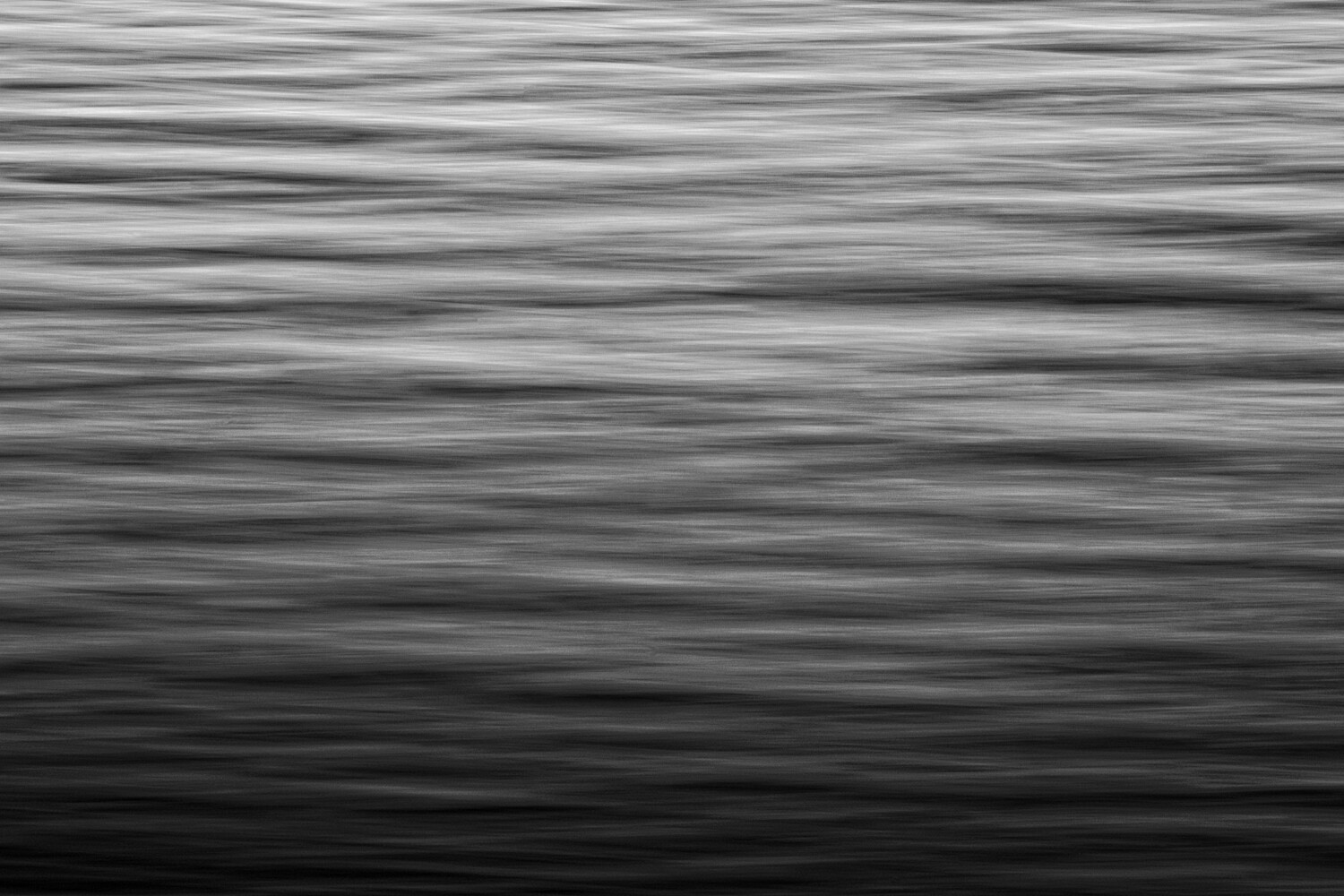
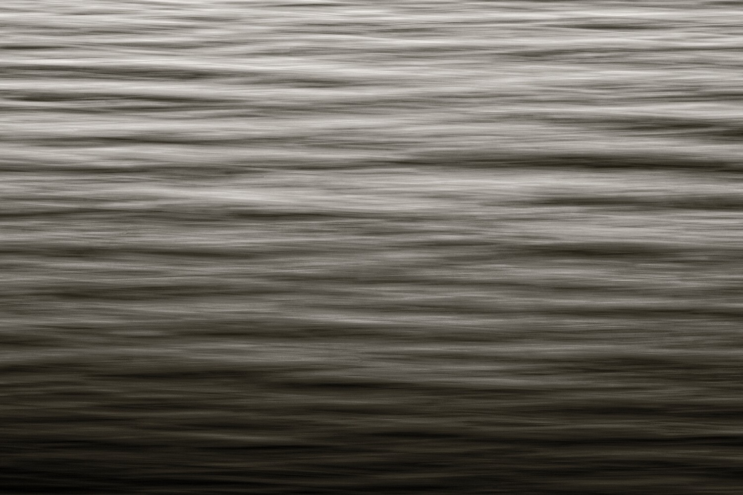
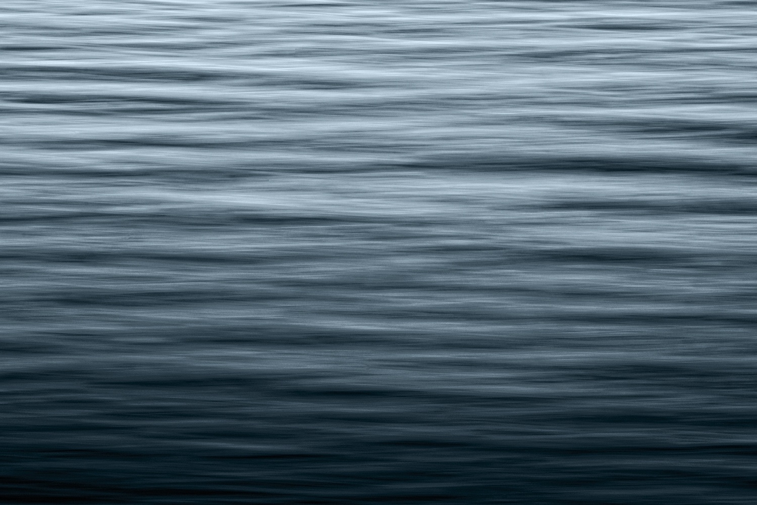
A Question of Toning
Once again inspired by Alan Brown, I have edited several different tones of this ICM photo. Now what I'm looking for is your first reaction to each. What do they remind you of, or which speaks to you most. If you have a suggestion for an alternate edit, I'm open to suggestions.
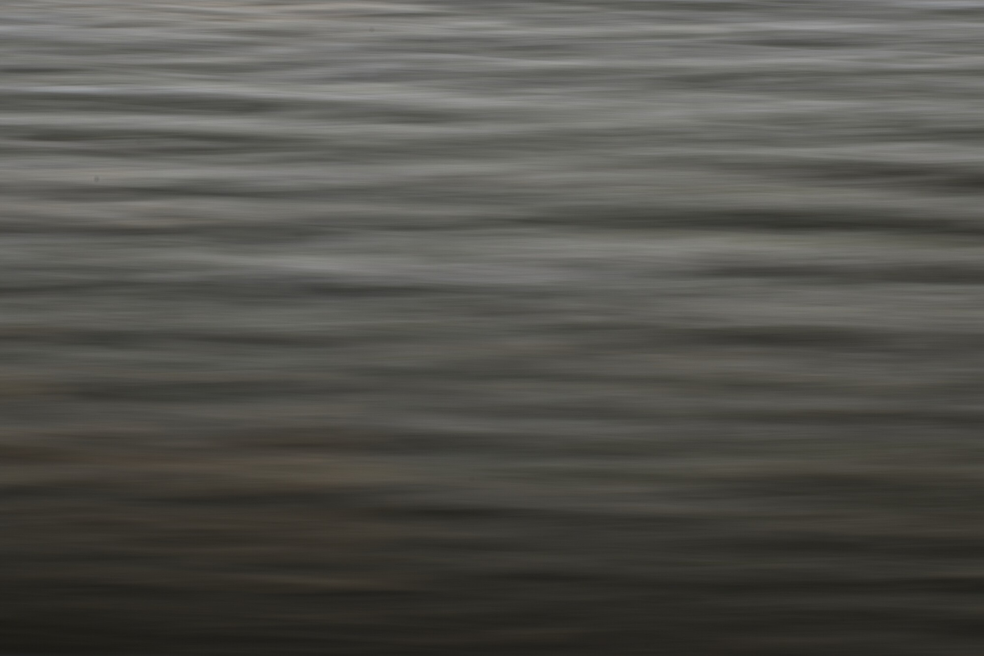
I was going for a specific feel for each one. What I mean is that each one was meant to remind of a specific thing. I will leave a comment if you get it right. The last image is the original to give an idea of where I started.


6 Comments
Hi Mathew. For me blue/Teal colour enhances the contrast well and is most appealing to me. besides that it expressed the emotion of calmness. though with energy and not lazy !!!
Image 2: It expressed sense of vibrancy.
Image 1: This may be funny. to me it says, I am waking up and now something is about to happen.
overall, I liked your choice of gradients. the texture of waves. Contrast looks well balanced for the effect of total image.
cheers.
Thank you very much, Vijay, for posting your perspective. It was interesting, and certainly not one I had considered before. I too like the blue/teal one best for the impression of waves it gives. The actual subject is a log.
Thank you for your positive words about the lighting in the image. I worked for some time on it, so it's good to see my work payed off.
Now settle down Matthew... I would consider myself more decent and eager to improve but am flattered by your remarks.
I prefer the blue version. Without definitive and recognizable form otherwise, the blue provides some context that the viewer can associate with water.
I was about to say that the monochrome version could be a variety of things, but I see you have indicated as being a log.
If you want to be inspired and get suggestions for ICM subjects there are a number of Facebook groups that present some wonderful material. My favorite at the moment is the ICMphotmag group (https://www.facebook.com/groups/icmphotomag) - the magazine itself is superb (great works and words from great ICM artists) and worth the $10
Alright. Given the subjectiveness of all of your ICM, it may not be that you are universally "great". That said, your images do speak to me, and for that I call them great. You are constantly improving; that is one of the things I like best about your photos. You always have something new coming.
I too prefer the blue version. The association of water was certainly not the plan when I took it, but seeing the shapes as I was toning it, I knew what I wanted to go for. The second one was supposed to be sand, but I see I need to try again to get that.
Thank you very much for leaving the comment and the link for me.
Matthew, a bit late to the party but here goes. I’m particularly fond of the second version. Elicits for me a past age where everything was shot on black and white film and the epitome of a fine art was ( and still is) printed with platinum.
Biased to be sure and it matters not what the underlying subject is. What you have begs imagination on the part of the viewer, like picking shapes out of clouds. It’s a calm, soothing, peaceful image which draws in the viewer allowing the to relax in contemplation.
Very nice work.
Thank you very much. Oddly enough the second one is not actually black and white. It has been subtly split toned. I am glad you like it though. Thank you for taking the time to check out my work.