Too Processed or Cool?
I do like to play around with images that have interesting lighting. I like this as an art piece but my husband is more of a purist and didn't like it as over manipulated. What do you think? All input welcome.
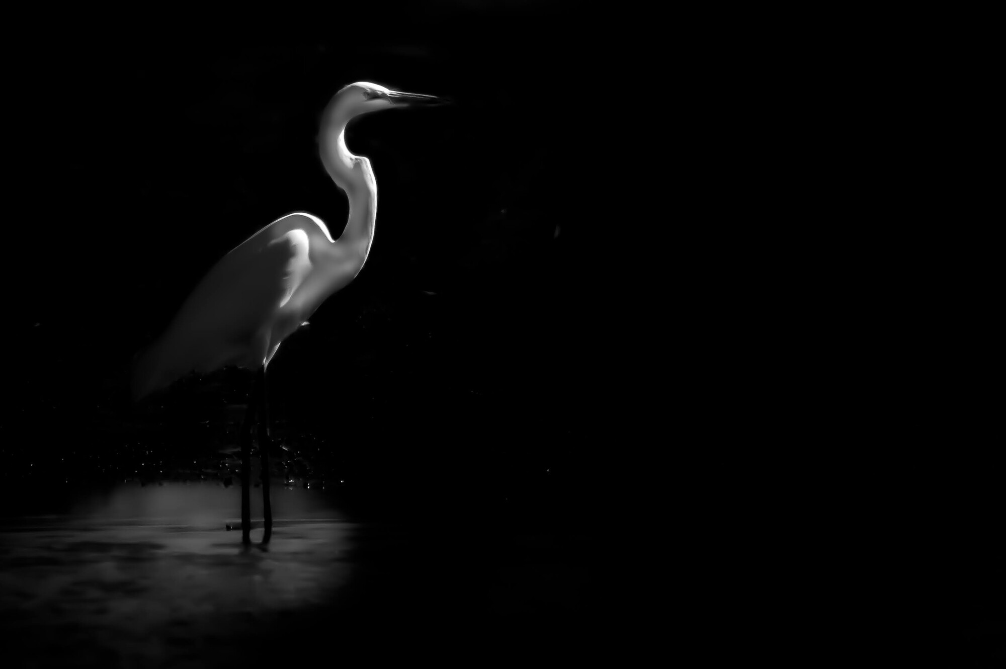


I do like to play around with images that have interesting lighting. I like this as an art piece but my husband is more of a purist and didn't like it as over manipulated. What do you think? All input welcome.
Was down in Austin for a bit on a work trip. I've always heard how beautiful the skyline is from the river.
Was a little let down by the clouds, but what can I do!
My two favourite images from my recent night time adventure in Tenerife. Foregrounds and skies were shot separately and blended in PS.
Hi all, I was looking for such a group but see that although there are many members there hasn’t been a single post. Is there interest out there in getting this group going?


10 Comments
Hey Ruth, as with all things, I think it depends on what you're going for here. The smoothing and lack of detail make me think of this more as the ethereal concept of an egret, rather than a photograph of this specific egret. In that sense I like it, and, as with much of your other work, I love the dramatic lighting! The only 2 things I'll say is that it looks like there are a couple spots, particularly around the bends in the bird's (egret? I'm not great at birds...) neck, that some of the lighter areas bleed off the bird into the background (maybe just some brush work that can be cleaned up?) and it looks like there's some banding around the back or the bird (though that may just be the compression on Fstoppers).
Weird idea--and not sure how possible it is on the file you're working with--but would be curious to see this technique, but with the eye razor sharp. Might just end up looking odd--and may not be noticeable at all given that the eye is relatively small in this instance--but just an idea that popped into my head when I saw this.
Also, interested to know how you did this. Looks kind of like the smoothing that happens when you ramp up noise reduction, but curious to know your technique.
Thank you for the time you took to provide this feedback. I think I fixed the issue in the black in the second post. I don't see banding in my version and think it was an upload issue.
This is highly manipulated. I think sometimes there is such a push to have photographs look untouched. The irony being that most of the work on this site is highly edited! I enjoy the process of taking an image and using it like a canvas on which to paint a new image. Maybe because I paint as well as do photography. As an artist I have a vision of a final piece and enjoy the process of creating it. (Just a little morning philosophy)
As to how this was done, it is hard to explain because it is like painting. But I will say that while you are right about the noise reduction, I actually think that it was texture reduction that contributed more to that smooting effect.
Thanks again!
For me, it's a little in between. Either more detail or go for broke.
I don't often mess with- and over manipulate other people's work - your image inspired me to give something a try. Not sure if you like the direction - if you do, a series like this with your bird photography may be interesting.
Cheers,
Rob
I love this Robert! It was a simple suggestion like this that set me on a path with my ink work. I sense a path opening uo here to. Thank you so much! What a gift!
As a (brand new) newcomer here, I have been enjoying the retinal kicks to be had from looking at many of the amazingly skilful peoples work here. This (developed) idea struck me like a Mack truck! To wit, the powerfully contrasted image of the egret is reduced to a recognisable form of the bird represented by four lines of white light. Four lines! It would be fascinating to see this image inverted (charcoal drawing style) to see if it still works. I’m sure it would. Minimalism at work! Very impressive!
Hi Ruth. This is a very good and impressive frame. I personally would prefer seeing the bird complete in some way. now that does not mean all lit in mundane way. it could be your artistic take for "how". the highlight at the legs is confusing for me for its storytelling in this composition. the bird could be located a very little bit more towards right.
Example given by Robert is interesting and impressive.
Thanks Vijay! He is tucked a bit too much to the left i agree.
;)
2nd version image is my preference.
Hey Ruth, I love the concept. The issue for me is that the birds have lost all detail/texture. If you could create the same effect and also maintain the plumage these would look great.
My initial reaction was that I like it, the bird looks like a dancer on a stage, in the spotlight. The beak gets a bit lost, so maybe bring up that part of the curve a bit, or selectively brighten the spot just a little - especially if printing this on paper.