Searching
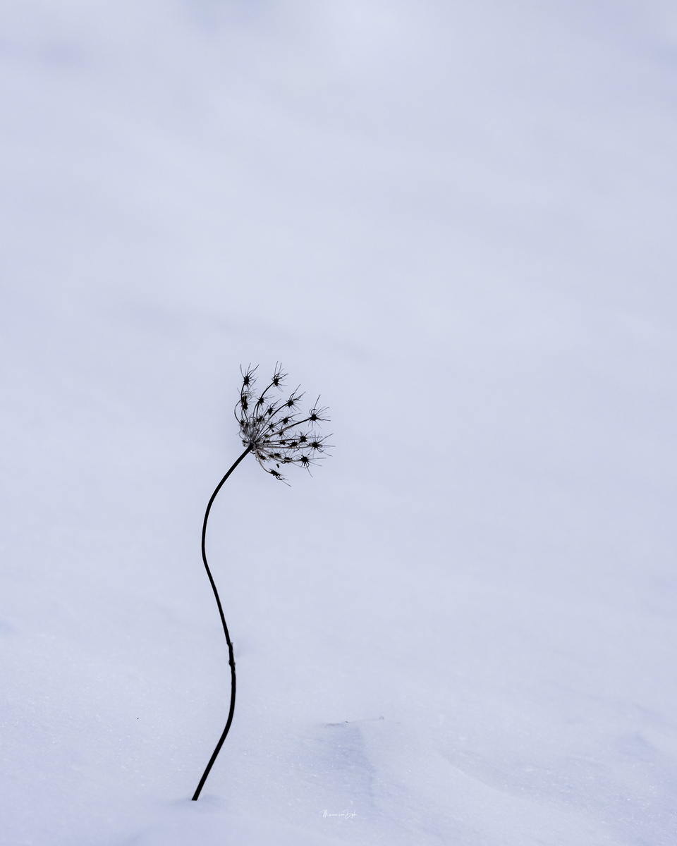
Searching for the sun / warmth / TLC .. another go at a minimalistic scene

Searching for the sun / warmth / TLC .. another go at a minimalistic scene
I really enjoy creating something different with drones. I've had the Mavic now for about four weeks and I absolutely love it.


Client came and needed headshots immediately. Set up a single Broncolor Para 133 in the dining room. Delivered 20 pics. Setup, Shoot, Edit and delivered within 30 minutes.
This is a water reservoir for the city of Curitiba, Brazil


10 Comments
I almost would like a 4:5 ratio with a little more space on the bottom. Something about this one seems off-balance as it is.
Thank you Matthew , i appreciate learning from the pros here
Q: Would this “off-balance” look not create the tension in the photo whereby you want to correct it thus remembering it vividly every time you think of the dud? Does a minimalistic image always need to be pleasing and calming ?
ps original was 4:5 but i gave it the space you referred to in this one
Well, color me a bad judge of ratios. I had a math teacher that'd probably agree with that though. What I first noticed when I saw your posted image was the large empty space at the top and on the right It was there my eyes kept going. You'll find that this group is composed of people with widely varying opinions and viewpoints. For myself, I tend to enjoy more balanced images, but there is a segment of people who tend to go the other way. Here's how I would have cropped this image, but everyone will do it differently. I am interested to see what other feedback the group may give.
I have to agree Matthew. This crop 'feels' right to me, with the visual weight of the dead plant being balanced by the larger, lighter area on the right& top.
I really like this one Marius, especially after Matthew's crop below. The stalk creates a wonderful curved line leading to the seed head, which adds interest and holds the eye.
Well done!
thank you gentlemen for the insights
Hi Marius! Interesting questions you raise here. As Matthew says, opinions here will differ - and yet at the same time they can converge. BTW I'm not a pro.
I'm inclined to agree with Matthew, and did a quick edit of your original image at left as I might compose it, which was between your and Matthew's version in terms of placement of the plant with respect to frame edge. (I didn't directly compared his until I'd done mine.) I can think of other placements with more tension, like yours.
For me, composition is purely intuitive - if it looks right, it IS right. "Right" can be repose, or tension or myriad other things. I wouldn't quite agree that tension implies the viewer "wanting to correct something", though! And surely a minimalistic image doesn't "need to be" anything in particular - it depends what the artist wants, and as sure as someone thinks it's great, someone else will think the opposite.
You've had some excellent compositions from the get-go here, so I don't think you need advice - follow your instincts, I reckon. I would put the plant in a different place - but it's your image, and not "wrong" whatever anyone thinks.
Thank you Chris. as always your inputs are appreciated.
Hi. For my academic interest, i checked for one more possibility. i liked it.
It brings the vision outside in.