Minimalist Canadian Goose
Lone Canadian goose on a nearby pond early this morning. Constructive criticism always welcome...
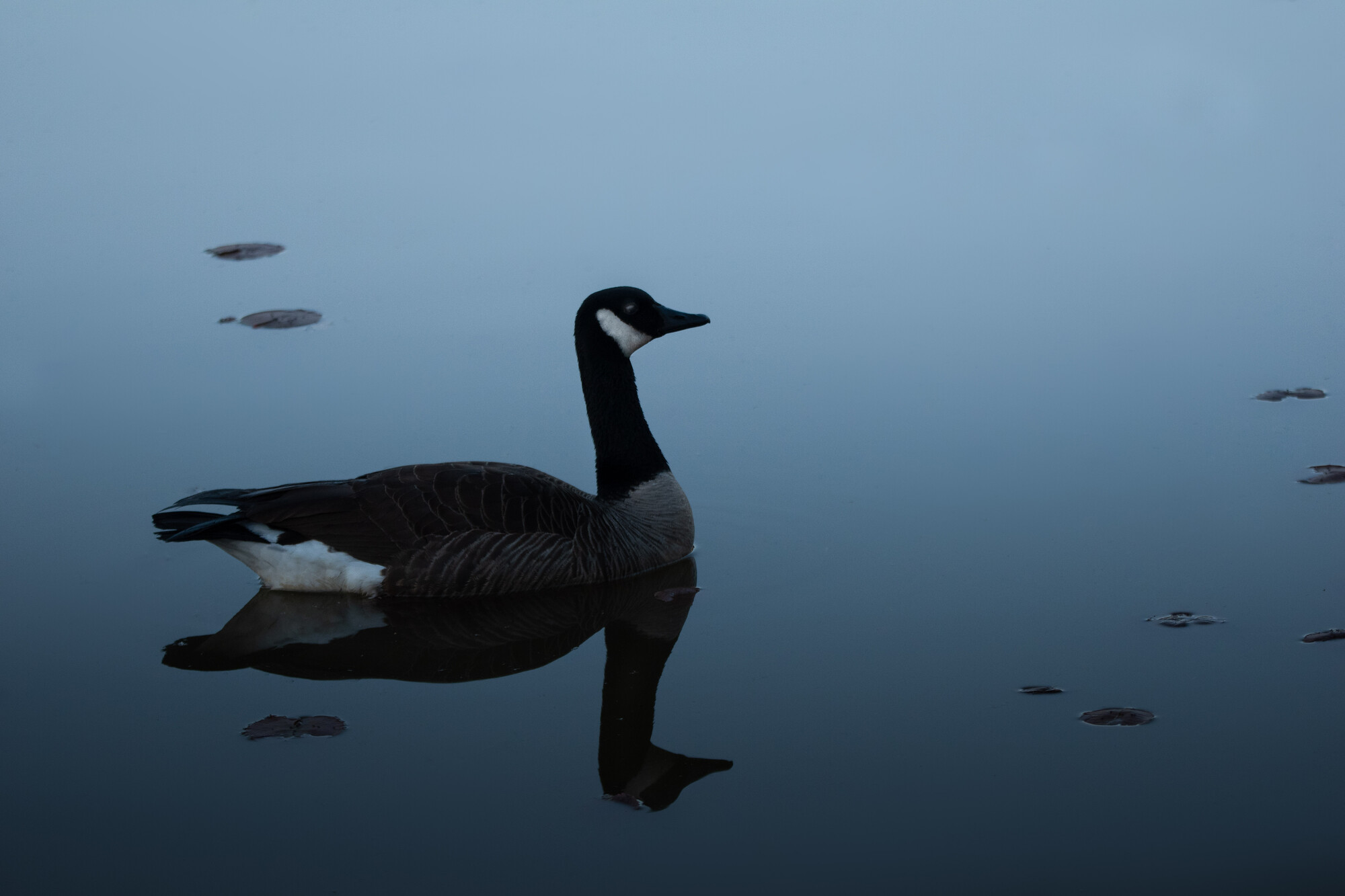

Lone Canadian goose on a nearby pond early this morning. Constructive criticism always welcome...
I really enjoy creating something different with drones. I've had the Mavic now for about four weeks and I absolutely love it.


Client came and needed headshots immediately. Set up a single Broncolor Para 133 in the dining room. Delivered 20 pics. Setup, Shoot, Edit and delivered within 30 minutes.
This is a water reservoir for the city of Curitiba, Brazil


8 Comments
While I understand the dark, moody shots are your style, I don't know that it really helps in this one. It just seems underexposed to my eye. Perhaps try brightening it a little.
The dim, moodiness works for me. It took me a moment to realize what distracted me and that the leaves detract the image. They lead my eye around the composition and work against the minimalistic quality.
I believe a smooth water surface would boost the image's appeal.
Nice work.
Great job, Marcus!
I note Matthew's observation; I think if it were meant to be a photo showing how the goose looks to help bird-spotters identify them, then the exposure could be higher. As a piece of art, though, I think the moody look is wonderful - there's a real depth to the blues. And I like your composition.
Regarding John's point, for me the shapes on the water help rather than hinder - it looks clichéd without them (I've tried it).
I guess I was kind of looking for a high-key style, which is exactly the opposite of this image. Ruth did some wonderful work in that vein. I suppose that I'm looking for something that isn't there.
https://fstoppers.com/photo/453740
Both styles have their appeal. Perhaps the high-key approach could have been done here as well as the low-key. I think Ruth's bird's legginess especially lends itself to the high-key look because the legs are emphasised by the pale background.
I can see all sides of this discussion but tend to agree that in this case the dark, moody style does add to the image.
On the leaves issue I might try removing some to see if they add or detract from the image (from the artist's perspective). Just thought I'd try myself as my curiosity was piqued.....
I might be tempted to do the same, Alan. Prob too much of a purist to, though!
Thanks to everyone for the feedback...I like the picture with less plants better! Looking at the photo again, I kind of wish there was more negative space. This is definitely an interesting genre...