
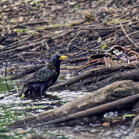
Capturing the sunset
Just experimenting with a technique here. This is an old image that I never really liked due to the harshness of the contrasting colors in both sky & foreground. After experimenting with the tilt-shift blur feature in PS I was able to create something more in line with my goal for the image and a lot more to my liking.
Feedback on like/don't like appreciated as always - does the processing technique work for you or do you feel otherwise?


12 Comments
This is really an image that looks pretty to me. That's not an adjective I use often for pictures, but I think it fits here. The way the layers of the image and the colors work together is quite complementary in my opinion, rather than contrasting. The silhouetted figures along the shore add a sense of story to the picture that would otherwise be missing. They're what really make this image work for me.
Somehow this doesn't strike me as your usual style, but that's not necessarily a mark against the photo itself. You've built such a strong portfolio of images that are either ICM, in the round, or muted in color and tone, that this one doesn't entirely fit. As an outlier though, that gives it some form of distinction.
I did note that given a motion blur effect in ON1, it bears a resemblance to some of Stephanie Johnson's work. This mockup I've included is in no way on the level of the original image though, nor its inspiration. That was just a thought that I had upon further reflection.
Thanks Matthew. You are correct in saying this is 'not my normal style' but I am always looking for ways to create images of interest - in that respect it does fit my goals.
The effect was actually inspired by the work of Chris Friel, whom I have just recently discovered (and in part uses a tilt-shift lens). Chris has a large body of work, but you can find a sample of pieces I enjoy on my blog if interested (https://www.alanbrownphotography.com/blog/2021/7/2/the-influencers-chri…)
I do see the resemblance to Stephanie's work in your rework, which is a great ICM simulation. My initial intent was to capture the small figures against the expansive sunset to give that sense of scale, so I think I'd like to maintain that element.
Think of this as not a change in style, just another tool that I may or may not use in future as relevant opportunities arise.
You have certainly succeeded at creating a visually striking image. The impression of vastness is one that sticks with me well after I've looked at the image last.
Looks more as if you'd finally bought yourself a 4 X 10 view camera or a LInhof or Fuji 617, Alan! I love the expansiveness in this image - it exactly captures the feel of a surf beach at low tide at the end of the day for me. Open, airy, refreshing and inviting, perhaps even nostalgic for me.
I don't understand the technical issues, and am curious. The complementary colours are very attractive here, and you could usually manipulate those in post to your satisfaction. Did you do the blur horizontally to smear colours together, keeping the figures separate? Nothing here grates. If I saw this somewhere else, I'd suspect it's a photo-based image or a photorealist-style painting.
Like much of your work, as Julian Ray recently said, you use photographic means to end up with something that transcends photography, looking somewhat like a painting but actually being its own thing.
Hi Chris. Thanks for your kind words.
TBH I could never get the sky and foreground to my liking. Whatever I did both became a distraction that took focus away from the figures.
This was taken a number of years ago, so perhaps I could revisit the processing at some point. I actually only reworked in this instance as the strong horizontal planes worked well with a couple of things I wanted to try (this result being one of them).
I think it's fine as is, Alan. I love the tiny figures, which help contribute to the sense of vastness. Now I understand, that you blurred vertically above & below the figures, leaving them sharp.
You got it - everything is spot on Chris!
Hi Alan. As an art frame, this looks great to me. And thats good enough reason not to spin further fine.
Correct me for my understanding that this is a composite and you actually played with focus blurs. PS 21 has further enhanced TS effect in another filter but that would not have helped particularly to this frame and its feeling.
Overall, the dark cloud patches diverts the attention but thats not the discussion here.
Good concept.
Hi for your response Vijay. This is actually a straight shot - global processing done in LR then into PS where the tilt-shift blur was applied.
Alan, great. Reading Tilt shift, was habitually "looking" for gradual transition from sharp to blur pixels.
very Good image at large.
Absolutely lovely, Alan. The only thing I can think of is that I would have liked more symmetry in the crop with the two children on the left and right of the frame. Either way, this image is fantastic.
Thanks so much for your kind comment Ian. This may not be the final image, although I do wish to keep that sense of vastness so may have to sacrifice a crop to preserve that feeling.
Thanks for the suggestion.