
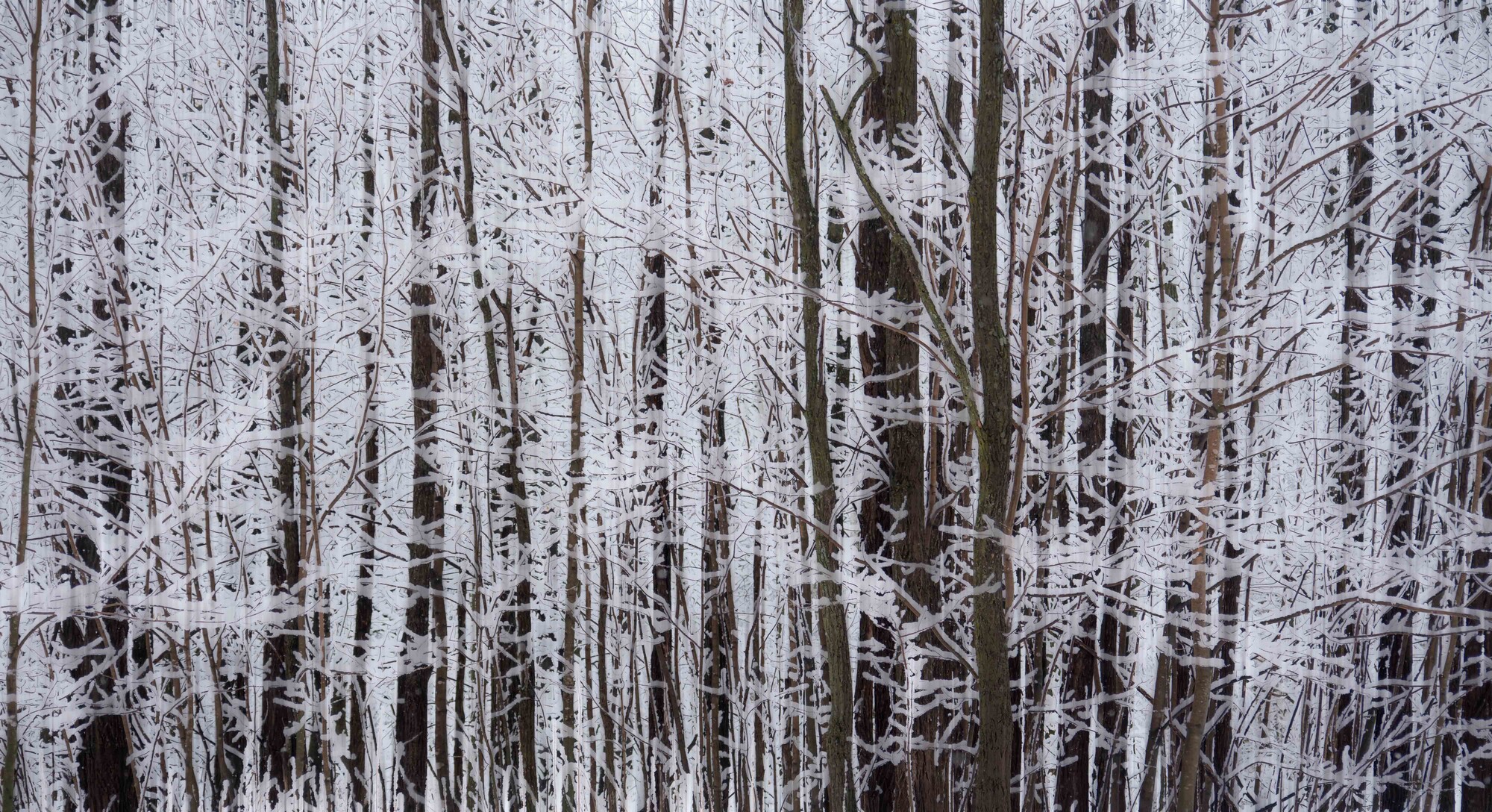
Thoughts on processing
Just playing about with a winter image. The original I thought was too harsh on the eyes so experimented and came up with the following.
I'd love to understand the initial feeling felt by others when they view this - all opinions equally respected, whether positive or negative


7 Comments
Hi Alan, I personally am not in love with this image as it is. I like the colors and natural contrast of the image, but when I look at it for the fisrt time it is almost too overwhelming for my eyes to pick a spot to focus on. I like the sort of asymetric blance that comes from the two bigger trees in the right center that act like a divide. I do however, like that you intended to do. I would almost like to see the original to see where you came from.
When I zoom in to look at the overall image in smaller chunks, it is much less overwhelming and very pretty. Do you have any idea what you're going to do with this? I would like to see it be a large print.
Thanks Chloe. This is an older image that just didn't feel right to me, although I do like the contrasting elements of nature.
I don't really have any plans for this, just experimenting to see where that takes me.
Hi Alan! Interesting one. Chloe and Jennifer both make good points. I think my reaction is much like each of theirs.
I'd say the image lacks structure e.g. the left half is a mass of confusing lines. Personally, I find the colour drab and off-putting, so Jennifer's comment about B&W makes some sense.
Ultimately, the snow-covered branches are interesting in themselves, but hard to convert into an aesthetically pleasing whole. I suspect I'd have made much the same image as you, and been unsure about it!
Whites and darks only
Trees encased in snow and ice
No need for color
I like it. It is what you've seen. You're letting the viewer actively notice something they may not have taken notice of before. Sometimes taking note of beauty in what is so often overlooked as banal is important.
I like when a shot is almost, but not quite, black and white.
Agree, point for point, Mark!
I appreciate and value your input Mark.
It's great to hear a range of perspectives, all provide insight into how work impacts others.