
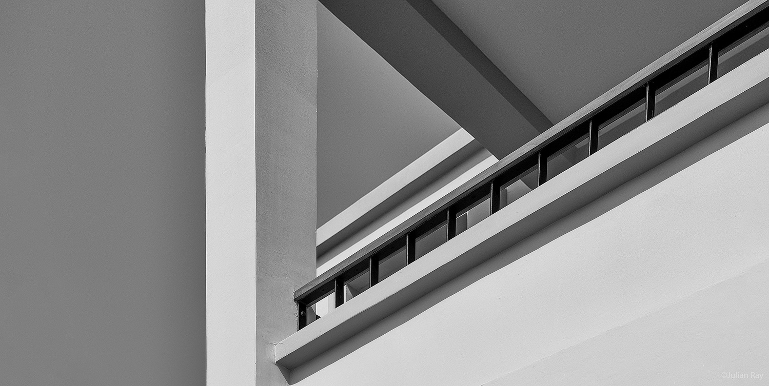
Lines as Form
As part of a recent commission for an architectural firm this image was selected to be printed large format and hung in their lobby.
Not being trained as an architect I kept working the aspect ratio to be more pleasing to my art trained eye but the team or architects that was involved in the selection kept pushing me to use this crop of the composition.
I would love to get some feed back from the group about their feelings about this image.
Thanks!
Also a big thanks to Alan for keeping this group going and being such a positive catalyst for our engagement.


19 Comments
I like it, Julian.
I would probably get rid of some of that dead space on the left.
Also, the triangle intersects with the top edge of frame, which leads the eye off the image; I'd give it more space at the top (if possible), so that triangle is contained within the frame - causing the eye to be contained in that space.
In any case, Ilike what you've done with this.
Hey William, thanks so much for taking the time to share your impressions.
I agree about the negative space on the left and for that matter on the lower right as well.
Thanks again for your input.
A pleasure, Julian. However, I think Alan was spot on.
Btw, great portfolio.
I have to say that I have enjoyed exploring your amazing images. I am so glad that you have lent your considerable talent to our group and I cannot wait to see what your next experiment here will be.
Thank you so much William.
That means a lot coming from you. Thank you, Julian.
Thanks for the encouragement, Julian. Hopefully we can get folks back to being more engaged.
I really like this shot. I think there is a lot to be said for the opinions of those that have an untrained eye as they are not influenced by 'rules' and tell it simply as they see it.
That said, initially I would have agreed with William on the dead space on the left, but after playing with cropping I actually feel it adds balance to the image.
Otherwise, I find my eye cemented on the intersection of the high contrast area where the dark diagonals intersect
If I were asked to offer suggestions, I may try cropping a little from the bottom and from the left as needed to maintain the feeling of balance. This i my personal view of course, I fully expect others to have different viewpoints.
I think you're right about the triangle locking the eye, Alan. Probably by virtue of the intersecting line.
Thanks Allan for your feedback.
In my clumsy writing about this image I did not mean to suggest that the architect team was not very skilled visually. Quite to the contrary.
I think the difference is that for me, you and William the composition feels a bit odd but from the architectural POV the lines, weight, geometry, and spacial tension is more important.
Another example of how art can be so varied and perspective dependent.
Thanks.
Hi Julian, My comment on the architect team was meant to reflect a different POV to those like ourselves.
I think it's really helpful to get the opinions of those who may not have studied photography/art and influenced by compositional rules.
I hadn't figured that groups such as the architect group would have a group perspective of their own but that actually makes perfect sense.
Just goes to show that we all have our own set of eyes and experiences that mold opinion
Well said Alan
Allan, I too did this crop from the bottom but they all felt that the shadow was an integral harmonic component of line echoing the others above it.
To me, as to you, the balance would have been way better your way.
How cool that to see that there really is no "right way" for this image to be.
Thank you so much for you insight.
I definitely like the different tones of grey you managed to get in this image. It is a very appealing image to me visually. I always love looking at the more abstract architectural photography, if it can be called that.
Thanks so much Matthew for your comments and take of this image. 🙏
Looking forward to seeing more of your work here soon.
You might like the work of David Koenig, Matthew. His (rather massive) book "Urban Elements" is a fine portfolio of just this kind of image, in colour.
David's work is definitely worth checking out. Layers upon layers of subtlety and complexity to explore and unravel.
Great recommendation Chris!
Hi Julian! Nice to see a teaser posted. Along with some others, I find the area of sky at left excessive, and agree with you about the bottom right. Here's my best effort at a crop, similar to Alan's except for the left edge, I think. Somehow, it still seems a bit elongated, yet a "squarer" crop leads to awkward intersection of building lines and frame edge.
One thing I find a bit disconcerting is that it looks as if you have over-corrected convergence if the dark rails are vertical in reality, as they slope to the right in the top right corner of the image. In a severe, formal image like this off-vertical lines don't quite seem to fit.
Sorry to be picky. It's still a fine image, as ever from you.
An interesting crop that illustrates very well how when it comes to art... there is no "wrong or right".
Thanks for sharing your take on this Chris.
Hi Julian,
Since you asked about "Feeling", ignoring everything else...
Fun ideas Vijay, thanks for sharing them with us.