
Help with blending time
I guess that now we have set an overarching theme of ICM I should post something myself.
I'd like help understanding how people feel about these images, specifically which they prefer upon first viewing, and whether that viewpoint changes over repeat viewings.
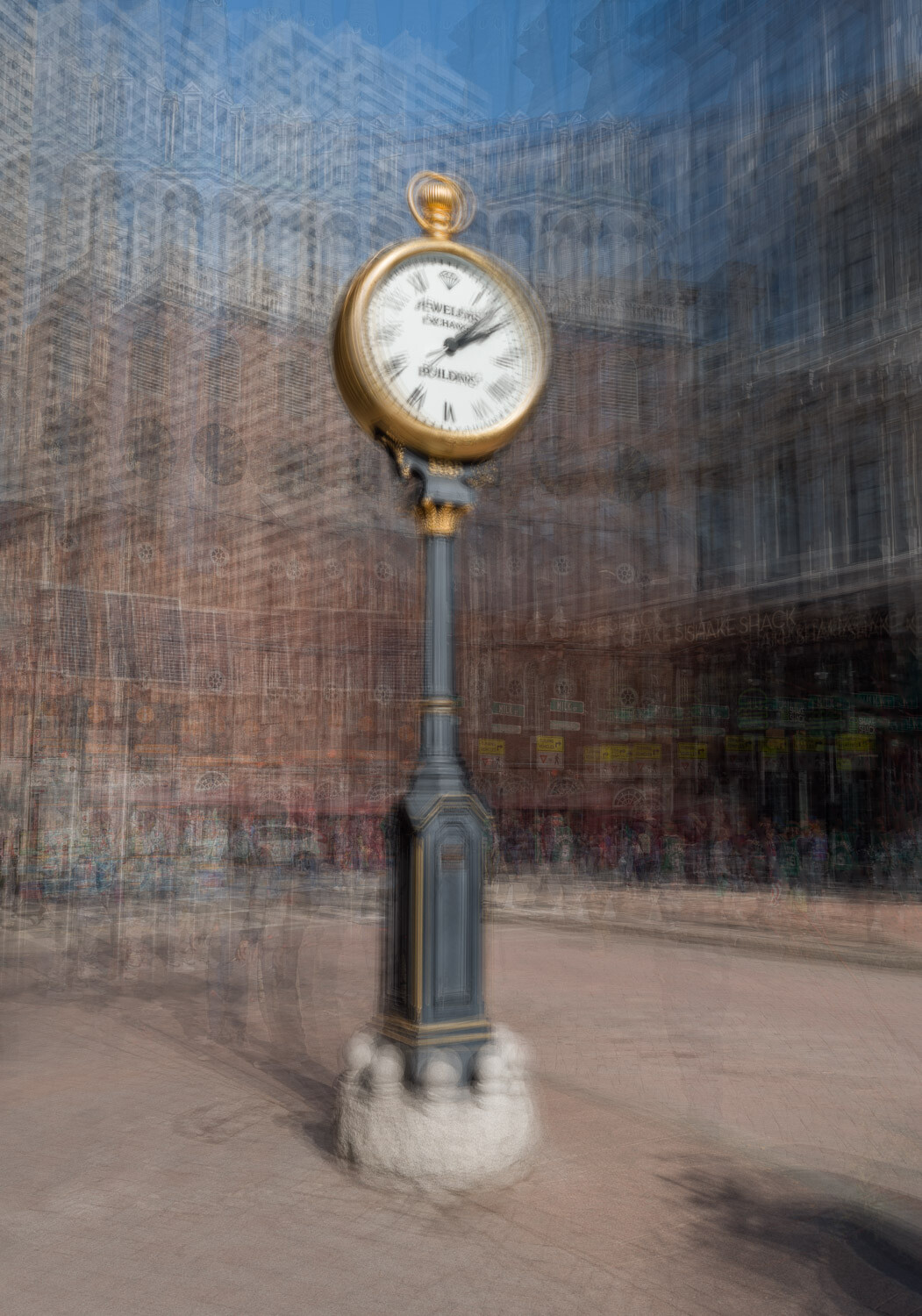
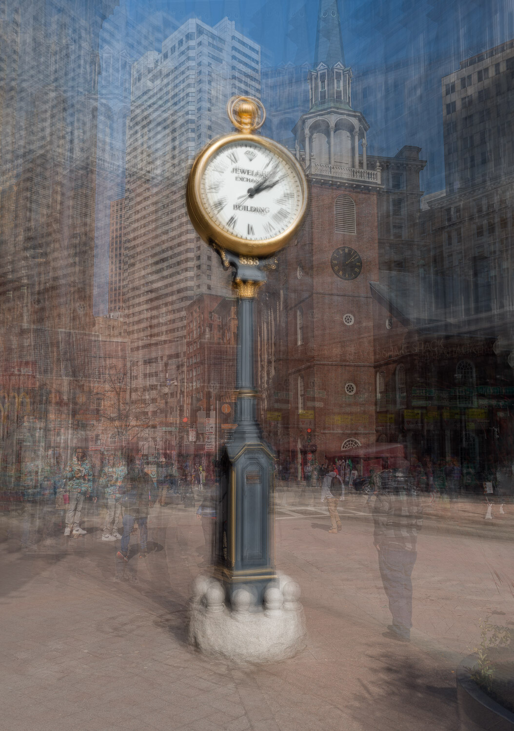
Both images come from the same 15-shot series, with simple changes in blending producing the differing results.
As described in an article earlier on Fstoppers, I feel the first image is OF the subject, the second ABOUT the subject.
Feedback in general (good OR bad) is always appreciated, and helps grow the understanding of the group.
Edit 4/3/22
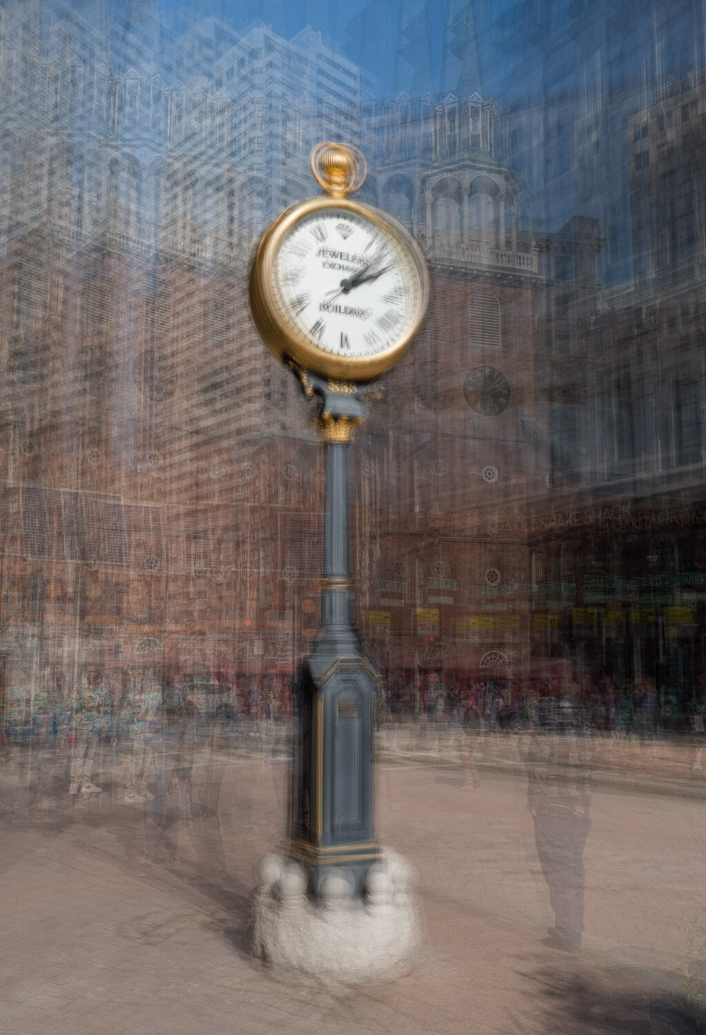
Following helpful comments I have included a third option that minimizes background detail.


4 Comments
Upon first viewing, I like the simplicity of the first image. I'll provide an update after a while to share how my view changes.
I like the first one. To me the guy is a helper in the image, he looks towards the clock and leads your eyes there also it seems to tell more of a story. I like the first because the background does not compete, in the second the clock tower competes with the main clock a little and draws my eyes away. This is all subjective but that is my opinion, but they both look good. Good to have helper and tell story, or good to eliminate competitive objects in background (first one).
I totally agree about the 2nd image Rich. I typically minimize background detail to the point where it has to be sought out, the attention fixed firmly on the subject.
On review I also thought a slight crop may help balance the image better.
I have included an edited version as the 3rd picture in the group. This does fit my personal taste more, thanks for pointing that out and let me know if you feel this is an improvement.
As an FYI - I often go back & forth on images and it can sometimes take me weeks to find a final image that I'm totally satisfied with.
I do like the 3rd one best, but first one is good too. Good job. Interesting effect